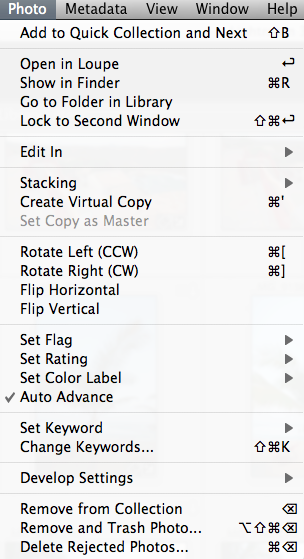
Yeah, okay, I don’t do this a lot, but every once and a while it’s fun to put together a quick technique or tip to share with the reading/listening community, so here’s one that’s very helpful when using Lightroom. More of a tip than a technique, this is simply a suggestion to enable the Auto Advance feature. When you check this feature, it makes your work flow go a lot quicker when making picks or rejects from catalogs. After I’ve completed an import, I’ll go through and tag the picks and rejects with my keyboard shortcuts (P) and (X) respectively. Because the Auto Advance feature is enabled, simply making a”tag” or flag selection on a picture, advances me to the next one in the current catalog or collection.
After I do this, I simply look up at the top of Lightroom while in Library mode to filter my collection for either picks or rejects. From my approach, I do the rejects first, then CMD/CTRL A to select all and delete! Then from the picks, I’ll go through and make whatever edits I need, even including round trips to Photoshop, Photomatix, or whatever 3rd party software I happen to need or be using at the time. This is always so much easier with Auto Advance enabled. I can fly through a shoot of 500+ images in about 20 minutes both to clean up the catalog, and make the picks of what will likely be in the final published album. Give it a whirl and see if it improves your work flow!
Got your own tips or tricks for Lightroom, Photoshop, or simple camera techniques? Share the love and sound off in the comments! Either that or share your own thoughts on what you think of the techniques I share here. Regardless, tips tricks and techniques like these are always designed to help you get through post production and do what we all love to do – get out and shoot some more! Happy shooting and we’ll see you back here next time!
Keyboard shortcuts are great ways to improve your efficiency when working on post production. Here’s a couple that I use in Lightroom to help improve things so I can get my processing done, and get out and back to shooting that much quicker!
CMD/CONTROL+8
This takes me all the way down the Develop Module to Camera Calibration. If I ever want to make adjustments to which profile to use (typically I use Camera Standard, but it’s always fun to experiment), this gets me there a lot quicker than scrolling with my mouse or tablet!
R
Yup, that’s it – just the letter R. From the Library Module, this will take you to the Develop Module, turn on the crop tool and show you how you currently have your image cropped for composition. That’s it – one letter, no fuss no muss!
Module Switching
A super slick way to move between modules is to use your Command key (CTRL Key on Windows) and the ALT key along with the number for each module. It’s super easy to remember too:
Library = CMD/CTRL+ALT+1
Develop = CMD/CTRL+ALT+2
Slideshow = CMD/CTRL+ALT+3
Print = CMD/CTRL+ALT+4
Web = CMD/CTRL+ALT+5
That’s it – 3 easy ways to improve your work flow with Lightroom shortcuts! Wawnt some more? Check out the full detailed reference guide straight from Adobe here. What ways have you found to improve your own work flow? There’s tons out there, so share your own in the comments! Thanks for stopping in and we’ll see you here again next time!
I was having a conversation recently with a fellow photographer and the discussion turned to taking the sharpest possible photos with your camera, and what was needed for it. Inevitably, post production came into play, and being very much a purist, he claimed that he does no sharpening in post production. It struck me that this sounded odd to run no sharpening algorithms in a digital world, as my understanding was quite different. I tried to make the case orally, but was hard-pressed to really make a convincing argument for it without supporting documentation. Given my penchant for writing, the resolution was my advice to “read the blog in a few days…there will be a post on sharpening”! So, for Paul (and for others who may be interested, here’s my take on whether or not to sharpen your images, and when!
The way I understand the digital photography landscape (no pun intended), is that there are three phases in which you can (and should) sharpen your images:
Capture Sharpening – This type of sharpening is done on initial import from your camera to your image editor. Whether that is through ACR in Photoshop, in Lightroom (which has ACR built in), or any other application. This initial one is of utmost importance because of the inherent softening of images during the demosaic process when interpreting raw sensor data. As I understand it, the settings used here are relative to the camera you are using, but not so much the specific image.
ACR Sharpening
Creative Sharpening – After import, this would be the time when selective and subjective interpretations are done on images. Whether you choose to apply USM (unsharp mask) in Photoshop, a High Pass overlay layer, or some other means, these types of effects are always done to taste, and very much open to interpretation.
Creative Sharpening using High Pass Filter
Output Sharpening – Last, but not least, output sharpening is when you apply sharpening effects specific to your output device. These settings are dependent on the output device, such as a printer, the web (screen), as well as the size and resolution of the output image (smaller size requires less sharpening than larger files). Even within output sharpening there are settings specific to the printer you are using, and to the paper you are using,
Again though, these are just my impressions on whether sharpening is needed in a digital age or not. I know someone is going to ask, so should probably state here that an entirely different set of criteria should be used when talking about film sharpening techniques…but I digress! 🙂 Back on topic, there’s actually a couple really good resources (from my biased perspective of course) that discuss sharpening in much greater detail than I did here. First off, a book called “Real World Sharpening” by Bruce Fraser and Jeff Shewe is one I would highly recommend. For those with an online reading preference, here’s another good article on the subject, also by Bruce Fraser.
Am I off base? What are your thoughts on sharpening? Is it needed in a digital world? When and how do you sharpen your images (if at all)? Sound off in the newest poll (also in the sidebar):
HDR, or High Dynamic Range, imagery refers to the process of representing a wider range of colors and light in a photo than what can be traditionally captured in a single image with a camera. There are several ways to produce this HDR-effect. The most common way to produce HDR imagery is to take several exposures, by both under and over-exposing the same scene by several stops, and then combining them in post-production. This process brings out details that would traditionally be lost in both highlights and shadows from normal photography. There are two schools of thought here really on HDR:
1. The first school of thought is that we should adhere to the accuracy of what it is the sensor is capturing. By allowing for interpretation and manipulation of the pixels, photography is no longer the means of reporting things – life, as we know it!
2. The other school of thought is that pixels and cameras are simply a means of capturing a limited portion of the world around them, and that even the human eye is capturing more in a single instant than any single still image could ever hope to capture. With that in mind, it is the job of the photographer to bring to life what it is they see, and use the tools available to them to bring that image to life, whether it means performing HDR, sharpening, white balance corrections, or anything!
Now, keep in mind that there are always exceptions to the above two schools of thought. Journalism for instance, requires accuracy and not making adjustments as it really is meant as a reporting mechanism not an interpretation or individual perception of what is scene. While I am not sure where my own line of thinking really ends up on this very polarizing issue, it does seem that perhaps there is a time and place for it. Again, with all subjective work, there is a certain degree of personal preference and bias – and this also speaks to the second point, because some HDR can be really really good, while others can be really really bad. Nevertheless, for my two cents, it does seem that occasionally, there is both a time and a place for HDR. During such times, I’ve tried a variety of approaches to utilize HDR while also keeping some measure of reality in my photos. Take for example, the three images below taken at different shutter speeds, while keeping ISO and aperture constant – thus creating several different exposures of the same scene:
HDR base Images
By combining and basically “stacking” each of these images inside our post production work flow, we can bring out the details in the shadows from the first image (down in the golf course area), bring out the details from the highlights (the clouds), while maintaining the clarity of the neutrally lit areas in the middle of the photos (the rocks and pool). While there are several ways to do this, including Photomatix, HDR Pro (the one native to CS5) and several other Photoshop and Lightroom plugins like what Topaz Labs, Lucis, and OnOne’s plugin Suite), here I am using the HDR Pro function inside of Photoshop CS5.
HDR Pro Sample
I did choose the option inside the HDR Pro menu to select a more saturated image than what was originally created in camera, and it is more reminiscient of what I actually saw. So, am I cheating at what I created? Is this a “real” photo? What if I were to take another approach, and simply make some adjustments on a single image? Back to the digital work flow I go…and here is a single shot edited in Lightroom:
Lightroom HDR
Now, while there are clearly some slight differences in tonal range, saturation, and such, there are two things to keep in mind: 1 – I was making these edits pretty quick, and 2 – this is the Internet, which makes color accuracy a difficult thing to achieve. It does serve to illustrate that you don’t necessarily have to stack images in Photoshop to achieve the HDR look. Simple slider adjustments in Lightroom can approximate the same thing. As mentioned above, there are also a number of third-party plugins and add-ons that can bring this effect to life. Regardless of what the consensus is, HDR is likely a technique that is here to stay, and it’s simply a matter of experimenting and finding a technique that works for you, and that your clients, or colleagues, or friends and family, will find appealing.
This is, of course, just my personal take on HDR. What about the rest of the readership? Any thoughts on the legitimacy or validity of HDR? Does it work? Can it work? Or should we stick to trying to capture it all in-camera – on a single frame? Sound off in the comments or via email! Thanks for sharing your own thoughts, and we’ll see you back here tomorrow!
ETA: Don’t forget – a couple contests are going on through November and the rest of the year:
1. Monthly LDP Giveaway – Share your own “POP” themed photos for a chance to win a pack of pearl metallic paper from the folks at Red River – this paper is awesome for HDR-styles of work!
2. The Nations Photo Lab Family Photo Day – Upload your images to their Flickr Page for a chance to win a pretty impressive set of prizes including autographed books, free printing certificates, and much more!
Friend of the blog, Andie Smith has generously donated her time again here to share some insider tricks and tips to get the most out of Lightroom 3 – she shows her work flow, what the effect of various presets are in LR, and how to effectively use them. Ladies and gentlemen, I give you…Andie Smith
It is no secret I love Adobe Lightroom… the rumors are true, I refuse to edit without it. As I’ve created my own presets I realized if they are created correctly you can “stack them”. What is stacking? It is similar to using more than one action in Photoshop. I assume you want samples.
RAW image:
This is the original raw file
1. image with Work It-Awesome Portraits and some local adjustments (cleaned up skin and Work It- Pretty Eyes.)
2. image with Work It-Awesome Portraits +Work It-Meadow. Medow is in the Tints and Tones and just adds some more blues and greens to the image.
3. The way the presets are created, you can use the Tints and Tones on color or Black and White images. Here is the same image with Work It- B&W Contrast Dark and then Work It- B&W Contrast Dark +Bobby
4. But wait there is more! (I hope you read that in your best “info-mmercial” voice) you can use a vintage preset. I used Work It-Vintage
5. Then add a tint and tone on top of the vintage preset. here is Work It-Vintage + Work it- Little Red School House
There isn’t an image that leaves Andie Smith Photography or Eight18 Photography that hasn’t had one of the Work It presets used on it. It is my work flow. No matter the presets you are using don’t forget to customize them to make them work for you… “some assembly is required” as the saying goes.
***
Editor Note: Thanks again to Andie for stopping in and sharing her workflow. If you like the styles, you can purchase the entire preset package from her website for only $89 here: Andie Smith Photography
She has also generously donated a full copy of her presets to the Lightroom Workshop, so if you happen to be attending, you will get the set there too. Not attending, sign up and get the whole rest of the day for only $10 more! Hope to see you there!
Eventually you knew it was coming – the subject of color management. Now before you mosey along, or your eyes glaze over, rest assured, this is not going to be the typical discussion of color management. I am not going to talk about LAB color vs CMYK, vs RGB, or anything like that. And even though the term “colorimeter” may sound like something Marvin the Martian was going to use to destroy Earth in the classic Bugs Bunny cartoon (that was the Illudium Q-36 Explosive Space Modulator), there is nothing overly scientific in today’s post.
Well, that’s not entirely true – it is scientific, but I certainly will not portray to understand any of that. Instead, I am going to show you how easy it is to calibrate your monitor using this device. Now I am looking specifically at the one from X-Rite (I own the Gretag Macbeth version from before X-Rite bought them), but color management has become as easy as a couple of mouse-clicks these days. So, you don’t have to know anything about color gamuts, RGB, CMYK, LAB, or anything like that to know you are getting color accurate images. Check it out…
After installing the software from the CD, simply connect the device and start the software. The device is the colorimeter (also known as a calibrator in some circles), and it is shaped like a computer mouse or a hockey puck. It has a cable that connects it to your computer via USB, and is good for either CRT, LCD, or laptop displays. Additional software components also enable you to calibrate things like projectors, scanners, and much more. Here though, I’ll be showing you how it works with a computer monitor.
Once the puck is connected and placed on the monitor, simply go through the wizard to calibrate everything from Contrast, to Brightness, and your RGB colors. It’s pretty straightforward…just open the display settings for your particular monitor type, and increase or decrease the values until the indicator is as close to center as you can get it. You’ll notice that I am calibrating a Dell computer monitor, and it is a Windows-based computer, but the process is just as simple on a Mac. (I just got my Windows notification though, so figured it’d be easier to kill 2 birds with one stone there.)
Here’s a couple of screen shots to give you an idea of the process. The first step when launching the software is to specify your white point and monitor type (if you are calibrating a laptop, pick the LCD). Next up, decide whether you want to go the easy route or the advanced route. I would recommend the advanced route, as even that is very easily accomplished, and these are the screen captures I am using here:
CRT or LCD
Next up is the screen capture of the contrast display. In the upper left, the software shows the current contrast setting compared to the desired setting. On the left is the colorimeter. The Brightness (or Luminance) window is pretty much the same layout, so I am not going to repeat the screen capture here.
Calibrating the Contrast
Here’s a screen capture of the first stage in setting the color values for my Dell 19″ LCD. The software readout is on the upper right, the colorimeter is on the left, and dead center is the display menu for the Dell monitor.
Calibrating the Color
Once your contrast, brightness, and color settings are defined for the monitor you are using, the software will run through and configure the graphics card, monitor, and display output settings.
Calibrating the Color 2
Once all the settings are complete, a profile is creating in your system folder. For Windows, that is in the system32 folder. You can give it a specific name, and set the schedule on which you will be reminded for a new profile to be built anywhere between 1-4 weeks…more on this in a minute.
Setting the Monitor Profile
As you can see, it is as straightforward and simple as can be – even on the advanced settings where I defined the color (RGB) settings. So, why doesn’t everyone do this? Good question! This device cost me roughly $200, which is likely not cheap by average standards for equipment (especially that which cannot be attached to your camera!), but if you really want to get quality results, the price is minimal. I have mine set to update every 2 weeks (my LCD display has a tendency to shift colors easily, and LCD’s in general are known for color shift especially as they get warm and cool down when turned on and off.) The benefits are huge though as your prints will be more accurate whether you print at a lab or print at home. In the case of the former, no color correction is needed (and if you use MPIX Pro, there is no color correction done), and in the case of the latter, you will use less ink and paper in test runs before getting the results you want.
Keep in mind that this is just the procedure using the X-Rite, and I am sure others could just as easily recommend the Spyder Pro series, or some other colorimeter. With that in mind, if you have an inkling one way or another, feel free to share your own experiences in the comments. Which colorimeter do you use? Do you like it? Not so much? What do you like/dislike about the process?
Whether you like the X-Rite method though, or some other model – calibrating your monitor is an important part of working with a color managed work flow if you want to produce accurate and quality prints. After all, it is still about the print. Don’t forget to share your thoughts in the comments! Until tomorrow, happy shooting and we’ll see you then!
For many of us, an upgrade of one element in our tool kit comes with many unforeseen consequences and additional expenditures. Just as a new camera body can necesitate the need for larger memory cards, hardware upgrades can also come with software upgrades. The reason? Camera file formats! As camera vendors develop new proprietary formats for their raw file formats (CR2 for Canon and NEF for Nikon as the two predominant players in the game), the need has always existed to update your software to accommodate the new formats for body upgrades.
The best example of this was when I did my upgrade of the Canon XT to the Canon 40D just last year (or was it two years ago now?)…at the time I was using Adobe Photoshop CS2 to process my files. Well CS2 development stopped as CS3 development started. My Canon 40D was stuck in between application life cycles, and as a result, I was no longer able to process my CR2 files from the 40D natively in CS2. Granted, I did upgrade to CS3 because of my interest in the field, but for those that either may not be interested in the software upgrade, or cannot afford to upgrade, there is a free alternative from Adobe – the Adobe DNG converter.
This is a really cool utility and it gets updated on the same schedule as the Adobe Camera Raw utility that is unique to the image-editing applications of all Photoshop applications (CS4, LR, etc.). The Adobe DNG stands for a Digital NeGative so it may help to think of this as a way of preserving your original data, yet still making it accessible, regardless of what other developments happen in the software world down the road. I know, we all think that Adobe will be around forever, but the same was also thought of Kodak 20 years ago – and now those Kodak CD’s are becoming difficult to manage. With that little nugget, it may be useful to consider the Adobe DNG option. Additionally, the Adobe DNG negative has been submitted to the ISO standards setting organization for acceptance as a universal conversion utility, and are releasing it under the GNU licensing, so it will hopefully always be available for anyone.
With the stage set then, for those who are not able to or not interested in upgrading, here is a brief tutorial of the Adobe DNG converter (in it’s current iteration as of 4/27/09), with screenshots. If your folders of images look like this:
Then the Adobe DNG Conversion Utility may be for you. It starts pretty easily…you can download the Windows or Mac versions of it from here:
Once you download and install this utility (did I mention it’s free?), start the application to get this screen:
First off, specify the path where the images are that you want to encapsulate into the DNG format. You can specify one folder, or you can specifiy a folder and all its sub-folders (in case you want to convert an entire library or set of images at once). Then specify the output folder and naming convention you want to use. Once that’s been decided, it’s time to select your preferences for how you convert your images.
Click on the “Preferences button” to specify how you want to conversion to occur: Do you want full size conversions or do you want to reduce the image resolution sizes for smaller storage requirements? (I always choose full size for maximum flexibility.) What about compression? Adding compression can further reduce the footprint that each DNG file has on your hard drive. (It’s a judgement call, but I choose not to compress, again to maximize flexibility down the road.) What about conversion methods? You can convert to a linear format, but I don’t like this option because it’s a one-way street (you can’t go back). Last but not least, what about inclusion of the original raw file? In most cases I would actually recommend that. It may increase file size, but this way you have access to the original raw date if your software needs ever change and you have access to software that can better handle the raw data you currently may not be able to manage. All these are things to consider. Hopefully, this short explanation of your options and the pros/cons will help in deciding how to proceed.
From here it’s pretty straightforward – you’ve specified everything from your input folder to your output folder, naming conventions, and conversion preferences, so now, simply click the button on the lower right to start the conversion process. You will get a dialog window showing you the progress:
If you like, you can always click the button in the lower left to stop or abort the conversion process in case you specify the wrong folder or for some other reason. Once the process is complete, the window will show all converted images. Simply click “OK” to close the DNG converter utility from that window, as shown below:
Finally, open the destination folder, and voila! Your image files will now have thumbnail previews again:
There you have it, your files are now prepped for one of the easiest, simplest, and most cost effective ways (did I mention this is free?) for both management, archiving, and accessibility – 3 very important things to consider in your image management workflow.
Granted, as with anything else, the Adobe DNG converter utility is not for everyone, as we all have work flows that call for different approaches. So, what approaches do you use? Feel free to share your own thoughts, processes, and suc in the comments or via email. Happy shooting and we’ll see you back here tomorrow!


")


