That’s right, you read that right – I got a chance to get with none other than the Photoshop Guys and ask a few questions about Photoshop, their own projects, and tackle everything from product preferences to personal projects and activities, and even a few personal perspectives thrown in for fun! Here’s a chance to catch up on the latest with them including their podcasts and shows. So, let’s just get right down to the brass tacks here…with so much content, it’s broken into three separate posts for today through Wednesday. Getting things started is Mr. Dave Cross!!! Continue reading “Q&A With Dave Cross!!”
Tag: graphics
Six and OH MY GOSH!!!
In their first game this season, I shrugged – they beat Cincy. Then they beat the Browns – ok, so we have Ohio’s number. But then Division Rival Oakland fell, that should light a fire, right? Yeah, I will always be a “Ray-dah Hay-dah”, but to be brutally honest, they are not the team they once were – we’ve had their number for a while now, so that’s not an impressive win in my books. Okay, so what about Dallas? Well, I stood up and took notice then – they might not be in a transition year after all – but it’s really one win, right? Dunno – we went on to beat New England in the hideous throw-up…throw-back uniforms. That raised my eyebrow again. But surely, the darlings of the AFC West with Phillip Rivers, Ladanian Tomlinson, Sprowles, and crew, on Monday night, and in San Diego, our chances there are dire. Surprise surprise though, we are now 6-0 – first time since 1998 (we won the big one that year). Oh wait…this isn’t a sports blog – it’s a photography blog. Okay, let’s talk brand identity!
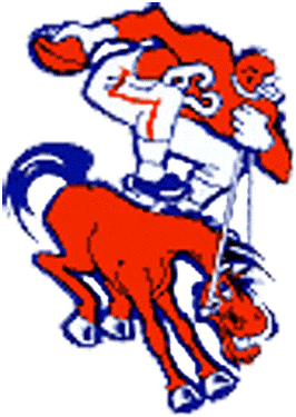
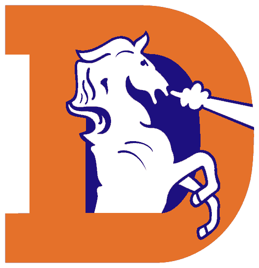
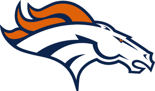
Someone once said that brand recognition is of supreme importance in building your identity. While building an identity and recognition is important to be sure, we always have to take care and not be afraid of changing, and mixing things up. While there are many examples of how a brand identify can change over time, take a look at this development over time:
From 1960-1961

From 1962-1967

From 1968-1996

From 1997-Present

So, you can see how changing your identity over time can be a good thing – as the identity and recognition of this organization has definitely improved with time. So, which one do you think is their best design? Each one is definitely identifiable for the era in which it resides, and some have definitely been more identifiable (and memorable) than others. Any takers for the first? Second? Third? Current? Sound off in the comments with which one you think is best…
Back to the original theme though, my hats off to the Denver Broncos – you showed your talent, drive, motivation, passion, and tenacity in the win over the evil Chargers (sorry Jared) last night! (Not like I am biased or anything… 🙂 ) Okay, so I made the post a personal one today, but at least I tied it to photography and design at least a little. That’s gotta count for something, right?
Don’t forget – 4 days left in the October Noise Ninja Giveaway over on Flickr – get your photos in soon (shots of Broncos players making some noise get one point in their favor…just kidding!)! Happy shooting and we’ll see you back here again tomorrow!
