Portrait or Landscape

One of the more common questions when it comes to composing images is whether to shoot with the camera oriented in the landscape or the portrait position (horizontal or vertical).  As always, the answer is usually along the lines of “it depends…”

There are some instances though when a portrait orientation is more conducive and others where a landscape is equally superior.  For instance – if you want to have your images published in magazines, portrait mode might work better primarily because that is how magazines are typically laid out.  Calendars, on the other hand, because of the opposing orientation, are more inclined toward landscape setups.  Your subject matter can also dictate preferred setups too…portrait mode is called portrait mode for a reason – it is particularly well suited to photos of people.  Likewise, landscape mode is also named that way because scenes and vistas (landscapes) typically extend from left to right and not top to bottom.

Sure, there are exceptions to the rule, when a landscape orientation may work for a particular portrait, or a vertical orientation make work for a group setting of people.  So, which one should you shoot?  My easy answer is to shoot both for any particular scene.  Often what I will do is if I find a subject that I want to capture to make a picture, I will shoot it four ways:

  1. Portrait
  2. Landscape
  3. Zoomed in
  4. Zoomed out

The latter two is a subject for another post some day, but for today, I thought it’d a be a fun way to cue up the weekend by reminding everyone to try shooting more ways than one – the results may surprise you!

A final reminder for the week too – there are only seven days left in the January circles themed Flickr Giveaway.  The winner will enjoy a free copy of Photomatix Pro from the folks at HDR Soft.  Is your picture in?  Don’t delay, submit today! 🙂  Happy shooting all and we’ll see you here next week!

Creating Compelling Captures

We always are striving to make our images more compelling – to bring the viewer in closer, and to connect better wit our audience.  I have had people ask me pretty much the same thing, but in may different ways and it basically comes down to the something like this: “I get the technical, but it’s the creative side of making compelling images that gets me stuck – what can you suggest?”

It’s the age-old question, and if I had all the answers, well, I’d be filthy rich!  The reason this is the case is because what is compelling or inspiring for one person will be different for another, and yet another, and even a fourth or fifth person.  The truth of the matter is that there is no magical silver bullet of what to do to create compelling images…but there are some things that we, as photographers, can rely on as starting points in our search for compelling captures.  Here’s 5 compelling capture tips that I’ve come up with:

  1. Color – striking colors are always noticeable.  We see the world in shades, tones and nuances of color, so seek out those types of images where color is powerful.  D0 this, and your chances of creating compelling captures increases exponentially!
  2. Light – Surprise surprise!  I’ve talked about light before, and it’s influence in photography (it’s all about light in photography, even the word itself translates partially as light).  Find powerfully lit scenes and you’ve found a compelling moment.
  3. Emotion – Photo journalism relies on this more than any other genre, but if you want to tell a story with your images, one way to do so is to evoke a sense of emotional connection.  Bringing out the emotion in the viewer by presenting scenes that are filled with emotionally charged elements – whether it’s a controversial image of a war zone, or the passion of a mother and her unborn child, these types of scenes stay wit us for a reason, because of the emotion tied to it.
  4. Action – In the words of Joe McNally, “action trumps everything.”  Action shots also connect with the viewer because it speaks to a particular moment in time more than anything else.  That moment a soccer player connects their foot wit a ball, or the moment a bullet shatters a wine glass – it’s something that sparks interest in the viewer, and cannot be ignored as a source of compelling interest.
  5. Eyes – Spoken from the rulebook of a true portraitist, when you have the faces of people or animals in an image – make sure you can see their eyes.  Remember, like the old saying goes, “The eyes are the windows to the soul”, and if you want viewers to connect with an image, one of the most compelling ways to connect with a portrait is to give a hint of what’s inside, and that is almost always done through the eyes of the subject.

So, there you have it – 5 ways to create compelling images.  These are, of course, adages, and there will be exceptions to these rules at times, but as a general rule of thumb, these tips can help you create compelling captures.  There’s also more to it than these 5 ideas, because you know that no single person can completely encompass the ideas behind what creates compelling captures.  So, I would invite you to share your own ideas for what you look to in creating those decisive moments?  Is it something here?  Is there something else you look to for inspiration or to capture something compelling?  What captures your interest when you look at pictures?  Sound off in the comments!

Don’t forget, the November contest has started and a literal bundle of prizes is at stake for some lucky participant so get your creative caps on and throw an image (or two or three) in the Flickr thread.  If you don’t play, you can’t win!  🙂 Until tomorrow then, keep on shooting those compelling images.  Thanks for stopping in and we’ll see you then!

Five Elements of Control: #5 Composition

You knew it had to come back to this, right?  I know, everyone is screaming by now “But Jason, you’ve talked about the Rule of Thirds until the cows literally came home!”  Truth be told though, most people think about compositional positioning with their subject matter.  While it’s true that subjects are ideally placed on a hot spot or along one of the gridlines in the ROT grid, but you can break the rules too, ya know!  I say, put anything you want on a grid spot.  Or don’t have a specific point of interest!  Make the subject of your photo the space – negative space, as previously mentioned, can be a powerful thing!

You can also think of the ROT grid for any point of interest, not just subject points of interest.  And, since we know that light (luminance, contrast, whatever your semantics prefer), geometry, color, and context can all be points of interest, then you can put any of these there and create visually grabbing photographs.

The greatest part of this exercise though, is that now we are looking at everything in a lot of new and creative ways.  I bet you are asking yourselves lots of questions now:  Does that light look good?  DO those colors complement each other?  What about that round  wheel in a square table – that could be interesting, right?  Keep on thinking and looking at the world around you from different angles and perspectives.  Sooner than you realize it (if not already), your eyes will dart all over the place looking at things and you might not even be conscious that you are doing it.

When we migrate these exercises from the front of our brain to the back of our brains, making them automatic to the point where we no longer need to even think about looking for things – we just do it, then believe it or not, the compositional perspective also becomes second nature.  You are already looking at how the light and colors on this corner of the room are really awesome contrasts to the darker shadows on the other side – and how cool is it that the funnel of light literally cuts through the darkness on that gridline?!

Some days you’ll have epiphanies, realizations, and great moments to capture, while others you may not see as many.  Rest assured though, once your brain and eyes are trained to look for it – you’ll see it everywhere you go.  So, take a look at the world around you – see what catches your eye – ask why if you like, but enjoy your moments, because these are the ones where you can really get creative with composition and take your photography to the next level!  Just remember the Five Elements of Control:

Luminance
Color
Geometry
Context
Composition

Have a great weekend everyone – this officially wraps up my first week-long thematic series of blog posts.  Hopefully you’ve found each one rewarding individually, and I would welcome any feedback, thoughts critiques, and comments, because this will likely become an eBook download.  I’ll expand on each element some more, and include even more photos as examples of each, along with detailed critiques and highlights to help show readers why certain ones work, and others don’t.

So please let me know your thought!   Who knows, feedback may get you a free copy of the eBook and a mention in the credits if you do!  Thanks too, for all the comments already throughout this week, with your comments and insights on both the written word and photographs.  We’ll be back to regular posting starting Monday!  Until then, Happy Shooting!

Grab the Feed

Five Elements of Control: #4 Context

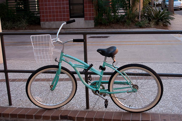
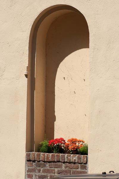
Have you ever seen something that looks so out of place that it catches your eye?  Well catch it with your lens too, because contextual positioning of subjects in interesting or unusual/unexpected areas creates visual interest.  This is what I refer to as controlling the context of your subject.  So many times I’ve heard people tell me “but how can I change the surroundings?”  The answer lies not in changing the surroundings of subjects you want to shoot, butin reversing that idea:  find unusual subjects in your given surroundings.  Say you are on a photo walk and in a city area.  Well, try and find subject matter that contradicts the sense of city.

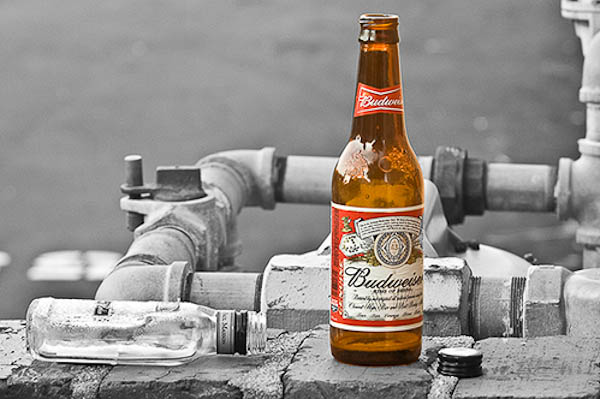
Additionally, you can also create contextual appeal by the use of negative space too.  See something standing all by itsef, or away from other things?  That’s a picture possibility!  Conversely, something that is amidst other things could be a cue for creative expression.  What if you saw a plastic water bottle among some glass beer bottles?  That could be cool…or what if you had a computer mouse sitting in a mousetrap?  You can create subject and background contextual associations in your own environment too ya know.  Photographers that make good money do it all the time.  (Hint:  that’s called stock photography! 🙂 )

Here’s a few examples to give you a springboard for creativity.  Find something you like?  Tell me below!  (I love to get feedback on photos just like everyone else…)  Got your own ideas?  Share those below too!  Sound off in the comments, and don’t forget to keep on shooting!  (That Flickr Contest thread is still alive and kicking you know – great chance to win $500 of gear, including a Thinktank bag System and a copy of the Topaz Labs PS Plugin Bundle!)

Trapped Bicycle
Trapped Bicycle

Hidden Planter
Hidden Planter

Hidden Planter
Hidden Planter
Alcohol Plumbing
Alcohol Plumbing

Grab the feed

Five Elements of Control: #3 Geometry

Earlier this week, we looked at the idea of how contrast/luminance can impact a photo, and that your creative style may tend toward a wider contrast or a narrower contrast.  Then, yesterday we looked at how the element of color can impact a photo, both in the sense of how colors can balance and compete against one another, and how bright versus dark colors can play off each other.  Since we’re moving from more theoretical to more tangible elements that we want to include in our photos, next up is the geometry of our photos.

So, what is geometry?  Basically, it’s shapes!  Shapes are everywhere, and the types of shapes (or the geometry) can play a huge role in the impact of your photos.  So, it makes sense to include geometry as an element of control.  Since shapes are nothing more than lines that are connected together, this also means we are looking at the lines in a photo.  Whether it’s long rectangular lines of grass or circular lines of a persons eyes, the sharpness of square and angles lines in architecture or the looping curves of ovals in a landscape, shapes and lines can really define our work.  So, with that in mind, let’s look at a few photos here to help illustrate what kind of impact different shapes can have.  Look through the images and see if you can find all the different types of geometric shapes.  What kinds of shapes do you see?  DO they help or hurt the photos?  Share your thoughts in the comments!  In the meantime, Happy Shooting and we’ll see you back here tomorrow for #4 of the Five Elements of Control…(any guess what it is? 🙂 )

Curved Seashell
Curved Seashell
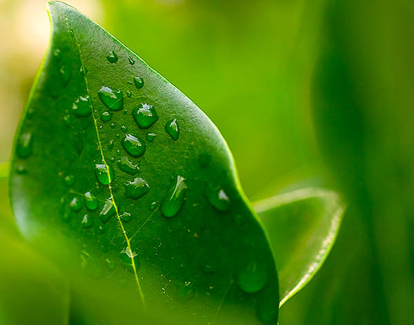
Dew-dropped Leaf
Dew-dropped Leaf
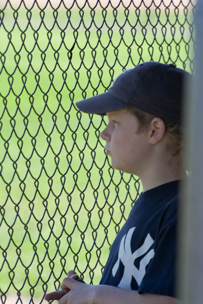
Looking through the Fenceline...
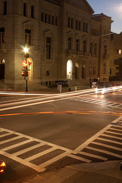
Charleston Street Corner
Days of Yore
Days of Yore

Grab the Feed

Repost: Quality versus Quantity

I’ve got a few software reviews up my sleeve for both Windows and mac, but ratehr than rush them out the door prematurely, I’d rather postpone that material in the interests of sharing some rather thought-provoking content on the question of quality versus quantity.  I’d written this post before, and the first publication got a few interesting email responses – so we’ll see if the debate is still holding true.  Tell me what you think:  Does quality trump quantity or vice versa?  Here’s my take:

“Okay, I’m done.”

“That’s it? You’ve only been shooting for ten minutes!”

“Yep, got about 50 shots, I should have 4-6 proofs for you from that bunch.”

“So we’re done?”

“Pretty much…I mean I can keep shooting, but there’s really no point, it’ll just be duplicates of the same stuff.”

This was the dialog I had with a co-worker a  short fair time ago when I went to take pictures of her son for her. It is indicative of a mentality that exists in society…not only is size king, but so is quantity. If you were to take two photographers and set them side by side, who would you think is a better photographer: the one who took 40 shots or the one who took 400? Many of the general public would probably respond by saying the latter, without giving it much thought.

Yeah, I took 50 instead of 40, because I have not been a pro shooter for 20 years, so I gave myself a little bit more of a margin for error. Having checked ISO, white balance and histogram settings though, I was pretty confidant that all that was left was composition – so I went with my instinct for what would make a good composition, took 3 or 4 different angles and was done.  Ten shots of each pose was enough.  I have photographer friends who still take 25 shots of each pose with only negligible differences in lighting or facial expression.  Can you see it when blowing up to 200%?  Sure, but who looks at pictures that close?

Nevertheless,  photographers fall victim to this mentality of delivering a massive quantity of images. I know of several studios that just inundate their clients with hundreds of shots to choose from. They can’t understand why these clients never get any prints or very few prints from the studio. They think that people like to have a choice, and that the more choices you give them, the better. While the idea is not without merit, (because choice is a good thing) it can go to an extreme… and I think that’s where it’s going. The reason why they’re not getting prints done is because too many choices can also be paralyzing. If presented with 4 options, it is very easy to pick out which one you like best, whether it’s cars, cameras, televisions or photos. Presented with 400 cars, cameras, televisions or photos, the choice becomes more difficult and time consuming, primarily because you become concerned over picking the “wrong one”.

My perspective, in contrast, is to deliver just a select few shots. It makes the choices easier for the client. In a world where time is an increasingly valuable commodity, getting bogged down in sorting through hundreds of images trying to find one or two to print and hang can be more frustrating and lead to inaction. In essence it’s like you are transferring the process of elimination part of the work flow from your hands to the client. This has several downsides with minimal upsides. The one upside is that “Hey, the client chose this, not me.” can absolve you of responsibility for getting a bad shot framed. I would venture to ask though: why was a bad shot among the choices?

As I told a friend via email recently, it also comes to one of work flow management. Which would you rather deal with as a photographer – a work flow where you process 50 images or 500 images? The argument that “it’s digital, so what’s the big deal?” always seems to get under my skin a little bit. For me, the big deal is that some are going out there and not putting much time or thought into capturing the essence of a scene. They just lift the camera, point in the general direction of what they want and just fire away. I’ve actually heard the term “spray and pray” used for such shooters. The idea of slowing down and taking your time to both enjoy the moment and to really take into consideration all the nuances of things like lighting, shadows, and minimizing distractions has benefits. For me, the benefits far outweigh the downsides. Firstly, it is a much more enjoyable situation to be in. Not only do you have fewer images to process, but you can really take your time, pay attention to the detail, and get every nuance of the image pegged!

Secondly, you will probably find that you are less stressed yourself. You’re not worried about missing the shot because you didn’t have time to consider all the aspects – primarily because you are considering the nuances. Third, and most importantly, when you relax and aren’t stressed, your clients aren’t stressed either…a photographer and their subject often feed off each other. I have so much fun when taking pictures of subjects, I often forget that I am there for a specific reason – we’re enjoying the moment.

That’s right…we are enjoying the moment – client and photographer! We’re laughing, and having fun, and I just happen to have a camera in hand recording it. Yeah, the first shots are often always a little awkward for them, but once they see my mug grinning over the camera at them and laughing and joking around, the stress level decreases by a factor of ten! When your client is less stressed, they photograph better! They are more willing to strike goofy (in their eyes) poses! You can capture the shot!

So, that’s pretty much it: taking fewer shots will do three things for you:

  1. Cut down on post processing (both for quantity and quality)
  2. You stress less, and thus, your client stresses less.
  3. You increase your keeper percentage!

Having said this, I realize that there are some situations where you have to mass produce images. Another friend of mine talked about a basketball or softball tournament where they had to take pics of every person on every team over the course of a weekend. With 50 players per team and upwards of 30-40 teams, that is 2000 shots to process – and that’s a small regional event even if it’s only one shot per person. Take it on to a national event, and it just ratchets up another notch. While the quantity is there, it’s also a different shot every frame. This is also not a fine art or a studio environment. This is a very fast-moving, fast-paced environment and is not applicable to the type of photography I am talking about here.

I would venture to guess though that most of us do not fall in that category…we’re shooting far less than this on average, so the quality versus quantity rule does apply in most scenarios. Now, if only I could take that principle and apply it to the writing here on the blog!

Before signing off today, just a couple closing thoughts to share that are non-related to this article:

  1. Some link-love from two friends who are doing some cool 365/blogs (a picture a day for a year: very creative minds at work and so inspiring!
  2. Don’t forget the Numbers Contest – only 4 days to go for your chance to win a $500 software package:  Flickr Thread for submissions

Happy shooting all, and watch those apertures!

Grab the Feed

Creative Composition – Vignetting Photos

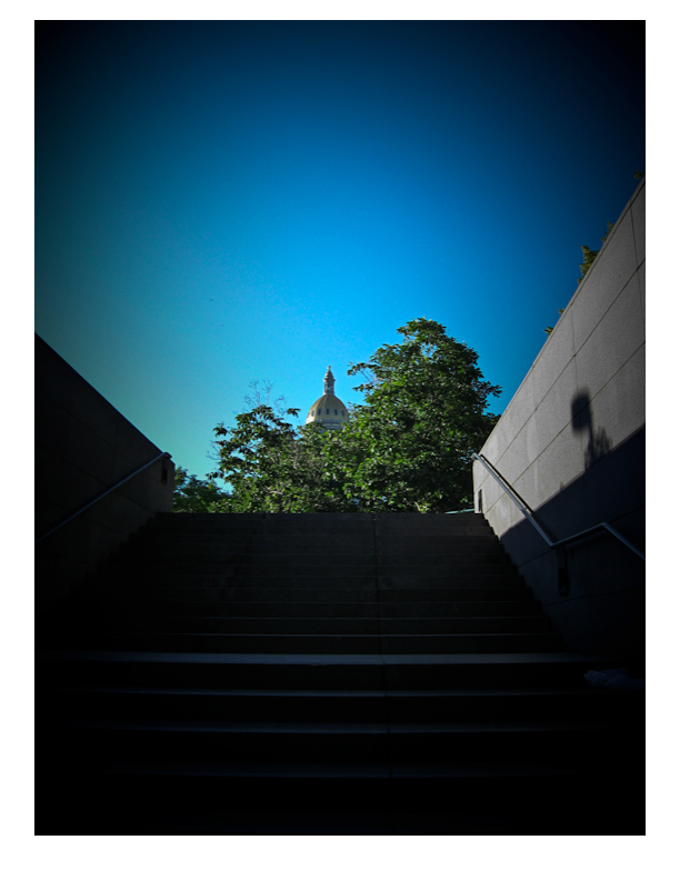
In general we learn that placing your subject dead center in the frame is something to avoid – creatively speaking it can kill a picture.  While this holds true as a general rule, I was walking into work yesterday morning and the sky was a brilliant blue, with the capitol bulding of Denver right dead center in front of me, and I thought that might make an interesting attempt at breaking the rules if only I had my camera….and then it dawned on me, I did have a camera.  Granted, not my trusty 40D, but the smaller Powershot As500 IS.  So, on a whim out it came and I snapped off a few frames of it.  The vertical came out the best compositionally speaking, but it still lacked something to bring it into what I would consider the “creative” realm.  After all, it is a rather mundane shot, and something you would expect the typical tourist to capture.  So, how could I create interest…and then it dawned on me:  vignette!  That would bring the eye in more, focus attention where I want it to go. So, into Lightroom I went, and sure enough it did create a little more visual interest.  I thought I’d share that view with you here today:

vignette

Granted this is still something that I would probaby personally consider a snapshot from my library of countless snapshots, but it does serve to illustrate that post processing in software can create more visual appeal and vignetting is one way to achieve those ends.  So, the next time you are about to toss a shot, ask yourself:  Could I improve this with a little vignette?  Give it a whirl – you never know whegn a little vignette might surprise you!

On that note, it’s always helpful to remember that post production work can make or break a shot.  Yes, the better your images are to start with, the less work you have to do in post, but that is not to say that post processing is a bad thing…so regardless of whether it’s a little dodging here, burning there, perhaps a litle vignette, or even applying some plugin processing from your OnOne Plugin Suite 4.5, always be willing to explore!

Oh wait – you don’t have the OnOne Plugin Suite 4.5?  Well, go figure, just the luck – today starts the July photo contest here on the blog, and entries are now being accepted in the Flickr thread here for some lucky reader to win their very own copy of the Plugin Suite from OnOne!  Pretty cool as this is a retail value of $500 for this package, so you can imagine the creative possibilities!  Feel free to capture away, and share your favorite shot in the contest.  You can find all the rules from the announcement post yesterday, but get out and shoot for your chance to wina free copy of this great software suite!

For those of you expecting the podcast today – year-end in state work means processing financials so we were working late today to get a lot of T’s crossed and I’s dotted before the clock struck midnight – so the podcast did not roll out today, but I promise it will roll out tomorrow and I’l be talking more about the photo contest then too, as well as answering viewer and reader questions, so if you have any to throw out in the mix, now’s your last chance to get questions in before the show goes live tomorrow!  Got a questio about photography, gear, software, tips, tricks, techniques?  Share it in the comments or with me via email.  Happy shooting for now and we’ll see you back here tomorrow for the podcast.

Grab the RSS Feed

Say Cheese?

Ever wonder why we’ve heard photographers say that when taking your picture?  Think about what happens when you do – your facial features open up, your mouth opens slightly, and you get a little upward curvature in the corners of your lips.  (Unless of course you concentrate on specifically not doing that.)  Whoever thought this up eons ago was well ahead of the curve, because knowing how to take good portraiture encompasses entire volumes of books on the subject.

Volumes exist on what lenses to use, how to light, depth of fieldand much much more, but perhaps the most valuable information on how to take great portraits comes not just from technical awareness, but from personal interactions, and how to get people to act natural yet emotive and to let that come through in your work.  While no blog post could entirely exhaust the subject, here are ten quick tips on taking better portraits:

  1. Establish a connection – portraiture is about connecting with someone through the image.  If you don’t connect with them through the camera, then there will be no connection in the print.  Make sure you connect with your subjects in some way.  Get to know about them, because that knowledge can transform your vision into really beautiful works of art.
  2. Relax the subject – Connecting with your subject means they feel comfortable around you – now the key is to get them to feel comfortable in front of the camera.  Many times this is much easier said than done, but when you do get them to relax, the poses will come more fluidly, and you’ll get better results.  One way I do this is to just start taking pictures of things around us as we talk and connect.  The whole idea of hearing the shutter can be scary to some people, so by hearing it almost to excess and know it’s not on them can mitigate the “scary” factor.
  3. Choose a background – if you are in a studio environment, this is fairly easy, but if you are on location, keep your eyes out for backgrounds that provide contrast to the subject.  Are they wearing light clothes?  Look for a dark background.  What about props to give a little more meaning.  Are they sports fans?  Have them hold a football, or stand by a basketball hoop.  Backgrounds can help give more definition to your subject.
  4. Have a purpose – try to think of reasons why you are taking the picture.  Is it to record an event, or is it for a model?  What about a head shot for a business executive?  If you think of why you are taking the picture in the first place, that can help give you ideas for how to compose it.  For the event, it’s about the moment, while the portrait it’s about just the person, so give some thought to how to enhance their best qualities and minimize flaws.
  5. Create separation – this is crucial to giving definition to your subject while minimizing distractions.  In the on-location areas, look out for things like power lines, nearby light sources and other objects that may detract from the subject.  Here it also helps to keep a wider aperture so that any distractions can be effectively blurred out of focus to minimize their impact.
  6. All about the angles – Some people have great profiles.  Striking features can be accented from certain angles and can give greater impact and meaning.  Shooting from below can suggest power and strength (for the business executive), while shooting from above can minimize a body style that is more robust.  Even profile shots can be stunning if done right (hint:  try shadows there).
  7. Lights, lights, lights – photography is all about painting with light, so portraiture is no exception.  Whether it be modifying existing light with reflectors, diffusers and shoot throughs, or creating your own light with strobes and flashes positioned off to the side or from above, lighting can create a wide variety of moods and bring images to life, especially in portraiture!
  8. Watch the eyes – for any subject, whether human or animals, we like to have the eyes in focus.  It’s just the nature of people to look at the eyes in a subject, so make sure the eyes of yours are tack sharp.  Seeing a persons eyes have often been said to be a mirror to their soul.  You can get playful eyes, soulful eyes, sad eyes, sparkling eyes, weepy eyes, tear-stained eyes, angry eyes, hungry eyes, passionate eyes… (you get the eye-dea!)
  9. Clean that skin tone – this means make sure that you are keeping the tones in check.  If the skin is too orange or too blue, add or remove some flash or ambient light.  Here the key is in white balancing your images.  Take along a grey card (even something as small as a 3×5 card can work) and you can set your white balance off that – your skin tones will be spot on if you do – and save you tons of post processing time.
  10. Less is not always more – let’s all just admit it, it’s a digital world.  Those pictures are really just data packets and with data being as cheap as it is, we can afford to take more shots.  This can help with blinkers, and if you want to try several poses or wardrobe changes, or lighting changes, or location changes, or group changes (think weddings). or weather changes (think sunlight versus rain, versus cloudy), or….I think the gist is clear again here.

So, there’s ten nuggets.  I tried to be brief yet have some detail, but you can never have enough time or space to really cover something with so much to talk about in a short blog post.  With that in mind, what about your thoughts on portraiture?  Add to the pool!  Got any ideas, DIY tricks or nuggets that work for you?  Share them in the comments or via email.

Before signing out for the day, I’d like to give some special thanks to a few people.  First to Derrick Story for the helpful link from his blog post today about the tethered shooting write-up.  It’s always nice to get what I like to call “a nod from the Gods”, but not only did he write a post about my write-up, he also submitted it to the Imaging Insider, who subsequently included the write up on their site.    Second up, I’d also like to throw some NAPP-Love back to Karen from “Pursuing Photoshop” (a.k.a. Mitzs in the blogosphere, also a member of NAPP) for her link back to the Adobe Photoshop Lightroom contest currently running here on the blog – thanks Mitzs!

Oh yeah, and finally, don’t forget the Photoshop Lightroom contest I announced in last week’s podcast – it’s running over in a thread on Flickr, and the images are starting to come in.  Some really nice ones so far, but there’s plenty of time left in May to enter!  Good luck to everyone!  Well, enough content for one day, so happy shooting and we’ll see you back here tomorrow.

Creative Vision – or not!

When looking at image composition, many of the things we use as our foundation are the typical rules of the trade – things like the the Rule of Thirds, Sunny 16, Golden Mean, etc., etc., etc.  While these rules are all well and good, and they definitely are some of the fundamentals that we all incorporate as we see to create beautiful images – they do not constitute the entire picture (pardon the pun).  As photographers, we should also be challenging ourselves to look at things in unique and new or innovative ways.

For instance, take the Eiffel Tower.  This particular piece of architecture has been around for so long now that photographers have had an opportunity to capture this from pretty much every angle and in virtually all lighting conditions.  You would be hard pressed to come up with a new angle or an unused lighting style for this monument.  So, what if you take a trip to Paris – should you not even bother with a picture?  Of course not!  Snap away, be a tourist  want and get your other half mugging next to the Tower.

The same could be said for the Sistine Chapel, the Venus de Milo, or any other of thousands of historically significant and/or interesting works.  And seriously – what do you think would happen if you went on a trip to Paris, came back and said “Nope, no shots of the Eiffel Tower, been taken too much already, no sense in taking yet another shot of it.” If your family is anything like mine, people would look at you and wonder – “But, you’re a photographer!”

The point here is that you don’t always have to be “on” and looking for that next great shot.  In fact, the minute you stop trying so hard to find inspiration, in general, the faster inspiration finds you.    Let the boring snapshots happen – they’re fun, and a great way to connect with others.  Imagine being at some social function and you’ve got your camera.  Are you looking at the light, wondering what aperture/shutter settings you can feasibly hand hold at without over cranking your ISO, or are you enjoying the time spent with family and friends?  Before you answer that – answer this – which circumstance do you think will provide more inspiration and creativity?

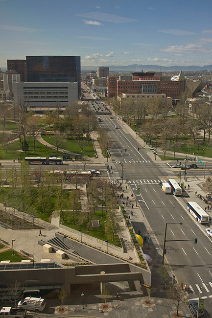
Just the other day I was delivering some computer stuff to another building, which happened to be 14 floors up.  Sure, I have my camera with me – and I looked out the window.  Aerial photography has always intrigued me, but I had never given it another thought – until the other day.  So, didn’t really think much and pointed my camera out the window, just having fun and taking a few snaps of the scenes:

denverabove1

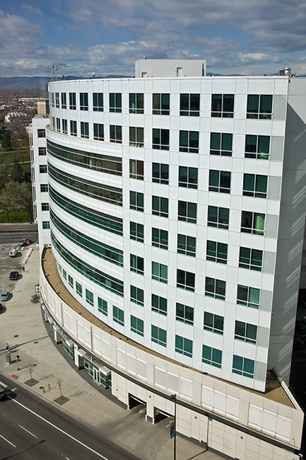
Quite the boring shot eh?  Certainly not even close to being on par with something like the Eiffel Tower, the Louvre, Venus de Milo, or anything like that.  It’s pretty much a scene of nothing.  But from nothing, and from not even trying to always be “on” you can find your creativity and inspiration.  This shot was taken only ten seconds apart from the previous one:

denverabove2

Okay, so it’s still not as breath-taking as any of the other historical monuments, but you gotta admit, that curved line of the building receding into the distance is kinda neat, eh?  This isn’t really looking for props or accolades though.  The point here is to not let yourself become too preoccupied with achieving your next great “hero” shot on every capture.  That is only setting yourself up for failure because no one can attain that.  Sure, it’s important to try and stretch your creative muscle, and try new captures, and experiment with new styles, using different lighting and all the stuff that goes hand-in-hand with being a photographer, but remember, before you can be a photographer, you gotta be a person!

Enjoy photography, but don’t forget to live your life!

Don’t forget to pick up the feed for the blog and the podcast – all during the month of May, you could be shooting to win a copy of Lightroom!  One of the best ways to do that is to just go out and have some fun.  Forget about the details from time to time and just enjoy life – because that is when you will most likely get your hero shots – when you least expect them.  So, just enjoy life, and enjoy photography – the rest comes naturally!  Happy living and we’ll see you back here tomorrow!

The Rule of Thirds Really Does Work!

When it comes to composing our images – we are always looking for new ways and angles to capture things.  Often though, sometimes the traditional methods work too though.  In fact, I would venture to guess that if shown 100 pictures where the standard rules of composition were followed, and then 100 pictures where standard rules were deviated from, the former would have more shots that found a widespread appeal.  The rationale?  Standard rules usually will work – that’s why they are the standards.  Things like the Golden Mean, the Rule of Thirds, and Sunny 16 are all basic rules of composition and exposure, and if you want to ensure things “just work” – traditional rules really will work the majority of the time.

For the purposes of this post, I am going to talk about one of the most basic rules – the Rule of Thirds.  The Rule of Thirds (or ROT) basically says that if you divide your image area up into a grid, where the horizontal andvertical areas are divided equally into thirds – you will get cross-sections that define where your points of interest should be – often called hot points.  Here’s a diagram to help demonstrate:

rotgrid1a

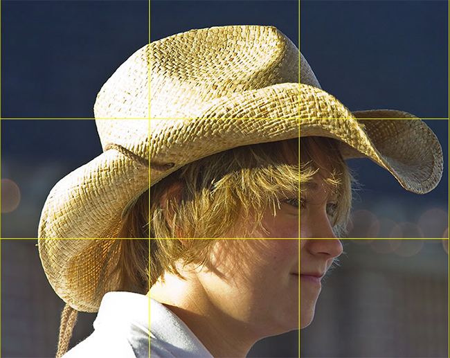
So, here the frame is divided (roughly) into thirds both vertically and horizontally.  Where the lines intersect, I’ve created red circles to indicate the “hot points”.  These are your points of interest.  If all else fails, placing your subject matter in these areas (or close to them) will dramatically improve your composition.  Here’s a great example:

rotgrid2

Here’s a shot of a carriage girl I took back in Charleston.  See where the cross-sections are?  I changed the color of the grid to make it easier to view – so you can tell that her eye is right on the marker for the right-most third grid line.  This really helps the composition that her eye is there instead of elsewhere (often times, there is a tendency to place the eyes closer to the center of the frame – resist that temptation to give your shots that extra oomph!).

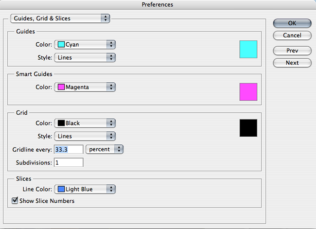
In fact the ROT concept s such a well-known standard, the folks over at Adobe have incorporated that element into their crop tool – so that you can crop your images to adhere to this rule.  Since I will likely get someone to ask – you can create this ROT grid in other variants of Photoshop (CS family), but going to your application preferences and selecting the Grids, Guides, and Slices option.  In there, change your grid size to display lines every 33.3% and number of grids to 1.  Then choose a strong color so that when you display the grid – you can see it!  Click OK and you are done – from now on, to show the ROT grid when cropping or editing in the CS family – simply use the CMD/CTRL key and the apostrophe ( this doohickey  ‘   ) to toggle the grid on and off.  Here’s a capture of the area you need to make the changes:

rotgrid4

There you have it – the Rule of Thirds grid – what it means and how to use it!  Any other rules of composition you would like explained?  Feel free to email, share your thoughts, ideas, suggestions and feedback in the comments or privately (if you rather would preserve anonymity).  In the meantime, go out, take some shots and practice visualizing that ROT grid in camera – that’s what will turn your snapshots into great shots!  Getting it right in camera!  Happy shooting and we’ll see you back here again tomorrow!