Is HDR really cheating?

HDR, or High Dynamic Range, imagery refers to the process of representing a wider range of colors and light in a photo than what can be traditionally captured in a single image with a camera.  There are several ways to produce this HDR-effect.  The most common way to produce HDR imagery is to take several exposures, by both under and over-exposing the same scene by several stops, and then combining them in post-production.  This process brings out details that would traditionally be lost in both highlights and shadows from normal photography.  There are two schools of thought here really on HDR:

1.  The first school of thought is that we should adhere to the accuracy of what it is the sensor is capturing.  By allowing for interpretation and manipulation of the pixels, photography is no longer the means of reporting things – life, as we know it!

2.  The other school of thought is that pixels and cameras are simply a means of capturing a limited portion of the world around them, and that even the human eye is capturing more in a single instant than any single still image could ever hope to capture.  With that in mind, it is the job of the photographer to bring to life what it is they see, and use the tools available to them to bring that image to life, whether it means performing HDR, sharpening, white balance corrections, or anything!

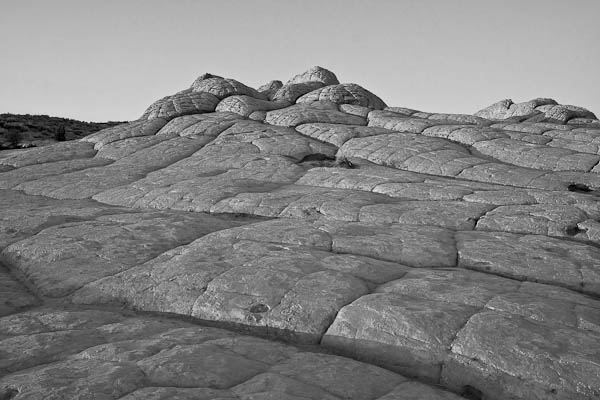
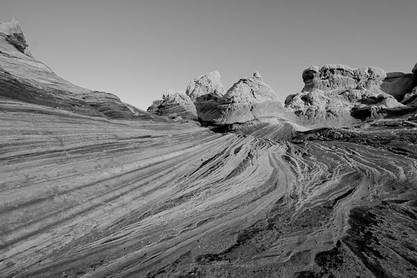
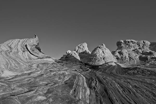
Now, keep in mind that there are always exceptions to the above two schools of thought.  Journalism for instance, requires accuracy and not making adjustments as it really is meant as a reporting mechanism not an interpretation or individual perception of what is scene.  While I am not sure where my own line of thinking really ends up on this very polarizing issue, it does seem that perhaps there is a time and place for it.  Again, with all subjective work, there is a certain degree of personal preference and bias – and this also speaks to the second point, because some HDR can be really really good, while others can be really really bad.  Nevertheless, for my two cents, it does seem that occasionally, there is both a time and a place for HDR.  During such times,  I’ve tried a variety of approaches to utilize HDR while also keeping some measure of reality in my photos.  Take for example, the three images below taken at different shutter speeds, while keeping ISO and aperture constant – thus creating several different exposures of the same scene:

HDR base Images
HDR base Images

By combining and basically “stacking” each of these images inside our post production work flow, we can bring out the details in the shadows from the first image (down in the golf course area), bring out the details from the highlights (the clouds), while maintaining the clarity of the neutrally lit areas in the middle of the photos (the rocks and pool).  While there are several ways to do this, including Photomatix, HDR Pro (the one native to CS5) and several other Photoshop and Lightroom plugins like what Topaz Labs, Lucis, and OnOne’s plugin Suite), here I am using the HDR Pro function inside of Photoshop CS5.

HDR Pro Sample
HDR Pro Sample

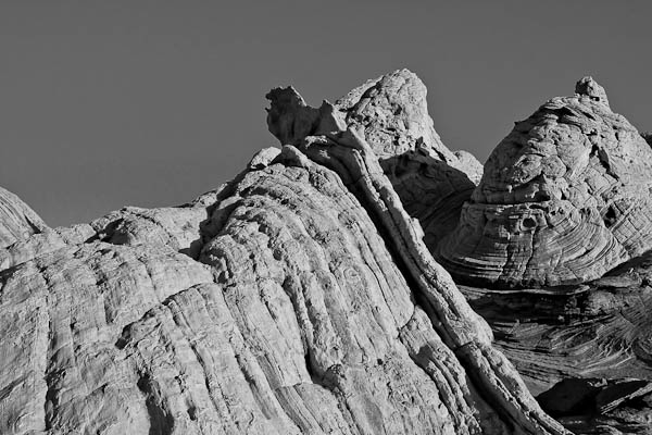
I did choose the option inside the HDR Pro menu to select a more saturated image than what was originally created in camera, and it is more reminiscient of what I actually saw.  So, am I cheating at what I created?  Is this a “real” photo?  What if I were to take another approach, and simply make some adjustments on a single image?  Back to the digital work flow I go…and here is a single shot edited in Lightroom:

Lightroom HDR
Lightroom HDR

Now, while there are clearly some slight differences in tonal range, saturation, and such, there are two things to keep in mind:  1 – I was making these edits pretty quick, and 2 – this is the Internet, which makes color accuracy a difficult thing to achieve.  It does serve to illustrate that you don’t necessarily have to stack images in Photoshop to achieve the HDR look.  Simple slider adjustments in Lightroom can approximate the same thing.  As mentioned above, there are also a number of third-party plugins and add-ons that can bring this effect to life.  Regardless of what the consensus is, HDR is likely a technique that is here to stay, and it’s simply a matter of experimenting and finding a technique that works for you, and that your clients, or colleagues, or friends and family, will find appealing.

This is, of course, just my personal take on HDR.  What about the rest of the readership?  Any thoughts on the legitimacy or validity of HDR?  Does it work?  Can it work?  Or should we stick to trying to capture it all in-camera – on a single frame?  Sound off in the comments or via email!  Thanks for sharing your own thoughts, and we’ll see you back here tomorrow!

ETA:  Don’t forget – a couple contests are going on through November and the rest of the year:

1.  Monthly LDP Giveaway – Share your own “POP” themed photos for a chance to win a pack of pearl metallic paper from the folks at Red River – this paper is awesome for HDR-styles of work!

2.  The Nations Photo Lab Family Photo Day – Upload your images to their Flickr Page for a chance to win a pretty impressive set of prizes including autographed books, free printing certificates, and much more!

Night Owl or Early Bird?

In photography, there is much to catch in the morning hours – sunrises, dew glistening off everything around you, and the slow to low hum of the world awakening around you.  It’s both invigorating and peaceful at the same time.  I can’t begin to recall the number of times I’ve crawled out of the cozy warm bed in the middle of the dark, all to be at an ocean beach before sunrise, to make a trip to Rocky Mountain National Park before the morning glow catches the peaks of the mountains, or to catch butterflies and other creatures before the heat of the day scurries them away.

Sunrise 1
Sunrise 1
Sunrise 2
Sunrise 2
Sunrise 3
Sunrise 3
Sunrise 4
Sunrise 4
Sunrise 5
Sunrise 5

By the same token, there’s also something to be said for the waning hours of the day and the night time coaxes us to our nocturnal tendencies.  The deep blues of the sky as the moon begins to creep over a skyline, the brilliant oranges and blues mix in unimaginable ways through the clouds, and streaks of headlights and tail lights bring a sense of motion to the darkness – they all lull us to stay up and about to catch the images the work-a-days miss.  These are what draw us out at night.  The downside is that your dinner is cold, or your spouse/significant other has already eaten and you chow down alone.  Of course, you may be eating as you pour your images into Lightroom, Aperture, or other photo editor – beside yourself with anticipation of what you’ve captured.

Night Owl 1
Night Owl 1
Night Owl 2
Night Owl 2
Night Owl 3
Night Owl 3

There are pros and cons to being either an early bird (that gets the worm), or the night owl (that gets…a cricket?).  I’ve enjoyed (and suffered) through both, but would love to hear your perspectives.  Are you a night owl or an early bird?  Sound off in the poll and the comments!

[poll id=“13“]

Does Fall Foliage Make for Good HDR?

One of the best tips I’ve ever received is to look all around for photos – even in your own back yard.  Over the weekend, while on the daily dog walk, a few scenes happened to catch my eye.  Not satisfied with what the camera phone could do, I quickly came back to the house and got the SLR out.  A few minutes later, started capturing some of the scenery that remained of the fall foliage that is still present at the lower elevations.  The next thing I knew, I was looking up, looking down, looking behind me, and poof – I had a whole new set of images for a “fall foliage” collection!  These are the types of images that definitely benefit from some subtle HDR processing both to enhance the colors, as well as bring some light to shadowed areas while allowing for the lighter whites of the clouds.  Here’s some of the scenes I captured from just this one outing:

Yellow and Blue
Yellow and Blue

Iydillic Scene
Iydillic Scene
Orange, Red, and Blue

Yellow, Green, and Blue

Colors Colliding
Colors Colliding
Going Low
Going Low

As you can see, the subtle HDR processing really added something to the photos.  Is it good?  Is it bad?  As in most things artistic, there is something of a judgment call involved.  Perhaps an important side note here in learning more about composition is to realize that something came out of an otherwise normal exercise (taking the dog for a walk), and in looking all around yourself, images are available everywhere.  Where should you look for your next photo?  Right there!  You just have to know to look for it!

Happy shooting and we’ll see you back here again tomorrow!

49 Photo Tips – The Sequel

About eight months ago, I cobbled together a laundry list of almost 50 photo tips and tricks to help with everything from gear to composition, photoshop, and more.  Given the penchant for sharing these things online, I decided to launch it as an eBook – but in the interests of keeping it simple, didn’t add much of anything.  It was basically a spreadsheet with a category on the left and the tip or trick on the right.  Given the minimal overhead I had put into the design, decided on a bargain basement price – $1.99.  Half a cup of coffee, and easily digestible!

After a few months of feedback and suggestions, it seemed the idea was pretty good, but people wanted examples, or at least something to liven things up a bit – the “spreadsheet style” was a little tedious on the eyes.  So began the latest project for me (as if I don’t have enough projects, according to Tracy)!  Well, after 6 months of blood, sweat and tears, it’s finally here – 49 Tips, The Sequel!

49 Photo Tips - The SequelAll the tips are new, just as useful, and even more in-depth, but here’s the best part – it’s really an eBook now!  With a cover page, a prologue, epilogue and, as you can see, there’s a photo for every tip! Okay, so some are screen captures so technically not photos, but each one gets the point across quite well (I think anyway).  A few of these tips have been shared out via Twitter and Facebook in recent weeks to give everyone a sneak peek of sorts, but it’s “out there” now, and very excited to see what people think.

So, let me know what you think of the new style and layout!  It’s only $4.99 , which is less than a grande white mocha at Starbucks (at least that’s what I’ve heard…b/c I don’t drink Starbucks…right?)!  And for the time being (through the end of July, anyway), there’s an additional discount code for $1 off if you use it in your shopping cart:  “Sequel

Since it was 6 months between Part One and The Sequel, my guess is it will be another 6 months before I come up with a third installment, so feedback, thoughts and input are always welcome!  There’s a link in the feature product are on the blog, or you can go to the full store here to see all three product downloads! 🙂

Apparently the WordPress eCommerce does not work as advertised as several people have gone through the process and not received their digital download email.  So, to hopefully make things easier for everyone, I’ve signed up with a company friends have used called eJunkie, and after a little configuration and setup, it’s available for purchase through their system (still using Paypal).  My apologies for the hassles initially, here’s the new download location:

49 Photo Tips - The Sequel

Add to Cart

Enjoy, and we’ll see you back here again next week!

Picking a Theme

We all get stuck in creative ruts, and are in search of ways to inspire ourselves.  Kerry Garrison (form Camera Dojo) and I talked about this last night while we explored the place that smart phones and their cameras have in the photography marketplace.  As the conversation went on (and on and on – we tend to digress a lot when we get to talking), we found ourselves talking about 365 projects, or photo-a-day projects, and ways to challenge yourself and come up with new topics to shoot. Continue reading “Picking a Theme”

The power of color

I’ve shared many many stories and images on the blog here to help illustrate the various nuances of things like light, angles, and yes, even color.  I’ve talked about complementary colors, and simplicity of colors and I’d like to re-visit that today as we head into the weekend, because it’s not something I see talked about a lot.

The illustration I am trying to make in all of this is that a simplicity of color can be just as powerful as a huge rainbow of colors – and sometimes, even more so.  Sometimes, a uniformity of color can have an impact and a power that all the wild variations thrown together cannot induce a positive reaction.  As in all things photographic, the best way to demonstrate is through imagery.  here are a few examples of the “Power of Color”  In the interests of keeping things consistent, I am working hereunder the RGB principle of Red, Green, and Blue as the three primary colors, and will look at these in comparison to a scene of multiple colors.  Ready?  let’s go! Continue reading “The power of color”

An exercise in silence…

As creatives, we often can find ourselves just not seeing anything new…even if given a theme to go out and discover.  In times like these, it’s sometimes beneficial to stop looking outward and start looking inward.  I am not talking about Yoga, meditation, or even pontificating the meaning of life.  Although these are equally viable options for getting out of a creative rut, I am talking about looking at your own past work.  While we all have done this from time to time, I found a recent little twist on this practice helpful.  Look back at your work with a theme in mind.

The monthly contests here encourage everyone to go out and capture new work with a theme in mind, and creating new work is always a good thing, but sometimes, when given a theme, and then looking back at archives, you can find new meaning in older images, when looking with a different perspective.

For instance – I was reading an article over on Nikon (yes, I read Nikon’s website – we all know it’s the photographer and not the gear by now, right?) about the value of sounds.  The article was talking about pet photography and that you can get certain expressions if you catch the right sound (full article here:).  It got me to thinking – what would the lack of sound look like in an image?  So, I decided to close my eyes and try to imagine what a photo of silence would encompass:  the serenity of a flower, the peace of a beach or the darkness of an evening or morning sunrise or sunset when it’s just you and the landscapes, even the chill of the day with snow covering everything in a blanket of quiet.

It gave me such a burst of inspiration from my own archives that I decided to go through and pick these specific ones out with the idea of “silence” in mind…  Of course I couldn’t just leave something like this alone – so I added a little taste of music that I thought would be appropriate:

PlayPlay

This is, of course, just my own interpretation.  What are your thoughts when you think of a series of images that captures “silence”?  Would you set it to music?  How many images would you include?  Here I had 8 images…was it too many or not enough?  Sound off in the comments, as it’s really the viewer thoughts and input that is always so valuable!

PlayPlay

The Rest of the Story…

Last Monday, you learned of my trip to White Pocket, AZ.  I met up with fellow photographer/blogger Rich Charpentier of “The Airstream Chronicles”.  As we left off last week, he had met me at the Page, AZ airport, and we were heading off into the Arizona desert.  The ride was smooth at first, but as soon as we started the off-roading, things got a little bumpy.  True to form though, his Nissan Titan handled it with aplomb.  Check out this short video footage of the off-roading adventure, with Rich driving and me recording:

You’ve also already seen some of the shots from the trip, but here’s a few more to satisfy the image-intensive crowd!

White Pocket, AZ

White Pocket, AZ

White Pocket, AZ

White Pocket, AZ

Have a great Monday and we’ll see you back here tomorrow when I announce the winner of the March Contest and the theme/prize for April…it’s another good one so be sure to tune in for that!  Happy shooting and we’ll see you then!

What is it about Water?

Something about water really draws us as photographers – whether it’s the sunrise on a lake or ocean, the beads of dew on a morning flower, the tears or sweat as they roll down a cheek, or even the implied motion of water drops bouncing in the air – water somehow draws us all.  Could it be that humans are made up of a majority of water?  We do need it to survive – water is one staple we cannot live without.  Those two atoms of Hydrogen and one of Oxygen have so much meaning for us, we somehow are compelled to capture water in all its various forms of…dare I say beauty?  Who knows what drives us to capture it in camera, but I for one enjoy it!  Do you?

What is it about Water?

#2 (What is it about Water?)

#3 (What is it about Water?)

#4 (What is it about Water?)

#5 (What is it about Water?)

#6 (What is it about Water?)

#7 (What is it about Water?)

The idea for this post came from a tweet where someone referenced their entire archive saying they had photos of this and that, and were prepared for most situations when clients would come to them and ask “Do you have a photo of…?” so they could say yes!  It prompted me to go through my own archives, and I found several recurring themes – one of which was…can you guess?  WATER!

Go through your own archives and see if you can find recurring patterns – I asked some fellow photogs and water was a common one, which got me to thinking about this post in particular.  “What is the deal with water?”  Do you see a lot of water in your work?  What other themes arise from your archives?  Sound off in the comments, as I’d love to hear what inspires others (even if it is water too!)

Don’t forget, the LDP Flickr contest continues and the “Heights” contest deadline is about a week away.  Get your photos in soon to be in the running!  Happy shooting all and we’ll see you back here again tomorrow!

5 Tips to Better Landscapes

The most common questions I get here on the blog center around the idea of how to take better pictures.  Whether those “better pictures” are better landscapes, or portraits, wildlife or events, everyone wants suggestions on how to approach the practice of taking pictures better.  Esoteric and creative considerations aside, there are some fundamental “tricks of the trade” that, by and large, will almost always improve your craft in pretty much any genre.  So, today, I thought I would take a moment to share 5 “tricks” I’ve learned that always lead to better landscapes: Continue reading “5 Tips to Better Landscapes”