Hardware Review: XRite Colorimeter

Eventually you knew it was coming – the subject of color management.  Now before you mosey along, or your eyes glaze over, rest assured, this is not going to be the typical discussion of color management.  I am not going to talk about LAB color vs CMYK, vs RGB, or anything like that.  And even though the term “colorimeter” may sound like something Marvin the Martian was going to use to destroy Earth in the classic Bugs Bunny cartoon (that was the Illudium Q-36 Explosive Space Modulator), there is nothing overly scientific in today’s post.

Well, that’s not entirely true – it is scientific, but I certainly will not portray to understand any of that.  Instead, I am going to show you how easy it is to calibrate your monitor using this device.  Now I am looking specifically at the one from X-Rite (I own the Gretag Macbeth version from before X-Rite bought them), but color management has become as easy as a couple of mouse-clicks these days.  So, you don’t have to know anything about color gamuts, RGB, CMYK, LAB, or anything like that to know you are getting color accurate images.  Check it out…

After installing the software from the CD, simply connect the device and start the software.  The device is the colorimeter (also known as a calibrator in some circles), and it is shaped like a computer mouse or a hockey puck.  It has a cable that connects it to your computer via USB, and is good for either CRT, LCD, or laptop displays.  Additional software components also enable you to calibrate things like projectors, scanners, and much more.  Here though, I’ll be showing you how it works with a computer monitor.

Once the puck is connected and placed on the monitor, simply go through the wizard to calibrate everything from Contrast, to Brightness, and your RGB colors.  It’s pretty straightforward…just open the display settings for your particular monitor type, and increase or decrease the values until the indicator is as close to center as you can get it.  You’ll notice that I am calibrating a Dell computer monitor, and it is a Windows-based computer, but the process is just as simple on a Mac.  (I just got my Windows notification though, so figured it’d be easier to kill 2 birds with one stone there.)

Here’s a couple of screen shots to give you an idea of the process.  The first step when launching the software is to specify your white point and monitor type (if you are calibrating a laptop, pick the LCD).  Next up, decide whether you want to go the easy route or the advanced route.  I would recommend the advanced route, as even that is very easily accomplished, and these are the screen captures I am using here:
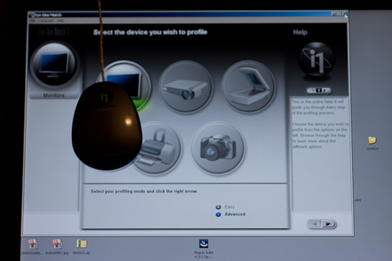
CRT or LCD
CRT or LCD

Next up is the screen capture of the contrast display.  In the upper left, the software shows the current contrast setting compared to the desired setting.  On the left is the colorimeter.  The Brightness (or Luminance) window is pretty much the same layout, so I am not going to repeat the screen capture here.
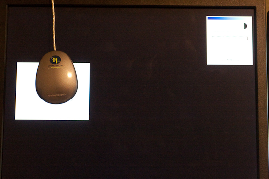
Calibrating the Contrast

Here’s a screen capture of the first stage in setting the color values for my Dell 19″ LCD.  The software readout is on the upper right, the colorimeter is on the left, and dead center is the display menu for the Dell monitor.
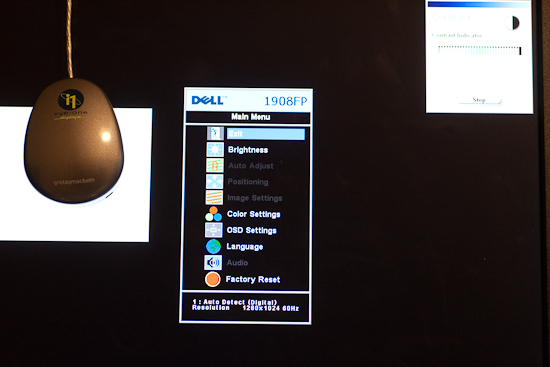
Calibrating the Color

Once your contrast, brightness, and color settings are defined for the monitor you are using, the software will run through and configure the graphics card, monitor, and display output settings.
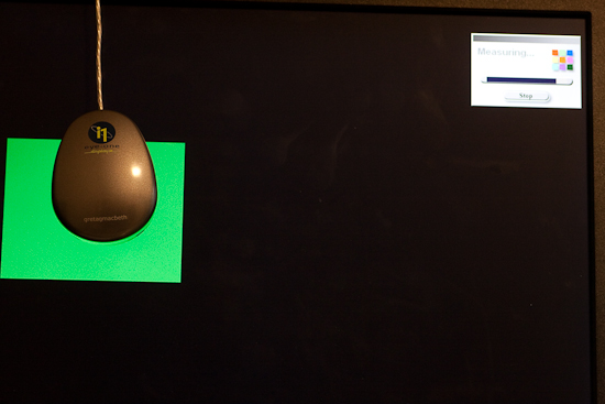
Calibrating the Color 2

Once all the settings are complete, a profile is creating in your system folder.  For Windows, that is in the system32 folder.  You can give it a specific name, and set the schedule on which you will be reminded for a new profile to be built anywhere between 1-4 weeks…more on this in a minute.
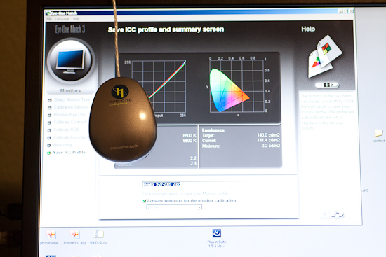
Setting the Monitor Profile

As you can see, it is as straightforward and simple as can be – even on the advanced settings where I defined the color (RGB) settings.  So, why doesn’t everyone do this?  Good question!  This device cost me roughly $200, which is likely not cheap by average standards for equipment (especially that which cannot be attached to your camera!), but if you really want to get quality results, the price is minimal.  I have mine set to update every 2 weeks (my LCD display has a tendency to shift colors easily, and LCD’s in general are known for color shift especially as they get warm and cool down when turned on and off.)  The benefits are huge though as your prints will be more accurate whether you print at a lab or print at home.  In the case of the former, no color correction is needed (and if you use MPIX Pro, there is no color correction done), and in the case of the latter, you will use less ink and paper in test runs before getting the results you want.

Keep in mind that this is just the procedure using the X-Rite, and I am sure others could just as easily recommend the Spyder Pro series, or some other colorimeter.  With that in mind, if you have an inkling one way or another, feel free to share your own experiences in the comments.  Which colorimeter do you use?  Do you like it?  Not so much?  What do you like/dislike about the process?

Whether you like the X-Rite method though, or some other model – calibrating your monitor is an important part of working with a color managed work flow if you want to produce accurate and quality prints.  After all, it is still about the print.  Don’t forget to share your thoughts in the comments!  Until tomorrow, happy shooting and we’ll see you then!

Thursday Thoughts with… Andrew Rodney

This is an historic day for CB, because our next guest here for the Thursday Thoughts series takes thing to a whole new level of quality information.  Our guest this week is none other than Andrew Rodney.  He has agreed to carve some time out of his already busy schedule to contribute to the series here.  Who is Andrew Rodney?  Andrew is a renowned instructor, NAPP Hall-of-Famer, published author (of Color Management for Photographers, Hands on Techniques for Photoshop Users), and well known contributing writer to several magazines including PDN, Publish, Photoshop User, Electronic Publishing, Digital Output, MacWeek, Digital Photo Pro and Professional Photographer.  He also regularly contributes to the forums of the NAPP community, and is considered by many to be one of the best around at color management and is a regular contributor for the Epson Print Academy.  (Which is coming to Denver in April too!)

CB:  Hi Andrew, and thanks so much for taking the time out of your schedule to participate in this.  I’ll get right to things…first with a few of the standard questions.  How long have you been a photographer?

AR:  I started as a kid. My dad gave me his camera, an Exakta VXIIa 35mm that at the time was pretty cool camera with interchangeable viewfinder. Plus it was a left-handed camera. Like many, my first experience in the B&W darkroom was one of amazement upon seeing ones first print come up before my eyes. I assisted a very good commercial photographer in LA in the early 1980s after which he kind of forced me to go to Art Center to get a degree in photography. I left the fall/winter of 1983 to work for the LAOOC who were staging the LA Olympics that summer. I got to shoot for them for 7 months, including the games themselves. It was my first introduction to sports photography and Fujichrome! I went back to Art Center, got a degree in 1988, shot locally doing mostly editorial and corporate/annual report work. Left LA in 1994 for Santa Fe and a new career that wasn’t income generated from shooting.

CB:  What kind of gear have you used over the course of your career?

AR:  From Exakta I went to Pentax, then Nikon, then Canon (as well as Hasselblad, Sinar). I shot with a lot of Kodak DCS cameras too, dating back to the original DCS-1. Now I’m using a 5D-MII, which I’m very impressed with. I’ve been lucky over the years to be able to shoot with a lot of digital capture devices I could never afford to buy. Betterlight scan backs, Leaf and Phase backs and so on.

CB:  So, you’ve clearly been shooting since the film era.  Did you have any particular favorite or are you still shooting with it?

AR:  I became a big fan of Fujichrome, despite its original reputation in 1984 when we were testing it for the Olympics (Fuji was a sponsor). Prior to that, I was a Kodachrome shooter. I can’t recall the last time I shot film that wasn’t for some Film vs. Digital test. I don’t miss film at all, sorry. I had to do a lot of scans in my time, like working all night in the darkroom, it gets weary after awhile.

CB:  I must say, testing film for use in the Olympics is sufficiently impressive!  How about your computer setup?  Do you prefer Macs, PC’s, Linux, or some other variant?

AR:  Mac, since 1988. In the old, old days, Photoshop only ran on a Mac!

CB:  Fair point…and now for the zany question of the day, Chocolate, Vanilla, or Strawberry?

AR:  Chocolate if forced to pick just one.

CB:  With all the sundry stuff out of the way, let’s move into an area with a little more granularity. Photographers often enjoy hearing helpful and constructive critiques of their work, as we are aware of how much we can grow from it.  However, we’ve also all had the “nice shot” and “cool” comments when we’ve shared our work.  What was the singular most useful critique or comment you’ve ever had on work you’ve shared publicly?

AR:  My god, that’s a though one! A great deal of the learning process at Art Center was the “crit”, from both instructor and fellow students. I think that total honesty with the understanding that much of this is subjective is key. That said, I spent two weeks on the Amazon River doing a photo tour with Jay Maisel who is one of the best instructors I’ve ever had. His approach to working with light, color and gesture is always in the back of my mind when shooting. If you ever have a chance to hear Jay speak, it could change the way you look at the world as a photographer. I don’t recall who first suggested that its critically important to scan your frame prior to capturing an image when time permits, really thinking about what’s in the frame and why its important to the image. Cropping after the fact is equally important because sometimes you really need to study the image after capture. Jay really reinforces the idea of ensuring everything in the cropped final is important to the total image. I really love Lightroom’s non-destructive cropping. It pays to revisit images you haven’t looked at in some time and seeing if indeed, the crop works or not.

CB:  Kind of makes me want to go back and look at some of my past images using Lightroom now!  What about giving critiques though?  If someone was asking you for an honest critique of their work, what 3 factors would you look at most (excluding friendships or family relatives, we’re talking professional or fellow photographer-types here)?

AR:  There’s that initial first look that either pulls me into the image or it doesn’t. Going back to Jay, I ask myself “is does this image say anything about light, color, gesture or more than one”? Second, I ask myself,  “Would I want to have this image on my wall, can I view it over and over again and see something new”? There are many images that I find successful that I might not want to view every day. Third, ask myself if I find the image successful due to the image or the presentation (which try to dismiss if possible). I’m seeing a trend these days with images that are printed really, really large because the size makes the image seem more important or more successful. But size doesn’t count; it doesn’t make a lesser image better.

CB:  Wow, I’d not thought of the impact that print or presentation size can have on how imagery is received, but that’s a great point!  Let’s move into something more software and technique oriented.  Being as well-versed as you are in color-management, you know that as Photoshop and other software programs mature and develop, new ways to create images are presenting wider options and possibilities. If you had to choose between the gear or the software as the only way to create, which would it be and why?

AR:  The gear. I’m finding less and less the need or desire to do work in Photoshop once I’ve used Lightroom, my modern digital “darkroom” to process the Raw images. I have to have software! The Raw (even the JPEG) is useless without a way to interpret what is nothing more then a big pile of zero’s and ones. The gear and latent film image, without a processor is equally inadequate. The software doesn’t create the image, so we have to rely on the photographer and some capture device. Some of the newer software is interesting in how it attempts to allow the user to produce some “looks”, like HDR that were not possible or darn difficult in the analog days. I find however that many prosumer photographers (if I can use that term), even some pro’s use software to mimic a “look” someone else has created and I think that’s usually a shame. I have to wonder if we really need plug-in’s that automatically make your image look like someone else’s style.

CB:  So, in looking at images you’ve captured with your gear, if you had to pick three pictures out of your entire portfolio to represent your approach to photography, or your artistic vision, which ones would you pick (feel free to share images here)?

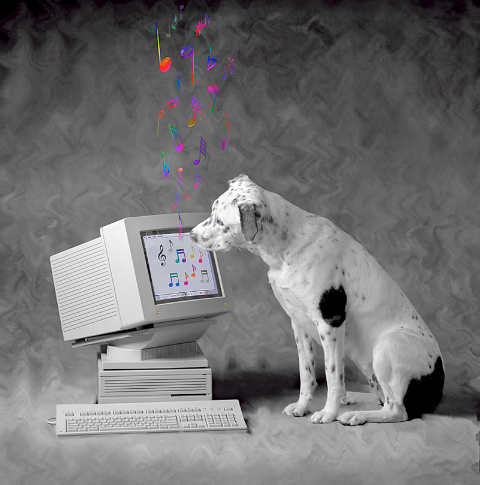
Tosh

The image called “Tosh” (Macintosh my dog at the time) that became my logo is near and dear to my heart and was one of a series of such images I did in the early Photoshop days (I started on version 1.0.7).

Digital Dog Photography

Digital Dog Photography

Two recent images from my trip with in 2007 were influenced by Jay (who I’ve known since I graduated from school). I’m uncomfortable with the term “artistic vision” although I do recognize that there’s some creativity involved in making (my) images.

CB:  These shots are fabulous, and it’s nice to learn a little background of your well-known image of “Tosh”!  Thanks so much for sharing these.  Any final thoughts you’d like to share about the state of photography or any catch phrases that you keep in mind when shooting?

AR:  I’m still so surprised that many users who are shooting Raw don’t realize that the LCD preview on their cameras and the histogram isn’t based on the Raw but the JPEG. And they don’t fully associate the differences in shooting for Raw versus JPEG in terms of proper exposure (Expose to the Right). As for catch phrases, I hate the term “accurate” color. You can’t define accurate without measuring the color and 99 times out of 100; measured color produces quite unattractive imagery on a display or output to a print. So when I shoot, I try to view the scene as I hope to express it on output, knowing neither the JPEG preview nor what I first see of the Raw data in my converter is going to be accurate to my memory vision of the scene. It’s still our job to render the print from what we “saw” when we captured the image or wish to visually express.

CB:  Let me say it for the record right here, that I did not know the histogram is based off the jpg and not the raw image.   As for the rest of your closing thoughts, you’ve definitely given me some food for thought, as well as the rest of the readership.  Andrew, again, thanks so much for taking the time to participate.  Have a great time at Photoshop World – I wish I could be there to take a class from you!

Well gang, that’s it for today.  There’s really nothing I can say to really “wrap things up” like I usually do.  You can find Andrew on the web at his website: Digital Dog, as well as through the NAPP forums.  There’s just tons of information on his website, including articles, links, ICC profile services, and much much more, and he is always very helpful to everyone in the NAPP forums!  Suffice to say, after hearing from Andrew, my own position on the learning curve just seemed to drop a little further.  Thanks so much to Andrew, and let’s hope we can take the insights he has shared with us here on the Thursday thoughts series and strive to make our own work better.  Happy shooting and we’ll see you back here tomorrow!