As promised from last weeks post on Youtube, I promised to share the “how to” on the creation of the little teaser video for transitioning from a black and white photo to color. For those that don’t remember, the video is here: Continue reading “Creating the color video”
Tag: black and white
Black and White Adjustments in Lightroom 3
As a regular contributor to the PhotographyBB magazine (which you can download for free simply bu subscribing here), I enjoy putting together articles to both educate and inspire. In this upcoming month’s issue, I am guest-writing a tutorial on Black and White editing with Lightroom 3. As a sneak-peak of sorts to the readership here, I’d like to share the first portion of that article…enjoy!
***
The power of Lightroom has been so well documented from various outlets across the internet and magazines, I often find it surprising that such a small amount of space is dedicated to black and white photography. This month, I’d like to take an opportunity to delve more into the creative adjustments you can make in Lightroom to bring out more in an image than just shades of gray!
There are two areas in Lightroom where you can make creative adjustments to the color to make things pop. The first two HSL (for Hue, Saturation, and Luminance) and Color are great resources to use when you want to massage the color palette of your image. The Black and White “tab” though, is where it’s really at. When you click this tab, the image will be converted to an automated black and white adjustment, where the colors are converted to shades of gray – with no color tones at all. This is where I’d like to begin the exploration:
While this can be a powerful way to present an image, the automated method of conversion is not going to work all the time (and for my tastes rarely does the default conversion work). So, you have to dive in and really get comfortable with adjusting color tones. To start off, I am using a pretty basic image – a red flower, and you can see that there is absolutely nothing wrong with the colored version of the image.

It’s got some great black and white potential though, so let’s go ahead and take it into the BW adjustment panel tab. When I do that, the automated adjustments will kick in:

It looks interesting, but let’s see what massaging the colors just in the panel can do. To start, since the flower was red and made up nearly 95% of the composition, I started with the red slider to see what the extremes would do on each end. Here’s the image with the red slider taken up to +100 and then to the opposite extreme of -100…


In both cases, for me it’s an absolutely hideous image. Clearly, there is a balance that must be struck somewhere in the middle – the question is where? Well, now it comes down to subjective tastes. For me, the default adjustment had the red a bit too strong – which kind of hid the morning dew of the flower, so I dialed things back a bit, taking the red slider from +22 to -20. The droplets are now much more visible as they are standing out from the petals!

So, now we are getting somewhere fun! I tested a few more sliders, and ended up with the yellows and oranges slightly higher than the default settings, just to give a bit more contrast. Here’s what it looks like after the black and white adjustments are made:

Of course there is always a bit of sharpening and noise reduction to make in post production, as well as lens correction, and even a little bit of vignette from time to time to help draw the viewer in. Once these are done, the final image definitely has a creative look and feel to it:

It’s clearly not easy to decide both when, to make a black and white conversion, as well as how much to massage or tweak it to your tastes. The ultimate decision is, of course, up to you as an artist and photographer, but you can’t get there by avoiding the Black-and-White panel! Take some time to explore it!
***
There’s more to the article than that, and it has been modified somewhat to make for a better blog post, so be sure you subscribe to the PhotographyBB newsletter when you have a minute. It is free, after all, and probably one of the best sources of a diverse set of reading material you can find. Dave Seeram, the editor, has been quite generous with his kindness and patience in my contributions! Please stop over and give him your thanks as well…nothing but learning and knowledge to gain!
As always though, I end up being more curious than informative! What types of black and white adjustments do you make? Do you prefer the neutral grays, or do you like to add a hint of color to your b/w images too? What methods have you found useful versus not so much? Sound off in the comments as I love to hear how others are working through their own images! Happy shooting and we’ll see you next time right here!
Like this post? Subscribe to the email version of the RSS:
The Rest of the Story…
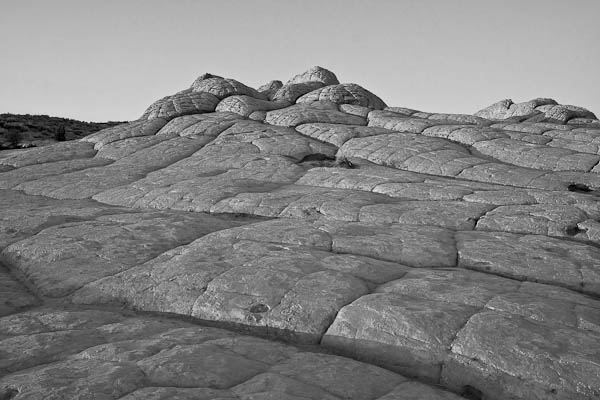
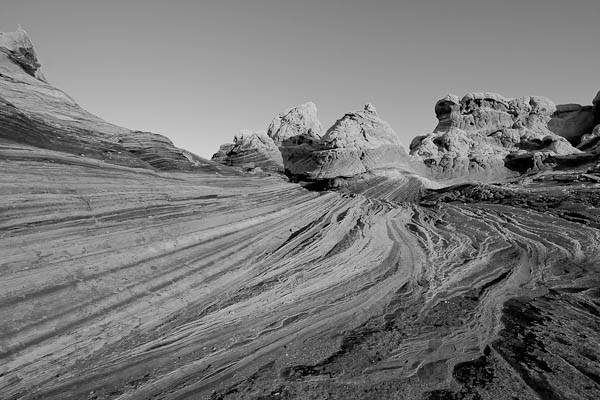
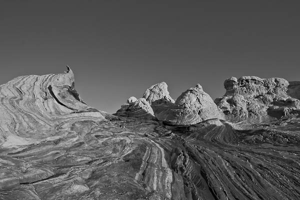
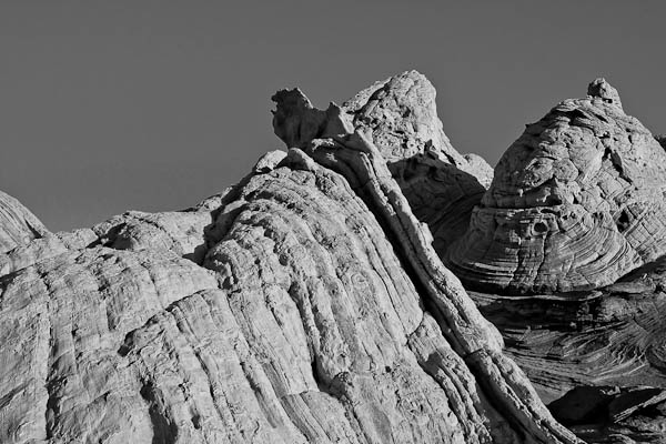
Last Monday, you learned of my trip to White Pocket, AZ. I met up with fellow photographer/blogger Rich Charpentier of “The Airstream Chronicles”. As we left off last week, he had met me at the Page, AZ airport, and we were heading off into the Arizona desert. The ride was smooth at first, but as soon as we started the off-roading, things got a little bumpy. True to form though, his Nissan Titan handled it with aplomb. Check out this short video footage of the off-roading adventure, with Rich driving and me recording:
You’ve also already seen some of the shots from the trip, but here’s a few more to satisfy the image-intensive crowd!
Have a great Monday and we’ll see you back here tomorrow when I announce the winner of the March Contest and the theme/prize for April…it’s another good one so be sure to tune in for that! Happy shooting and we’ll see you then!
Podcast: Play in new window | Download
Black and White Conversion Options
About a year ago, I put together a list of my top five favorite ways to convert images to black and white. As technology has advanced though, more options have become available, and I have learned a lot more. So, in the spirit of keeping the blog topics up-to-date and current, I would like to re-visit this here today. (This is also coming on the heels of the Black-and-White issue I finally finished of Rangefinder Magazine!)
- Camera Raw Conversion – If you aren’t working in camera raw, here is a big reason to think about it – converting images to black and white in camera raw allows you to make a conversion while retaining access and malleability to all image data. The camera raw dialogs that you should use to make conversions here include the saturation slider, then exposure and shadow sliders, followed by the Brightness slider. Don’t forget to play with the contrast slider a little to enhance the effect as desired. Last but not least, for advanced adjustments, the calibration tab can have effects similar to the Channel Mixer.
- Black and White Conversion – With Photoshop CS3 and now in CS4, the good folks over at Adobe have added a Black and White conversion option in the image adjustments menu. This is pure gold because you can duplicate the image before making adjustments and apply the effect to it’s own layer. You can also add back in tonal values for specific b/w effects that previously were pretty much out of reach without many many edits, layer adjustments, masks and much much more.
- Channel Mixer – with your image open in Photoshop (7.0 or higher), you can select a specific color set you want to remove from or add emphasis to in an image. The traditional color sets or red, green and blue are available, as well as a constant (think brightness), and a check box for monochrome.
- Hue/Saturation Adjustment – whether as a dedicated layer, or directly to an image, the Hue/Saturation allows you to account for different intensity levels of a wide range of colors, from Red, Yellow, Green, Cyan, Blue, and Magenta. You can also adjust the range of color within one of the default ranges for each set by adjusting the left and right limiters of the color wheel at the bottom of the dialog window.
- Grayscale Conversions – most black-and-white images aren’t true black and whites, because a little color from a specific range is added back in for emphasis. To make an image truly a b/w, it would only have a range of black and white. This can be done using the grayscale option in Photoshop. Often, this is used as the last step in a digital approach to black and white photography so that saturation and brightness level loss is minimized.
So, what have I added and what have I removed? The Black and White conversion method is the latest addition, and I jettisoned in-camera conversions. While pretty much all cameras have the in-camera option to take images in black-and-white, as I have crawled my way up the learning curve, I am cognizant of the fact that if you lose image data in-camera, there is no getting it back afterward.
Well, that’s it – the new and improved post on Black and White conversion options! If you’d like to read the original post, that can be pulled up from the archives here. In the meantime, feel free to share your favorite techniques for black and white conversions here in the comments or via email. As always, Happy Shooting and we’ll see you back here again tomorrow!
Now the flip side
Earlier this week I talked about various ways to decrease noise in your images. While preventing and removing noise is something we typically do like to address in our work flow – there is also the flip side where noise or grain can enhance the quality of a print. All one has to look at for examples where noise can have an impact is in black and white photography. Grain gives an added sense of detail to black and white photos. The same can also be said for sepia-toned photos, those with a slightly yellowish, an “old-fashioned”, or “antique” look to them.
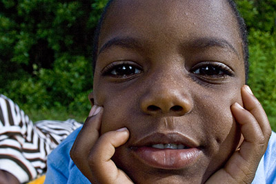
To give you an idea of how images can benefit from noise, take a look at the following two shots. First the color:
And how the black and white:
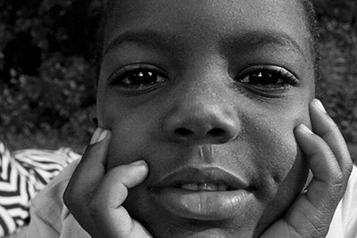
See how the grain from the image really accentuates his facial features? That’s one way in which noise/grain can enhance an image.
So, what about noise in your images? Do you like it or not? Got ideas for how noise can enhance your creativity? Sound off in the comments! Until tomorrow, happy shooting, and as always, keep watching those apertures!