For the month of October, the theme of the contest series has been STUDY…and people have been submitting their images to the Flickr thread in hopes of winning a years’ subscription to the well-respected National Association of Photoshop Professionals. I’ve spoken highly of them before and their educational approach to not only Photoshop, but much of the Adobe family of products, as well as to graphic and web design, oh yeah….and photography… is literally unparalleled. With over 70,000 members worldwide, it’s an impressive organization and I have learned a lot from my own participation in NAPP events, seminars, and their community forums. Winning a year membership to NAPP is like giving a fisherman (or woman) the keys to a lake full of fish, and time needed to learn to use the nets. NAPP membership can literally change your life! Continue reading “Welcome to NAPP!”
Hardware Review: Sigma 70-200 f2.8
The kind folks at Sigma have become quite the regular contributor to the review section here – as you keep asking for lens reviews, the Sigma brand keeps coming up, and they continue to be generous with my participation in the loaner program. Thus far the lens line-up I’ve reviewed from the Sigma Collection include:
- Sigma 8-16mm
- Sigma 4.5mm Circular Fisheye
- Sigma 50mm f1.4
- Sigma 10-20mm
- Sigma 18-250mm
- Sigma 70mm Macro
Having compiled quite the list of review lenses, I am happy to announce the latest addition to this review series (some day I hope to have reviewed every lens Sigma has! 🙂 ) I give you the Sigma 70-200 f.28…
This lens is the comparable one to the Canon 70-200 f2.8, and while I’ve not had a chance to test the Canon equivalent, there are some optical similarities. I won’t go so far as to compare it to my own Canon 70-200 f4.0 simply because there are enough differences that it would be an apples to oranges comparison. So, here I’ll just share my own thoughts and shots on and from the lens for everyone to consider. Here is everything from soup to nuts:
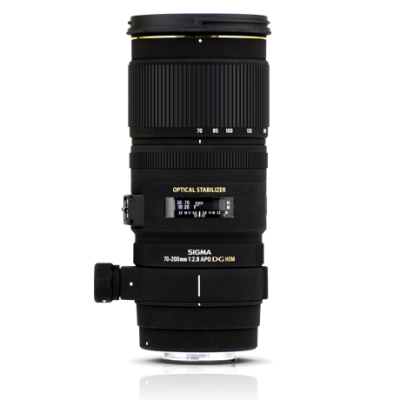
The (Alphabet) Soup
This is the 70-200 F2.8 EX DG OS HSM lens – quite a mouthful, but all of these features are important. The EX signifies that this lens has benefitted from the now signature finish of Sigma lenses. It’s smooth but rugged, and hard to really explain, but denotes quality and professionalism while being also understated – it means business. I’ve raved about the finish that Sigma puts on their lenses and this one is no exception. Top Notch! The DG? That means it’s optimized for Digital use. To quote Sigma,
“These are large-aperture lenses with wide angles and short minimum focusing distances. With an abundance of peripheral illumination, they are ideal lenses for Digital SLR Cameras whilst retaining suitability for traditional 35mm SLRs.”
In other words, the f2.8 means the aperture is designed for the width and opening, optimizing the amount of light that comes in, and minimizing barrel distortion. The end result of all this means you spend less time in post fixing things. A definite plus in my book!
OS is the now easily recognizable label of optical stabilization. These lenses have built in mechanisms that counter your movement to allow for shooting at slower shutter speeds. Slower shutter speeds, wide open apertures all means you can shoot and get quality results in lower light! I’ll go into more details on their OS features later though.
HSM refers to the Hyper Sonic Motor, which means nearly whisper quiet movement as the lens picks up on the AF points. Less noise means less distraction. This is good regardless of whether you are shooting portraits, wildlife, or street photography. Remember, it’s not about the photographer, it’s about the photo, and the HSM is an added bonus to help achieve that end goal!
The Nuts
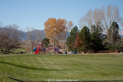
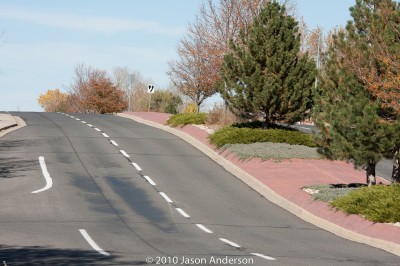
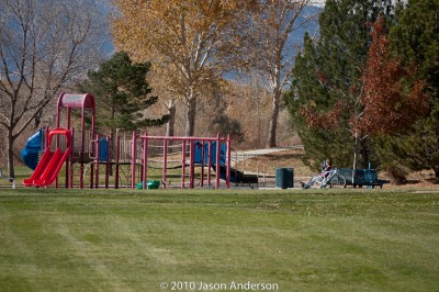
All the acronyms in the world won’t tell you a thing about lens performance though, and neither will my blathering about this or that, so let’s just get to the nuts. I went out with the lens to take some test shots and basically get a feel for the optical quality throughout the lens. I took some at short range (70mm), some in the middle (ranging from 120-150mm), and some at the long end (200mm). Shot groups also were mixed between simple test shots (a street) to portraits, and landscapes to get an idea of the focal range. Here’s said shots!
The 70mm shots



Mid-range Shots

Long Range Shots

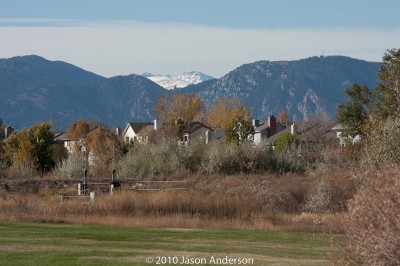
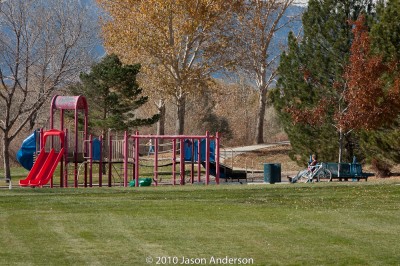
Here, you can get an idea of both the optical quality and range of the optics as well as an idea of how it would perform in a variety of functions. I should also note that I have done literally no post production work in these at all. The only sharpening that was applied was on output sharpening from Lightroom, and that was set “For Screen” by default on all my images. In other words, nothing has been tweaked. Having said that, let’s take a look at some of the pros and cons of the optics overall.
Pros ~
I absolutely love the bokeh on this lens at long range. It compresses subjects nicely for portraiture, and throws the background nicely out of focus with some great treatment due to the optics. These shots were taken in afternoon light, and the sun was coming in and out of the scene – which could change the settings quickly. We were shooting on a monopod, and with IS on so the minor changes in shutter speed (these were aperture priority shots) didn’t really affect us. The f2.8 end came out nicely too, which was as expected though – that’s the whole reason for the f2.8 My excitement was primarily lent toward the bokeh at the long end which came out to about f4.5 Not too shabby!
I also was a huge fan of the OS – optical stabilization. It had two settings…OS 1 for shooting handheld, which counters both vertical and horizontal axis movement, and if you are shooting on a monopod (which is common with heavier glass), you can switch to OS 2, which turns off the one axis (horizontal I think). This allowed me to take some pretty decent shots at a hockey game a few weeks ago. You may recall seeing a gallery of those shots here on the blog. I was toggling between the OS1 and OS2 for that series so some shots did come out better than others – the ones with OS2 were the sharper in the set!
Another advantage here is that the collar for tripod or monopod mounting is included. I had to shell out an additional $50 for my Canon when I bought the f4, so seeing it included here was a happy surprise. I hate to go on and on here, but there was one other feature that bears mentioning and that is the smooth rotation I was getting from the lens as I worked it through the focal range. Either this was brand new, or had just been serviced because it was about the smoothest glass I’d seen from Sigma yet…and given the laundry list up top, that’s saying something!
And finally, the last big notch in favor of it, is – of course – the price. Coming it at $1700 this lens is certainly not cheap. However the savings is still there as it offers a s$200 over the Canon equivalent which comes in at at $1900! For the cost conscious (and who isn’t these days), that $200 can go toward many other accouterments in your shopping cart! And from what I can tell, the image quality is pretty darn good. (I got my prices from B&H Photo – the Sigma one is here and the Canon one is here)
Cons ~
This was much heavier and bigger than I anticipated. It was longer than my own 70-200 from Canon. Now I grant you my own is only an f4.0 and does not have the OS (or IS if you prefer – for the strict Canonistas out there). But I was a little surprised. I think that’s why my initial shots were a little oof – out of focus – because my arms just weren’t used to carrying the weight around. Lesson learned though – when moving into the fast glass category, at least shoot with a monopod, arm strain is greatly reduced!
The other big con was battery drain. All the time I could hear the OS kicking on and off as it would sense movement, even as I walked around. This caused some noticeable drain on my battery and I found myself swapping out after about 3 hours of shooting. Maybe this is typical of optically stabilized lenses and I am just not used to it, but the drain was something else that I had to take into account. I did have a spare with me, so it wasn’t that big a deal – but I certainly could not have shot all day on only two batteries with this lens.
While the collar was included, I don’t believe the lens hood is. Now the test unit I had did include a nice lens hood with the butterflies to avoid as much vignetting as possible, but that would likely add to the cost. Based on prices seen on B&H though, that’s only in the neighborhood of $25 (Direct link to Sigma marketplace here).
The Decision:
I would loved to have held onto this lens a while longer, and truth be told, will probably end up buying it. The Canon 70-200f4 may be working its last days in my bag, just because the faster glass and features are sure to see much more use from me. Coming up tomorrow, the results of the October contest giveaway – and announcing the November giveaway…make sure you stop in for that! Happy shooting and we’ll see you then!
3 Things to Beware Of…
A recent birthday launching me firmly into my fourth decade of existence yielded some nice returns…which has afforded me the opportunity to upgrade my monitor. I’ve been in desperate need of an upgrade to my setup as I have been working off a Dell 19″ and a Dell 17″ for my two display setup for a while now. Given the birthday broohaha, I had about $250 to go find something new. So, on a shopping spree I went, and I come back from said spree, with three new nuggets of information to share…or more to beware of when purchasing a new monitor.
#1 – Understand the data
I was out two weeks ago with this money (probably burning a hole in my pocket, and came across an HP monitor in none other than Best Buy. The price was right ($249), as were the dimensions (23″). I was looking at some of the other monitors, and none really filled the bill like this one did. The only downside was that there was no USB port (or so I thought). The salesman also pointed out the contrast ratio of 40,000:1! Without thinking about it to much, I figured it certainly wouldn’t be a bad monitor – so why not give it a whirl! After all, a 30 day return policy to the brick-and-mortar worked in my favor. So, home it came for setup. A few landmines awaited:
Size – While the dimensions of the monitor are always important, another consideration to take into account is the elevation or lift you get. My old faithful Dell had a telescoping arm that elevated it nicely over my Drobo, and kept it right at eye level for me (or very near it to prevent me from hunching over too much and becoming Lurch!. The HP 2310m had no such benefit and I then found myself shopping around for monitor stands. Subtract another $40 for a decent quality stand (Allsop).
USB Ports – I neglected to consider that the HP had no USB ports. I previously had 3 things coming off the old monitor – a printer, my mouse, and a dangler I could connect my card reader to easily. So, some rewiring was in order. But, this helped me clean up some cable management issues, so that’s not necessarily a bad thing.
Contrast Ratio – If you take away nothing else from this post, consider this: contrast ratios are meaningless! That’s right, they are meaningless numbers, generated by each vendor to measure their own “belief” of what the expected performance could be of the monitor under the most extreme settings. I got a hard knock here, recalling after some collaboration with the crew over in the NAPP forums (thanks to Andrew Rodney for the reminder). As it turns out, pretty much anything past 1000:1 is meaningless under a calibrated workspace, because monitors just aren’t made to produce a useful contrast past this once calibrated. Some of the really price ones from LaCie and Eizo do, but those are in the thousands of dollars range. So, keeping true to my budget, I had to settle for consumer grade gear. But, I wish I would have known that before buying, because the decision was made in haste and on bad information. So, lesson learned – know the important data! Contrast Ratio = 1000:1 or greater is fine!
#2 – Don’t Be Afraid to Settle
After finding out all these little caveats, I also got an email blast from Newegg, touting their Halloween deals, and of course, a monitor came up in the laundry list. An ASUS 25″ for $230! I was floored. Two more inches of real estate, for $30 less! So, I started digging into the reviews, forums, and consumer reports. I’d purchased a few of their motherboards over the years and was happy with those. A trip back to the NAPP forums did alert me to a few misgivings some had about the brand though, so I decided against returning the HP in exchange for the ASUS. After all, it was only $30 difference in price, and would have possibly got me in a situation where I may not have been able to return the ASUS without getting an ugly restocking fee. And besides, the low profile and lack of USB were also present there, so there wasn’t much to gain. Then I saw the LG.
It was on display at Sam’s Club, and I’d seen these things in use in lots of retail settings, including warehouse environments, retail, and even doctor offices. The seemed to be of decent enough quality, although the contrast was always way over cranked. I could fix that with a calibration though, so checked the price: $189! A savings of $60 (figure in tax). That would negate the $40 spent on the monitor stand and give me a little change back in the wallet. Off to the web I went for more research. Turns out this isn’t that bad a monitor. I decided to go for the savings and returned the HP, bringing the LG home. Now, all that was left was to set it up, and I was off to the races!
#3 – Calibrate it!
Last but not least, I set the LG up to calibrate. After twenty minutes trying to dial in the color, contrast, and brightness, I was beginning to understand the differences between vendor makes and accuracy. I’d heard of monitors that just wouldn’t calibrate and was suspecting that this was the case for the LG. (The luminance was just way to low, and the colors would never fully align to center in my Gretag Macbeth colorimeter. I finally gave up, and went to take the colorimeter off. On doing so, I noticed that the ambient light filter was still on the puck that I had used to measure ambient light. That explained it! Sans filter, I placed the colorimeter back on the monitor, and within 5 minutes, had things dialed in pretty close to perfect. My luminance is 0.5 off, the color is at 6500, and contrast is spot on dead center. It’s got 30 days to satisfy me (and assuming nothing else goes on sale…) So, word to the wise – when calibrating your monitor, remove the ambient light filter – it can save a lot of headache!
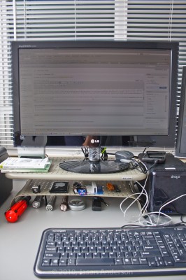
I’ve now moved the 19″ into the secondary position, the 23″ has become the primary, and the added benefit of the monitor stand has given me two new rows of surface area to store things like my thumb drives, media cards, businesss cards, and other bric-a-brac. More storage in an increasingly cluttered life is a good thing!
So, watch that contrast, check to calibrate, and exercise caution in spending habits – especially if you can’t return things easily.
Now it’s your turn – got any purchasing stories or tales to share where you learned something in the experience? Sound off in the comments, let me know your thoughts on the above, or to share your own “war stories”. Thanks for stopping in and we’ll be back tomorrow with more photo goodness.
P.S. Another heads up reminder, that the November Newsletter will be coming out this Friday, so if you’ve not signed up – make sure you pick up a subscription for it either in the sidebar or here. It’s free, and only available to subscribers!
Tis the Season…
Early one morning, with clouds in the sky, and dew on the ground, we went searching high and low for our annual…

Night Owl or Early Bird?
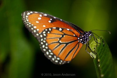
In photography, there is much to catch in the morning hours – sunrises, dew glistening off everything around you, and the slow to low hum of the world awakening around you. It’s both invigorating and peaceful at the same time. I can’t begin to recall the number of times I’ve crawled out of the cozy warm bed in the middle of the dark, all to be at an ocean beach before sunrise, to make a trip to Rocky Mountain National Park before the morning glow catches the peaks of the mountains, or to catch butterflies and other creatures before the heat of the day scurries them away.



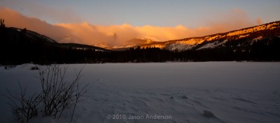
By the same token, there’s also something to be said for the waning hours of the day and the night time coaxes us to our nocturnal tendencies. The deep blues of the sky as the moon begins to creep over a skyline, the brilliant oranges and blues mix in unimaginable ways through the clouds, and streaks of headlights and tail lights bring a sense of motion to the darkness – they all lull us to stay up and about to catch the images the work-a-days miss. These are what draw us out at night. The downside is that your dinner is cold, or your spouse/significant other has already eaten and you chow down alone. Of course, you may be eating as you pour your images into Lightroom, Aperture, or other photo editor – beside yourself with anticipation of what you’ve captured.

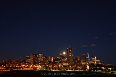
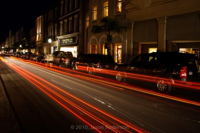
There are pros and cons to being either an early bird (that gets the worm), or the night owl (that gets…a cricket?). I’ve enjoyed (and suffered) through both, but would love to hear your perspectives. Are you a night owl or an early bird? Sound off in the poll and the comments!
[poll id=“13“]
Does Fall Foliage Make for Good HDR?
One of the best tips I’ve ever received is to look all around for photos – even in your own back yard. Over the weekend, while on the daily dog walk, a few scenes happened to catch my eye. Not satisfied with what the camera phone could do, I quickly came back to the house and got the SLR out. A few minutes later, started capturing some of the scenery that remained of the fall foliage that is still present at the lower elevations. The next thing I knew, I was looking up, looking down, looking behind me, and poof – I had a whole new set of images for a “fall foliage” collection! These are the types of images that definitely benefit from some subtle HDR processing both to enhance the colors, as well as bring some light to shadowed areas while allowing for the lighter whites of the clouds. Here’s some of the scenes I captured from just this one outing:
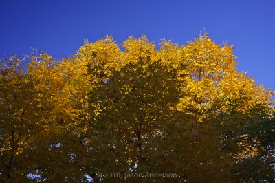
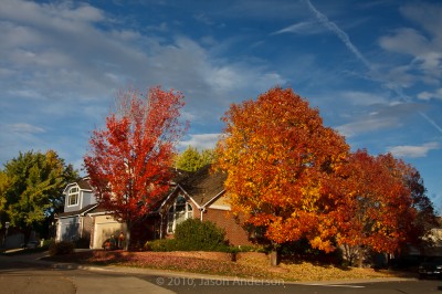
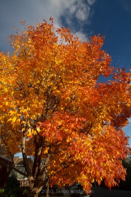

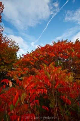

As you can see, the subtle HDR processing really added something to the photos. Is it good? Is it bad? As in most things artistic, there is something of a judgment call involved. Perhaps an important side note here in learning more about composition is to realize that something came out of an otherwise normal exercise (taking the dog for a walk), and in looking all around yourself, images are available everywhere. Where should you look for your next photo? Right there! You just have to know to look for it!
Happy shooting and we’ll see you back here again tomorrow!
The TEN stop Filter DIY Project
As promised in the monthly newsletter (you can sign up for it free, by visiting this link here), the article on creating your own 10-stop filter is finally here! Delays with some tripod issues have prevented the final shots showing the effects, but the principles will hold, so without the end results (I should have my tripod fixed by next month, and will share a supplemental post then with the resulting shots and work ups.) So, today, I give you:
The TEN stop filter project
A common problem with shooting landscape photos is that we are limited by the hours of available shoot times. We all know that the best times to shoot are morning and evening for the best light. The overhead light in the middle of the day just does not allow you to drop your shutter speeds much to get flowing water, or a sense of motion in clouds without assistance. Another possible use could be a kissing engagement couple with some blurred motion behind them (like a train, the clouds, or whatever – suggesting a really long kiss!) 🙂
The only way to address that is through stacking MANY neutral density filters (ND). They are made in various stops (defined by the stops of light they block), and stacking can get pretty costly. There are some though that you can get that address multiple stops of light in one filter, like the Lee 10-stop filter. Problem? Cost! (It’s $160 at B&H). I learned a while ago about a way to make one yourself for as little as $20.00 though. Here’s the process I used (let me also apologize for the image quality – some of these were taken with the Droid in low light and studio level shots wasn’t where my attention was…but you can hopefully get the gist from these):
Step One – Find a cheap filter at your local camera store. These can be found for a dollar or so. The one I used was found at a camera store for 50 cents. A Hoya 85B orange filter (77mm).
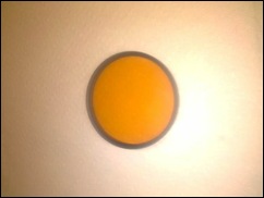
Step Two – Place it on a paper towel, and wrap a second one over the top (this is for your protection and easier cleanup)
Step Three – Get your favorite hammer out…

Step Four – Do not just go to town….whacking away crazily is not needed. Just a couple firm taps until you hear the glass give way…
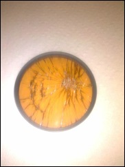
Step Five – Once the glass is broken, a few strategic taps around the edges should pop most of the glass out of the filter ring:
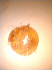
Step Six – Wrap up paper towels of broken glass and discard. Then check the filter ring and make sure it is free of any glass shards (I used canned air)…
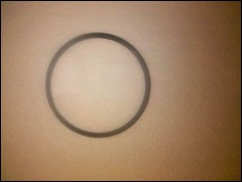
Step Seven – Buy a welder’s replacement lens from your local hardware/tool store, or perhaps a local welder shop. If you prefer, there are online retailers that sell this stuff too. The problem there is that the cost of shipping quickly ratchets up the price. I found some Hobart #9 at a local store for under $2.50 per pack and some Lincoln Electric #10 at Lowe’s for $5 a piece.
Steps 8a – I tried first to mark a circle with tape and use a Dremel with a regular cutting wheel to slowly cut to the ring dimension. It resulted in a pretty bad crack through the center of the glass, rendering it unusable, so I had to start over.
Step 8b – I tried a second piece of glass with a scoring hand tool. Since the welding glass is about 1/4” thick, it takes several score to make it weak enough at this breakage point to snip off cleanly. My efforts did not result in clean snips, and ultimately, the glass cracked from my impatience (so, add patience to the list of materials needed!).
Step 8c- I went to purchase a 3rd piece of the cheap stuff. This time, I called around and found a place willing to try to cut the glass (everyone will ask and believe the glass is tempered, when in my case – neither was). I took a sheet of the cheap stuff into them and explained what I was trying to do, then asked what size they could cut to. They had a 2 1/2” hole saw and a 3” whole saw with diamond tips for glass cutting. We did the calculations and realized that 77mm is almost 3 inches exactly. He warned me that the saw itself would take a portion out. Thinking there was a lip on the interior of the filter, I said go ahead (after all, it’s only $2.50 here right? 🙂 )
He was able to cut it into a nice circle. I knew it would be close so thanked him and asked how much I owed. He smiled and said “No charge – give me a plug or a print if it works out!”. Since I am happy to either way, the name of the place is CNC Glassworks in Arvada CO! Super nice folks and great attitude toward customer service! I am sad to admit though that the hole he cut out was just a shade too small. I may possibly attempt to sand this down to the next filter size in my gear bag glass and on testing, but it did prove to be too small.
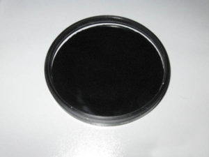
Step 9 – I now knew that I needed to either find a diamond-tipped hole saw and cut it myself, or find someone that had a 3 1/2” hole saw that would be willing to use it on my glass. A little bit of Google research showed that Bosh makes a Diamond Hole Saw in the 3 1/8” size. Problem? None, if you want to pay $60 or more for the tool itself (the cheapest I found was around $60 at Ohio Power Tool, and locally through a company called Tool King for $70). Even if it was half this price, the DIY cost saving approach is quickly ratcheting up. So, a little more in-depth research was required.
Step 10 – Sure enough, after I did some more research via telephone and email, I found a manufacturer online (THK Diamond Tools) that sold the equipment. I was able to purchase the diamond coated hole saw bit for $10 (+ $10 shipping). Since I don’t own a table drill, a quick trip back to CNC Glassworks with a 4th piece of the cheap stuff resulted in in a good cut. I have a piece of the good welder’s glass (the #10 Hobart one for $5 at Lowe’s), but wanted to test the results first. The end result of the cut now fit perfectly into the filter ring!
Step 11 – Now, I just took a little clear silicon glue applied to the inner circle of the filter ring and snugged the new “filter” into place. After letting it dry for about a day, it is now ready to shoot! (Unfortunately, my tripod is still pending repairs, so the final results will have to wait a while longer – but the project is officially complete!
Supplies/Tools Used:
- Filter Ring ($1-$10 depending on where you get them)
- Welder’s Replacement Glass (ranges in price from $2.50 – $5 depending on market – ymmv)
- Paper Towels (50 cents)
- Hammer (??? had this forever)
- Safety Glasses (required for any DIYer – but $3 from Lowes if you dont own a pair)
- Safety gloves (again, required for any DIYer – but $3-$5 from Lowes if you dont own a pair)
- Glass Cutter ($3)
- *Dremel with cutting bit (ETA – if you have the time and $, get the diamond cutting bit – you may have more success than I did… and sanding bit)
- Strong glue (to hold glass in filter ring after completion – $5)
- Masking tape ($2)
- *If you want to go the more “professional route” and have a table drill, or know someone who does, the cost for the$20 for the diamond tipped 3″ bit from THK is $20.)
*You don’t need both of these, but you should have either one or the other.
Project Time Frame – 1-4 hours total work time, 2-4 days total project time.
So, in totaling all the costs of the project, I probably invested $40. This did involve multiple test cuts which you can avoid though, and if your area has a glass cutting shop with a 3″ diamond tipped bit, then another $20 can be saved. This could drop your cost to less than $20 if you only need one cut and already have the materials. Either way, considering the cost of a Lee 10 stop $160 filter, I’ve saved $120 in my project by going the DIY Route!!
Keep in mind that these filters will leave a green tint, so you’ll have to do a little bit of post processing, but if I spend ten minutes in post, that’s worth the savings to me – especially since this is an extremely unusual type of use piece of glass, and hard to justify that kind of expense. Give it a whirl and share your own shots in the LDP Flickr pool! Happy shooting and we’ll see you here again tomorrow!
Photo Books – MPix review
Photo books are becoming an increasingly popular way of getting your images printed. It’s no longer as cost prohibitive or complicated to do as printing outfits seek to bring more products and services to the consumer market. I’m in the midst of doing some testing of various online printing services, and one of the first books I got was from Mpix. So, today, I’ll be showing you some of the pros and cons of this service. I decided to approach the photo book reviews from five perspectives: image quality, binding quality, durability, value, and turn around time. Continue reading “Photo Books – MPix review”
Can You Shoot Stock?
Several readers have asked me about what it takes to be a stock photographer, and not being a stock photographer (at least not a very good one), I had to honestly say, “I don’t know”! I wanted to find out though, partly to satisfy not only reader interest, but also my own interest, so I signed up to become a contributor at iStockphoto – one of the premiere stock photo agencies around. I also picked up a copy of “Taking Stock“, by Rob Sylvan to give it a read and prepare for my foray into stock photography. For regular readers, you may remember an interview I had with him a while back, and the contest giveaway where 3 lucky readers won a copy of the book.
So, for starters – I’d suggest that you educate yourself on how to shoot stock, which means reading resources like Rob’s book. You also need to practice, and be aware of trends in the market place. You also need to be prepared for something else, and that is rejection! Even the best photographers have images rejected from iStock. It’s going to happen, so get used to it. Images can be rejected for any one of a number of reasons. By far, one of the most common ones I’ve seen is worded as follows:
“This image appears to be over-filtered/over-processed which has affected the image quality. This may include Photoshop filters & effects (over-sharpening, excessive adjustments to levels, curves, contrast, hues, gaussian blurs, saturation, added textures, noise reduction…) or other manipulations.”
What can be frustrating about this is that you may have applied very minimal processing, and applied no filters whatsoever, but your images are still rejected. The reason? The next part of the rejection description:
“Inspectors judge images based on quality, composition and usability.”
The key is not to worry if this happens – it can happen to anyone, and images can be rejected for any of many reasons. Here’s a couple examples of photos I’ve had rejected from iStock during this test phase:
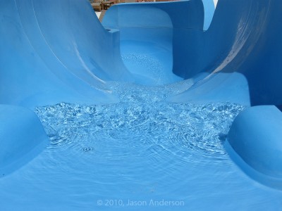

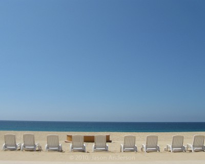
One thing I’ve always tried to do when assembling work for stock is to make sure there is negative space available. This allows buyers to have their text or content overlay on the image. Plus, it’s a pretty effective compositional technique – which I’ve talked about in the past…for more details, you can read that full article here.
Here are some other suggestions and approaches for shooting stock:
- Try and avoid brand names. If someone is wearing Nike shoes, a Champion sweatshirt, or other easily recognizable logos, forget it. First off, you can’t use them without permission, second, the clean-up work required in post degrades the image quality, and third, it’s just not worth the time to remove when you consider that stock is not just about the quality of photos, but to make any decent revenue, it’s also about quantity of photos!
- Incorporate people into your work. This doesn’t mean having someone put on a headset and pretend to be a customer service rep (because this has been done too much already). It does mean to be creative and use people to demonstrate things – like lifting weights, or singing into a microphone, or repairing a computer. These are the types that typically will do well in sales.
- Plan ahead. If you are thinking of shooting your Halloween themed photos now and getting them online for sales possibilities, then expect the purchases to start happening around August or September of next year. Buyers of stock work usually are working ahead of schedule to line up ad campaigns, and other uses well in advance, so you need to be publishing your work on their schedule, not in real time.
- Make sure you get model releases if people are recognizable in the images. Stock work requires it, and if you don’t have it – then forget even submitting. For more details on what model releases are appropriate and what should be included, visit this location where iStock gives you one to use!
That’s just a couple tips for how to get started in stock photography. For more information, go to the pros that already do it, and know the industry much better than I. As mentioned at the beginning – Rob Sylvan is a great resource as an iStock reviewer and author. Other people you may want to keep tabs on include Nicolesy (who I’ve talked to here on the podcast series!).
Got your own tips and ideas on how to shoot stock? I’d love to hear what others think too, so sound off in the comments. Happy shooting and we’ll see you back here again tomorrow!
Extending Lightroom's Web Module
As much as we talk about extending our applications with plug-ins, additional features, and nuances, I have yet to see some really extensive discussions about how to extend Lightroom’s web gallery features beyond the out-of-the-box designs. We’ve always known that the option was there, and there are some developers that have added some pretty cool extensions out there for bringing some very high end custom web galleries into play. The problem thus far though is that most have been either strictly HTML or Flash based. The former usually doesn’t look very pretty, and the latter can be difficult to view on other types of devices. Continue reading “Extending Lightroom's Web Module”
