Tuesday Tricks and Treats (and a tutorial)

This Tuesday, I’d like to share some neat tricks I came across online. First, How to Light a Shot on Two Planes – this came courtesy of The Strobist (one of my regular reads) – plus it includes a really cool-looking shot of some Turkish Delight! Apparently he (David Hobby, Strobist author) did this workshop in Florida last weekend with industry folks like Scott Kelby and others from NAPP in the room – no, that wouldn’t be at all intimidating!

Another neat treat I read about through PhotoJoJo was a blog where two friends who live a fair distance (3191 miles to be exact) from each other and they each share an image a day on their blog, one from each region. A definite cornucopia of inspiration as sometimes it’s the regular snapshot-types while others it’s truly breathtaking scenes…and when the two complement each other, it’s just too cool (February 7th is my favorite day so far)! Stop over when you get a minute and comment on their work – they deserve the accolades. The blog name, coincidentally, is titled 3191!

And last, but not least, the tutorial for the week – my inspiration for this came from (surprise surprise), NAPP contributor Matt Kloskowski. He had done this trick on the show (and in the NAPP member space) for Macs, with a little verbal instruction set at the trailer for Windows users. After sharing a few msgs with him – I decided to do the counterpart tutorial this week for Canon Blogger – the Windows version of creating a Desktop Calendar. So…to Matt, thanks for the creative idea, and to the rest of the world, here’s how to create a desktop calendar for Windows. Enjoy!

Windows Desktop Calendar

Selective Color, Part III

The Tuesday tutorial for this week is the final installment in making selections based on a specific color, or range of colors. The first demonstrated how to use the Magic Wand and Lasso tools to copy an item onto it’s own layer, while preserving the rest of the image for editing.

Part II looked at using the history brush to bring back color in a specific part of an image for a unique way of identifying one colorful object of an image.

In this final installment, I use the Color Range method to demonstrate how you can make a selection based on the range of color.

The Quicktime version is up and ready for download via the link provided or in iTunes. The flash-based version is uploading right now, but will likely not be finished before the 7pm deadline. For those that prefer the flash web-based version, check back later this evening, as the linked path should be finalized by then. Tune in tomorrow for more web gems. In the meantime, I would like to give another round of thanks for all that are tuning in to the show and sharing their thoughts, comments and feedback with me both personally and in the comments area. That’s all for today. Happy shooting out there and watch your apertures:

ETA:  Flash-based version is up – thanks for the patience! 🙂

Selective Color, Part III

Tuesday tutorial teaser

Today, I am going to show you yet another technique for making specific color selections, but as noted in the title, this is just a teaser – the tutorial is not finished in production, so I should have it up later this evening (around 7).  In the meantime, I would like to thank everyone again who has been reading, watching, listening, and sharing their feedback.  Let’s keep it up – what other tips, tricks, techniques and stuff do you want to hear in tutorials?  I’m listening… 🙂

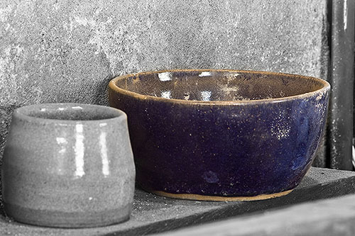
Big Blue Bowl – Selective Color, Part 2

The tutorial for this week is the second in what will hopefully be a three-part series showing the various ways that you can approach selective coloring in Photoshop. Last week, I went over the technique of using the lasso and selection tools to select your color component and then putting that on its own layer. This week, I look at the history brush. You can quickly see the differences between each and how each has its advantages and disadvantages.

I gave a shout-out to Scott Sherman and Michael Stein’s Digital Photography Show on the video, but you really do need to listen in. Rudy Winston from Canon is on this week and according to the show notes, gives some really good insights and dialog on the Canon line. Kudos to Scott and Michael for incorporating the info into their podcast – I can’t wait to listen to it tomorrow during the commute. Additionally, I spoke with Scott on the phone today too, so that was a neat experience to actually talk to one of the established regulars of the photography community – if you’re reading, thanks for taking the time to chat with me Scott!

For those that prefer the flash version, here it is: Selective Color, Part 2

For the others, the Quicktime version is linked as a media file, and is also available in iTunes. Here’s a sample image of the final product as a teaser:

Selective Color applied to a Blue Bowl

Don’t forget, you can now sign up for email notifications of new posts to the blog. No worries about spam or hokey solicitations from me, I don’t even see that stuff. It’s all automated, and this way you can save space on your toolbar and widget space. One more thing that is done for you, so sign up for it today! As a final note, thanks to all the listeners who have been downloading and watching the videos. I’ve received several kind emails with ideas for future tips, so plenty of creativity is on its way for 2008.

Well, that’s about all for today. Tune in tomorrow for my trip around the web, compiling all the news and reports trickling out of PMA. Happy shooting, and as always, watch those apertures!

Selective Coloring: Method #1

The task of selecting a single object in an image to highlight by means of leaving that color intact while altering the surrounding elements is nothing new to photography…and there are several ways to do this, with varying levels of success and usability for each. The tutorial for this week looks at the simplest of ways, by putting that object on its own layer. The nice thing here is that the technique is portable to multiple versions of Photoshop. Having recently upgraded myself to CS3 Extended, I am trying to keep tutorials cross-functional across multiple versions for usability. Enjoy, and see you next week, for the second method. Don’t forget to vote in the polls!

bw_beer.jpg

Browser Version

Web 2.0 Style Graphics

In keeping with the theme of last weeks tutorial, I’d like to round out the discussion of Web 2.0 styles. Last week we took a look at using Photoshop to create Web 2.0 style text and type, while this week we turn the focus to Web 2.0 style graphics. With the emphasis on Web 2.0 style effects lately, one may ask what this has to do with photography. Well, in creating our photographs, we often like to use the web as a means of displaying them. With the myriad of cookie cutter templates out there, creating a customized and personalized web site is becoming more and more crucial if you want your images to stand out.

If it helps, think of the web as your framing process. Sure, you could hire it out. There are web designers out there that would be fully capable of creating a custom web site for you. But, if you are limited in your budget, and are like many of us, you can create a nicely polished website that will enhance your images nicely. The website in this sense represents the mat and the frame through which your clients and customers view your products.

This is not to say that a photographer should dedicate serious amounts of time to web and graphic design. Au contraire! Rather, take a default template from the likes of the Photoshop and Lightroom options you already have, and customize them with your own graphics. It’s not that difficult and can serve to take you to the next level of quality image presentations. Now, having said all that, it should also be noted that next week, I will be returning to more photography-specific tips and tricks for the weekly tutorials, so we’re not going to be stuck in web graphic design forever.

I also wanted to offer a brief explanation for the late posting of the tutorial… someone had emailed saying that the intro was producing a white line on the left side of the video. As it turns out the intro was recorded at a different resolution so I took some time tonight to correct that. The timings were a little off afterward so I had to adjust for that as well. But, it is now fixed. The reason I am saying this? The animated text has gotten a little boring. I would like to move toward a flash-based intro (the original was recorded in Powerpoint *shudder*). But, I really don’t know much about Flash. I am on day 7 of the trial version and have miles and miles to go before even grasping some of the basics. So…if any Flash gurus out there would like to do a charity case, feel free to email me – you’ll see your name up in lights, (I’ll set up a contributor tag in all future videos) and I’ll be more than happy to provide a link to your website. (Hey, it’s all about helping one another out, right?) 🙂

One final note is that Canon Blogger is now in iTunes! After some initial testing of graphics, audio, and determining what feeds best for iTunes from the blog, there’s a good working feed where you can subscribe to the shows from there. Stop in and check it out. Feel free to share your ideas on the value (or lack thereof) by offering a review. It looks like a few have found it already, but no reviews as of yet. Be the first and review the show on iTunes today! I’ll likely be adding an iTunes feed button to the sidebar tomorrow too, but in the meantime, just search for “Canon”, and I’ll be the second podcast under the “Software: How To” section, right beneath Rick Sammon’s show… it’s getting late, but I’ll try to get a link feed generated for the sidebar tomorrow. In the meantime, you can view the show directly in iTunes from here: iTunes Feed

Okay…enough of me blathering – on to the tutorial!

Web 2.o styled Graphics

Shiny Web 2.0 Text Effects Tutorial

As promised, the Tuesday tutorial is up today for viewing. The web version will be linked first, with the iPod/iTunes version for download listed second. A brief note on this – I’ve made some adjustments to the video quality, and am trying to keep the sizing consistent, so these are set to display now at 1024×768 which is the standard resolution for a 15″ LCD monitor. If you are at 15″ or higher, you shouldn’t have any problems. I’ve also added a graphic to the web flash, and cleaned it up a little more in my production software. The effect is a little more polished, but I may tweak the html a little as time permits. The PDF version of this will also be up shortly too, as the video moves pretty fast (I cover a lot of ground in this one…)

For the Wednesday Web links, since I am talking about text effects in the tutorial, it seems only fitting to mention a few resources for fonts on the internet. Here’s a couple I know of…if anyone has their own suggestions or resources, feel free to share them in the comments section. So, here’s the font sites I’ve used and heard good things about:

www.dafonts.com – Great resource for tons of free fonts online.

www.myfonts.com -If you need a professional set of fonts with a little more polish and visual appeal, some really well done ones are available here.

www.minifonts.com – This should be self-explanatory, but this site specializes in mini fonts. Tiny ones used in avatars for example, or in favicon images for websites (note the new one used for Canon Blogger – refresh your cookies if it’s a fuzzy CB logo)

Now, on with the tutorial materials:

Web Flash Version

PDF Download

[display_podcast]

Tuesday Tutorials Temptation…Trashed

Well, I came home from work today, set up the tutorial for recording (with my new preamp in place for truly the best audio recording thus far), and after a few dry runs, recorded everything with no interruption. When I went to review it, I realized that the “microphone” option in my recording software was not checked. I never recorded the audio! So, the hype and setup for the Tuesday tutorial has thus been a tease, as I had to trash it. (Doncha just love my alliteration? It literally rolls off my fingertips! 🙂 )

I will re-record it tomorrow (with audio) and finish production on it tomorrow, so it’ll be a day late this week. For the time being though, I got this question in an email from Dave in California:

Hey Jason,

Can you do a video demo on how to set up and use the ST-E2 with multiple
flashes and different light ratios?
That would really helpful.

-Michael

This is a great idea Michael, and I would love to do one – but alas, I do not have multiple flashes, nor the ST-E2. Additionally, my recording capabilities are limited to on-screen subject matter, as I do not have a video camera. I could tell you how it’s done according to some stuff I’ve run into on other sites, but that kind of defeats the purpose of preparing tips, tricks, and tutorials for you to read on Canon Blogger directly. So, I’d love to see if anyone else has the means to do so! That’s right – open audition night for CB – submit a video clip (in AVI or MOV format please) of the set up, and I can port that into the format. Naturally, the original recorder would retain all copyright, and I would be more than happy to help promote your work if you have a website.

The terrible truth about me and lighting is that I tend to prefer ambient light. I do have a 550 EX, and have used it on occasion, but am not very well-versed in off-shoe lighting techniques. I’ve read all about it and know it’s the way to go, but I’ve just not pulled the trigger (or should I say “tripped the shutter”? ) on doing much of that yet. A great resource for learning about this is one of my favorites too: Strobist, a site run by David Hobby that truly is the mecca for anyone with lighting questions. If you have a question, post it in the comments and believe it or not, you will likely get an accurate answer, usually within about an hour or so. His site is just hoppin’! Not meaning to leave you in the dark Michael, but lighting suggestions and recommendations are really out of my league. I did find something within the vicinity of an answer on SportsShooter, so check this out along with Strobist for more details.

Feel free to throw me audition tapes! 🙂 Thanks to Michael for the great idea, and I’ll be sending you an email shortly. In the interests of full disclosure, I would also like to help Michael out by offering a link up to his website – he’s got some really cool photography set up at Sage Photography. My one recommendation would be to add title tags to your header info. Each page comes up with a title in my browser of “Untitled Document.” Does not help with Google crawling…

In lieu of a tutorial, I would like to point out a key factor in the behind-the-scenes of the tutorial – stamp visible! This is a great utility in Photoshop that lets you create a new layer out of all existing visible layers that is fully editable. This is great if you want to have multiple versions of a base workup, you can create multiples with this function. The keyboard combo is Command + Option + Shift + E. (In Windows it’s Control + Alt + Shift + E). Quite a large keystroke set to remember, but it sure provides the ability to take things to the next level! I’ll show it to you in action tomorrow – I promise! In the meantime, Happy Shooting!

Friday Frenzy

Rather than the Friday follies, it was something of a Friday frenzy. I realized belatedly that next week Tuesday is New years Day, and I would be spending that time with family. So, to avoid going that long without putting out a new tutorial, I decided to put together a short one on vignetting. Since we’re all enjoying some slower times at work, and more times with family over the holiday season, I figured a vignetting tutorial might be an appropriate one given all the family and portrait shots that people are likely capturing.

So, I put together some materials for posting as a PDF, and decided to do the video-versions as well. So, in a rather rushed manner, here’s the latest tutorial from Canon Blogger. Since I will likely not be posting again between now and after the first, this is probably my last post of the year. I had wanted to get 25 in before years end, but falling only one shy is okay in my book. The other piece of exciting news is that I have finally finished the addition of a tutorial section for the website – ALL the video, PDF, and article contents, nicely assembled in one page. I’ve also thrown together some contact information, started a photo gallery section, and some other neat stuff. Many links are still not verified, but I suspect will be finished before the end of the year. Feel free to check back on your own as I’ll likely not have a chance to make that announcement directly until after the 1st. Here’s the link to that page:

Tutorial and Additional Resource Center

So… without further ado, enjoy the tutorial, linked below (I am using larger sizes that are not blog friendly, but on completion of the video, you do get bounced back here…)! Also take some time to enjoy family, friends, and loved ones for the rest of the holiday season, and I’ll resume the posting and podcasting next year! 🙂 Happy New Year all…

CB #24: Artistic Vignetting

The weekly tutorial is up and available for viewing!

This weeks tutorial has been recorded, produced and published. Watch how to create a neat antique effect on your images. Because the tutorial shows a camera raw view, it does not fit a blog-sized flash screen, so my normal procedure for embedding the flash player in the blog will not work.  For an online streaming version, click the Flash link at the bottom of this post.  The Quicktime version is available as always for iPod or other media player via download. Enjoy the vid, and feel free to share your comments here on the blog or with me directly via email. My address, as always, is jason <AT> canonblogger <DOT> com. Thanks and enjoy the tutorial!

Flash Tutorial – Applying an Antique Effect to your Imagery