Cabo Creativity

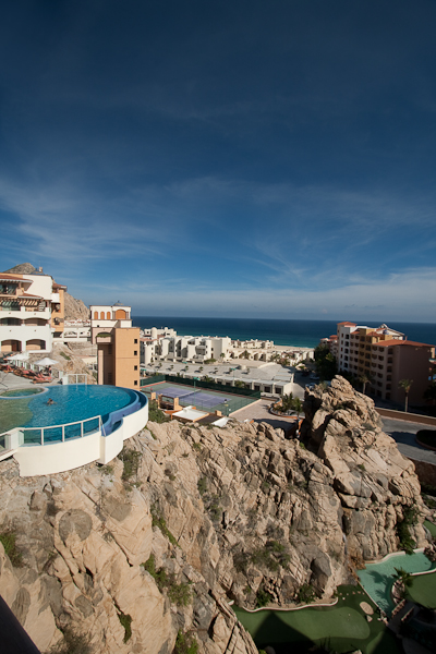
Last week’s first ever 5-day series of written work “The Five Elements of Control” featured 5 distinct ways in which you can control and increase the impact of your work.  Those elements were through controlling for luminance, color, geometry, context, and composition. Hopefully, the perspective can be one many will find useful in elevating their own work.  In taking the task to heart, today (my first day back after a week-long break in beautiful Cabo San Lucas), I am sharing a slideshow of some of my favorite recent shots.  So, rather than suggesting others incorporate these techniques, I am trying to apply them to my own efforts as well. Here is where you get the chance to be the critic for my work, so by all means, share your thoughts, comments, feedback, and perspectives below.

In other blog and podcast notes, don’t forget, the $500 giveaway for the Thinktank Photo Multimedia Bag and Topaz Labs plugin bundle is still going on over on the Flickr site.  We’re in the last week for submissions so we can wrap things up by the end of September, so time is drawing nigh!  The thread to share your pictures (and the guidelines) is here for those interested.  It’s a great opportunity to take advantage of some great products from Topaz Labs and Thinktank Photo (and thanks go out to the sponsors for their generous contributions)!

In case you haven’t noticed the sidebar, there are now short little audio tips being offered up courtesy of the folks over at Audioboo.  The latest comes  the shores of Cabo San Lucas with the peaceful waves of the Pacific crashing in the background!  So, for the feed readers out there, stop on over to the blog and check out the audio tips – some hopefully good stuff there too.

Thanks also to the recording capabilities of my wife’s point-and-shoot camera, you are in for a special treat tomorrow in the form of a Quicktime video!  Until then, here’s the promised stills from the trip.  Happy shooting everyone and we’ll see you back here again tomorrow.  (Don’t forget to let me know your thoughts and feedback in the comments!)

Mexican Harbor
Mexican Harbor
Negative Space
Negative Space
The Power of the Waves
Umbrella Dots
Umbrella Dots
In Honor of Escher
In Honor of Escher
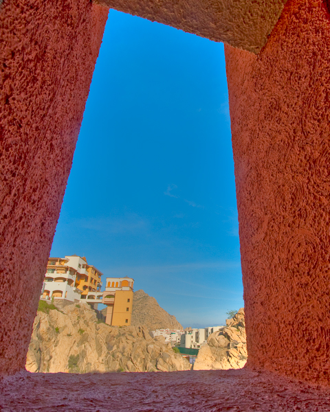
Through a Window
Through a Window

As a little postscript, since many will ask, I did my post processing in Lightroom and Photomatix (yes, some of these are HDR images).  One image did reveal a pretty heavy dust spot on my sensor, so that one did see a round-robin through Photoshop for that one speck.

The Topaz Labs Plugins: Details

Another exciting plugin from the folks over at Topaz is the Details plugin.  This smart little plugin is, well…not so little.  A simple click from the Filters Menu chugs at your processing speed for a good while as it scans, reads, and takes your image through several unique variations of detail adjustments.  With 12 variations in this single plugin, you can take your image from bland to beautiful in just five minutes or so (depending on computer specs)!

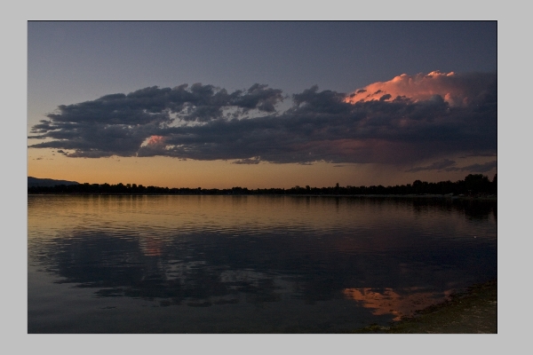
Check this out.  I took a sunset picture from here in Colorado a few months ago, and ran it through the entire collection.  Here’s the original image:

original_blog
Original Sunset Straight out of Camera

Sure, it’s an okay shot, but could it be better? I sure don’t remember it being that plain looking when I pressed the shutter, so let’s take a look at some of the options available in Topaz Labs Details Plugin:

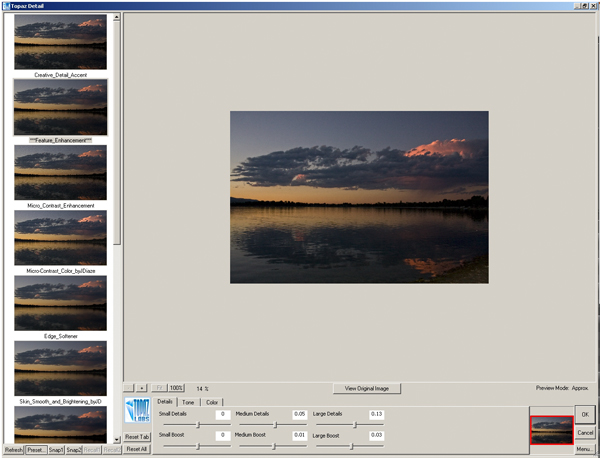
Topaz Details
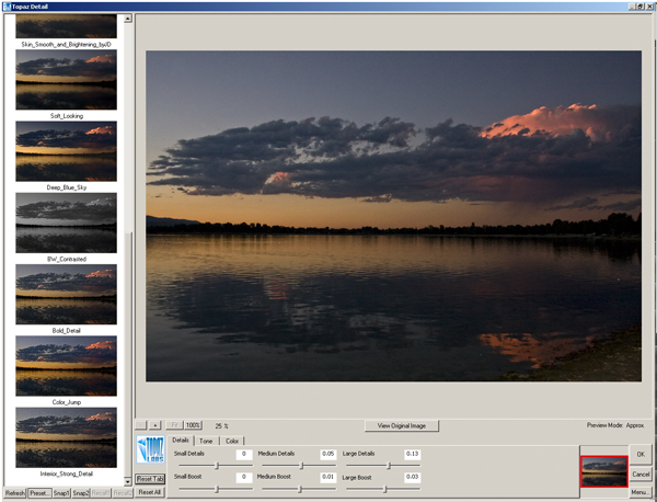
Topaz Details
Tobaz Labs Details panel - Set 2

With twelve total options, I was stunned.  A slight difference between this plugin and the Adjustment plugin is that this one does appear to chug a little slower – each time it had to re-scan the entire image and the scratch disk filled up further, so by the end of the 3rd edit, I had given up on an action for PS.  Just find your favorite initially based off previews (they are pretty close) and run with that for your output.

What I did like is that the sliders at the bottom were still adjustable for further image customization from the default “out of the box” adjustments that Topaz Labs gives you.  I also liked the number of options too.  In the Adjustment plugin the options were just a little too overwhelming for me – but 12 is just about enough.

My last note though, would be that once you have the plugin loaded, it shouldn’t have to reload again with the same photo still open.  A quick scan of the exif data should be able to say “same image” and scan no further.  That would allow for actions, and quick galleries of the various options for viewing full size images of the various options rather than the smaller previews.

What about the CB Crew?  What are your thoughts on this short review?  Have you used the Details plugin yet?  If so, thoughts on the usefulness?   Got a favorite details adjustment?  From here (I know it’s small), which ones hold the most appeal for you?  Oh yeah, the last thing – do you want this plugin free?  Then get your photo in the LDP contest today!

Anyway, happy shooting and we’ll see you back here tomorrow!  Don’t forget to enter the contest… here’s the link to the Flickr thread!

Grab the Feed

Topaz Laps: Software Suite Review

So, as everyone is likely already aware, Topaz Labs approached me recently to sponsor a giveaway and generously donated their entire suite for some lucky listener/reader.  As is always the case, I like to say “thanks” in my own small way by giving the vendor some “air time” on the blog with a personalized review of whatever it is they are contributing.

In the case of the Topaz Suite – boy did I bite off more than I could chew!  The Topaz Labs package consists of 7 different Photoshop plugins with somewhat descriptive names for each plugin package, ranging between:

  • Adjust
  • Denoise
  • Simplify
  • Detail
  • Clean2
  • DeJPEG
  • Vivacity

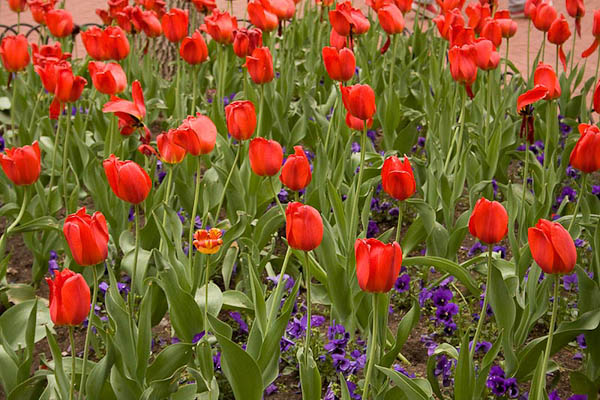
There’s also two video plugins available:  Enhance and Moment.  I’ll address those in another post, just because, well… even just the 7 plugins for Photoshop was going to be a lot of plugins to review in one blog post!  Thinking I was up to the challenge, I powered on and installed each package, then fired up Photoshop.  Wanting to find an image that had some depth, color and tonal range to it, I picked one from a photo walk I did in Boulder a month or so ago of the tulips:

original_blog
Boulder Tulips

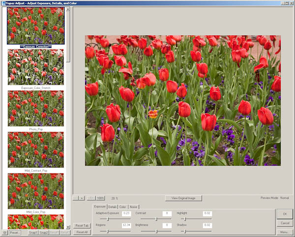
Kind of a neat image:  one flower all by itself ina sea of red tulips.  The green stalks and purple base also served as a nice contrasting set of colors to see how things progressed.  So, into the first plugin I went – the Topaz Adjust.  Lo and behold, within this one plugin are 21 different photo adjustment presets! That’s right – 21!  Here’s a quick look at the interface:

adjusteditview

See that left-hand column?  There’s 21 different variations of creative adjustments done to your photo to give you a specific look and feel to your images – all at the click of a button.  To the bottom center are all the slider controls for exposure, details, color, and yes – even noise handling.  You can select a creative style, then edit within that style to go for a unique look and feel all your own!  This is a very clever and unique approach to photography work flows, because now you can look at your photo with various edits in an simple and easy preview to see how various adjustment styles will look on them.  I’d like to give some face time to each style but there just isn’t room here in the blog to do each justice.  So….enter the photo gallery!

That’s right, I took my one image and ran it through each of the 21 possible adjustment styles.  On each style I just left the default sliders in place, but what’s especially cool is that these slider values change from one style to another, so if you are paying attention to the numbers, and you like a particular style, but want to drop just a touch of the contrast, or bump a touch of the noise, you can do so easily and intuitively!  Pretty darn cool in my book.  The styles go alphabetically in order in the gallery:

  • Clarity
  • Color Blast
  • Crisp
  • Detailed
  • Dramatic
  • Enhanced Contrast
  • Equalize
  • Exposure Color Stretch
  • Exposure Correction
  • Mild Color Pop
  • Mild Contrast
  • Mild Detail
  • Neutralizer
  • Photo Pop
  • Portrait Drama
  • Portrait Smooth
  • Psychedelic
  • Simplify
  • Small Details
  • Smooth and Flat
  • and Vibrance

To see the overall effect each adjustment style has on your images, visit this companion photo gallery here that shows each – the original is listed first, followed by the 21 different adjustment styles!

This alone would be worth a giveaway prize – but this is just one of the entire suite that Topaz Labs has donated to the blog/podcast for our next giveaway.  The rest of their various plugins will have to be reviewed individually on the blog, so this means during September, I’ll take a more detailed look at each of the plugins – clearly more than one will have to be addressed each week, and I’ll try to post an image gallery so you can see the effects of each plugin on some photos.  This is definitely a product to consider as a part of your arsenal of tools though – I’ve already seen so many possibilities for photo galleries and output options on my own collections that I could be busy for months just reviewing what these plugins have to offer.

One downside to the Topaz plugins is that they are only functional in Photoshop and Aperture.  From what I understand, a LR set is in R&D right now, and should be released in very short order.  But for the time being – Photoshop and Aperture are your installation options.  The only other downside I can see to all these options is the risk of decision paralysis – when prompted with too many options, it can often lead one to indecision.  For this reason, I’ve designed an action to use in my own work flow when using the Topaz Labs Adjust plugin.  Here’s what the action does:

  1. It takes my original file and creates 21 duplicate layers.
  2. Each adjustment style is then applied to its own layer, and the image is flattened and saved by that style name as a lower-resolution jpg file.
  3. I then go into Lightroom and look at all 21 (and the original) in either the Library module or in a web gallery module to see which one or two I like the most.
  4. I’ll then go back to Photoshop and find those two layers and delete the rest.
  5. Save that resulting file as a PSD
  6. On each adjustment style, I then tried some various tweaks on the sliders to see if there were minor adjustments that I found more appealing to my tastes.

This is just my work flow that I am thinking will work well for me – I like having at least a few options available, and since different scenes call for different adjustment styles – the action will help expedite my work flow.  It took a while to create the action as you have to be methodical and pay attention – but the resulting options for workup are worth it in my opinion.

Anyway, back to the Topaz Labs Adjust plugin – this thing rocks and I could easily see it become a part of my work flow (who am I kidding – it really already has since I built an action to support it!  LOL)  Don’t forget, next month you can WIN not just the Adjust plugin but the entire suite from Topaz Labs.  Keep checking in for details and the theme announcement.  Thanks to the good folks at Topaz Labs not only for their generous contribution to the LDP podcast, but also for the R&D they’ve invested in this entire series of plugins!  Judging from my review of the first component – this is sure to become part of the standard set of utilities for photographers and creatives!

Okay, that’s probably enough for today.  If you’re still chomping at the bit for more info about Topaz Labs software – go check out their blog – it’s got some great info on there too and really goes in depth from Product Manager Eric Yang (this is his Twitter link – follow him, very cool guy!)!  I’ve already added it to my own list of RSS feeds!  Check back tomorrow as we get back to the previous project I started – the manually adjusted Star Tracker!  In the meantime, you also have only a short time left in the Wacom Giveaway – Friday is the last day to submit your photos!  So, if you want to Win a Wacom (Bamboo Fun) – enter today over at the Flickr Thread!

Happy shooting everyone and we’ll see you back here tomorrow!

Grab the Feed

How I shot Lightning!

Today the post is going to revolve more around a set of photos I took the other day – you see while en route back to the house, I noticed that the clouds were passing over the mountains and the sun was starting to set.  It had the makings for a really nice sunset.  Never one to turn away the opportunity to capture a sunset, I hurried home and gathered my gear, and took off to my favorite spot near the house for landscape work.

Well, the clouds and the sun didn’t really cooperate so I gave up on that and starting fiddling around with some HDR kinds of things.  I saw a traffic light nearby and there wasn’t much traffic so tried to time some bracketed exposures (my shutter speed was getting near 30 seconds on the top end of the bracket).  Some possibilities developed, but nothing too earth shattering, and I was starting to feel a few drops of rain, so I packed up to head back over to the house – about 2 miles away.

As I was coming back to the house, the clouds that evaded me on the mountainous horizon were ominously hanging over the cityline of Denver (another scene I’d been meaning to shoot) and flashes of lightning were coursing through the clouds, with some pretty regular spikes coming down.  All of this was about 30 miles away, and heading away from me so i was feeling pretty safe except for the possibility of some raindrops now and then.

So, I found a nook by the open range, set up the camera on my trusty tripod, and tried to recall things I’d read about how to shoot lightning.  Apparently some of it stuck, because I came away with this:

lightning_blog
Lightning over Denver

So, how did I do this?  I kept four key things in mind:

  1. I used my tripod!  Stability was key because every single exposure was no less than 15 seconds!  When shooting lightning, you want to open the shutter for a longer time to increase your odds of catching it.  Because it was flashing so regularly I eventually dropped my shutter to 15 seconds and still managed 6 or 7 really good captures.
  2. Keep the noise Down – I dropped my ISO to 100 for all shots and made sure long exposure noise reduction was turned on in camera.  Sure it took twice as long to capture each image, but in the long run it was worth it because there was much less noise to process on the back end.
  3. Don’t touch the camera!  I set the camera to bracket exposures and put it on a two-second delay.  So, by the time the camera shutter opened I was no longer touching it, and then the second and third shots fired automatically.
  4. I made sure I was in a sweet spot of my lens.  Part of this is knowing your gear – I was shooting the 10-22mm (wide angle) from Canon, and know that when it goes below f4 it can get fuzzy.  So, I was at f11 for most of my shots.  Great depth of field and everything is sharp!

Well, a fifth one was post-processing.  After a few rather unpleasant attempts to process as HDR images, I enlisted the aide of friend-of-the-blog Terry Reinert, who you know from our podcast talk a short time ago.  Terry is wicked smart (he’s an engineer) and knows the heck out of HDR.  I asked him what I was doing wrong (because the clouds were getting blotches scattered through them and generally looking poorly).  He gave some insights, what he was finding yielded better results and sent me a low res sample via email.  I liked the path he took, but the colors were not quite where I remembered them from Sunday, so dove in again with the new-found knowledge.  I tried a few quick variations on his technique, but in the interests of time, just did a short version to post here.  Once I get my final edit done (probably this weekend, I will likely be adding the image to my portfolio, so will also post that here as well.  For now though, I wanted to share the back story and a quick version of one processed version that I found appealing.  I am not crazy about the black across the bottom, but since my time was limited here, I’ll likely be addressing that this weekend when I have more time.  For now though, the quick version and a panorama crop looked kinda cool!

Thanks go out to Terry for giving a hand.   In our discussion he also mentioned possibly doing a tutorial on blending using the images, so keep your eyes on Terry’s blog (Where Art and Engineering Collide) as I may be a featured artist!  (How cool would that be?) ETA:  On posting the link to his blog, I see he’s already put his tutorial together – thanks Terry! 🙂

In other blog/photo news, as you all know from yesterday, the OnOne Giveaway concluded with Pete Petersheim being the big winner.  The new contest is underway though, with a new thread up at the Learning Digital Photography group on Flickr, so be sure to stop in there and share your images in the new thread (the theme this go around is “Fun” since the price is a Wacom Bamboo Fun!)  Good luck to everyone and don’t forget to have some fun!

Happy shooting and we’ll see you back here again tomorrow!

Grab the Feed

Mask Pro 4.1

Okay, I know the folks from onOne have been very generous with their contribution of a copy of the OnOne Plugin Suite for the latest giveaway here at Canon Blogger/Learning Digital Photography, but I have to say that I am literally blown away by this offer even more.  As I delve into each tool more and more, I am totally amazed at the functionality and how easily it really makes things.  For those of you that watch Photoshop User TV, you’ve seen what I’ve seen – ads from OnOne claiming that masking is made so super easy that you can swap backgrounds and composite images together in a snap – it’s a breeze, right?

Well, we all know that ads only show you the quick and flashy parts of things, not the nitty gritty.  Let me tell you here and now – the Mask Pro really has no nitty gritty – it really is that easy.  Take a look at these sequences:

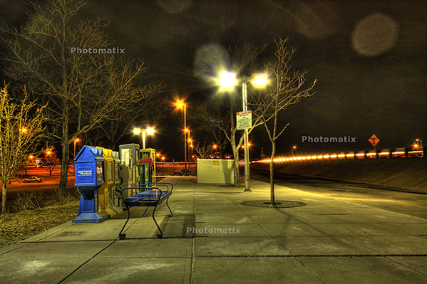
First off, an image I merged together during a trip to SC last summer.  It looked like it could make for a nice HDR, so I did some tone mapping and got this result:

originalhdr

Needless to say, it didn’t really have the “wow” factor I was looking for.  (I should also throw a mention in for the folks at HDRsoft that produce Photomatix, the HDR software utility that I was testing at the time I originally put this HDR together – still working on a review of that – I lost the trial version after re-installing XP, but will get that back shortly.)  Anyway,  given the success I’d had with some other images in HDR and the background I tried, figured it was worth the effort to blend in a different background.  Here’s the results.

hackjob

Keep in mind, this was after literally hours and hours of painstakingly selecting branches, twigs, and  what not literally zoomed in to almost the pixel level.  Still, not that flattering a result and clearly a less than “stellar” job.  I relegated that to the “learn from your mistakes” folder and had not really touched it since.

So, this was my test for the Mask pro – could it do what I couldn’t after at least ten hours of agonizing masking selections and duping to repeated layers to start up the following day?  Well, let’s see, here’s what happened.

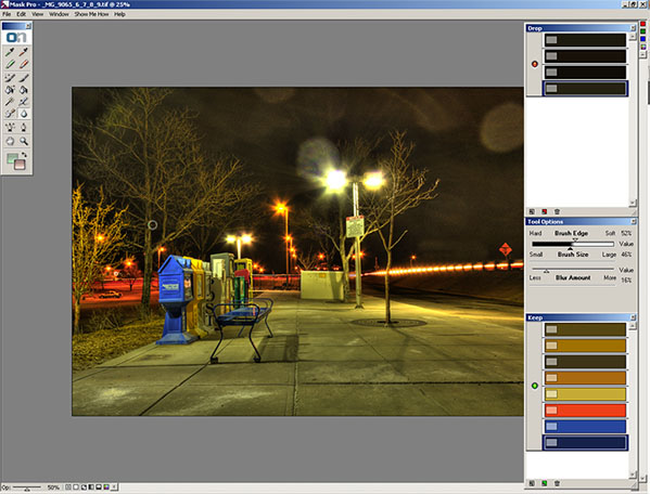
After installing Mask Pro, I loaded the tone-mapped HDR image into Photoshop.  Then, rather than taking any time to tweak, I went straight to Mask Pro (after all, it should do the work for me, right?).  After a short 7-slide presentation on the tools, my first screen looked like this:

maskpro1a

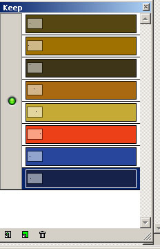
Before I go on, let me explain how the tools on the right ended up how they were.  You see, Mask pro gives you eye dropper tools to select the colors you want to keep and the ones you want to subtract.    So, I went and selected the green eye dropper to define the colors to keep.  I clicked a few parts of the branches and signage, which took the better part of 5 seconds.  The end result was this color set:

keep

Then I switched to the red eye dropper to define the colors to drop.  I clicked a few parts of the sky.  This took another 5 seconds or so.    The end result was this color set:

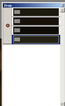
drop Lastly, I clicked the Magic Brush tool, from the Mask Pro tool panel maskpro_palette

and just started painting around the sky.  I certainly did not take my time, as I was running on my Windows desktop which has a single core 2.3 Ghz celeron processor (it chugs when I load my browser fer Pete’s sake).  So, I dealt with about 5 minutes of a magic brush tool as it calculated the mask to apply as I painted impatiently across the image.  (After all, I wrote these blog posts after dinner, so time = sleep here.)

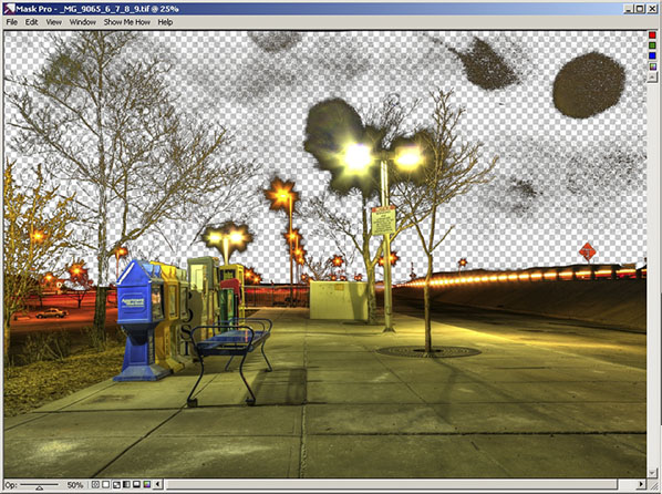
So, after about 5 minutes and 10 seconds, I have a mask that looks like this:

maskpro2

Yes, that was after 5 minutes!  I could already tell this was a wickedly intuitive and powerful tool (and I mean that in the best of ways), so I just stopped there and decided to take it back to PS for final cleanup and adding the new background.  To do that, I simply clicked the File menu, then “Save/apply” (another 2 seconds)…

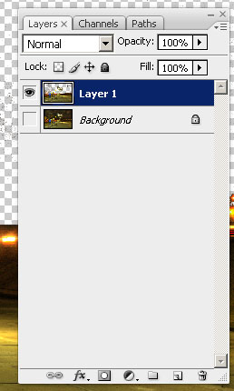
Now back in Photoshop with the original image.  It looks the same, but take a look at the layers palette:

layers2

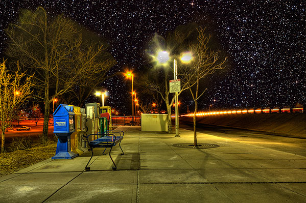
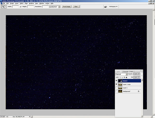
I know the low-res and smallness of captures for the blog make this hard to tell, but at this point I am pretty much ready to bring in the new background.  My only last step in PS is to duplicate the layer I just created from mask Pro to clean up the big blotch in the upper right, and a few specks in the rest of the sky on the third layer.   So, now I am ready to bring in my starry background again.  I place the object in the PS document to get this (for the record, I went with a different starry background to go for a more realistic effect rather than the Harry potter look of my swimming pool shots):

layers3

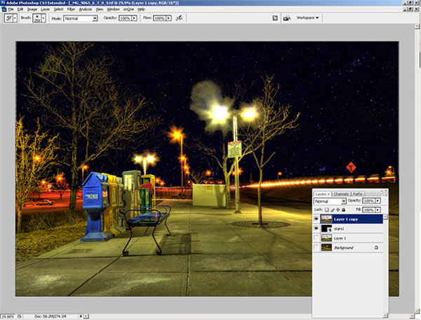
Finally, I just pulled the stars layer to sit below the Mask Pro layer and here’s the resulting layout in Photoshop:

layers4

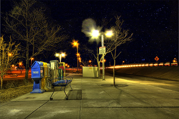
The last bit took all of another minute, tops (remember, I am working off a slow processor.  The final result, which took literally less than 10 minutes (the first took over 10 hours):

finalhdr

Such is the power of the OnOne mask Pro – just one of the multiple plugins that are available in this Suite.  If you want this kind of power and malleability in minutes, then enter the giveaway today.  it can literally save you hours, if not days, of post processing!  Here’s the Flickr page for photo entries and here’s the link to the rules.

What can I say – OnOne rocks!  Just to give you a true frame of reference – it took me about an hour and a half to write this post – and that includes getting the screen captures, then sizing them for the blog.  I also interspersed some Twitter time and surf time as well, so it’s not like I was really in any kind of “zone” or anything.  It was just another task in an evening of multi-tasking.  The original one took me over ten hours of processing and that was with no other apps running, seriously.  I was restarting the computer just to free up the RAM for usage only by PS every evening.

This feature alone can save you days of time in the digital darkroom.  Don’t delay and enter to win today! Happy shooting and we’ll see you back here again tomorrow.

Grab the Feed

Wacom Bamboo Fun: Hardware Review

The good folks at Wacom were kind enough to donate a Bamboo Fun to me for review on the blog a while back.  In order to really get a full handle on it though, I wanted to use it within the context of my at-home work flow.  You see, I’m not a newcomer to tablets, as at work and through  previous experience, I’ve grown quite accustomed to their usage.  I’ve had to instruct people on how to use, configure the basics, and such on their computers. as well as used them in many of their varying sizes (most recently being the Cintiq).  Having said that, I’ve never really had the need to incorporate a tablet in my home work environment for a number of reasons.  Before I get into the reasons though, let go over some of the basics…and rather than a listing of pros and cons, I am following a slightly different format this time. I should also give fair warning that there are a LOT of pictures coming, so for the graphic avoiders in feeds, you may want to visit the site…

Installation

Installing this product can’t get much easier.  Regardless of whether you are running a Windows or Macintosh environment  (it really doesn’t matter a whole heck of a lot) the system will auto-detect the drivers for your Bamboo fun.  Still, it never hurts to go through the CD installation on their provided media, so I thought I’d share with you the process (and a few bonuses) of installation.  It’s pretty much identical, but I am showing the screen shots from Windows:

Here’s the main splash screen where you can choose what to do, ranging from installation to viewing video tutorials, or browsing the CD contents…

install1

I opted to do the driver installation first, and got this following message…

install2

Then the notice that the pen drivers were being installed…
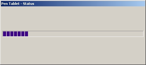
install3

Then notification that installation was complete…
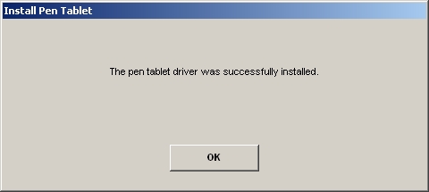
install4

After finishing that, I was offered the video tutorials on how to do different things.  For first-time users, a very useful resource…
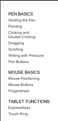
install5

And finally the extras that are included on the CD.  I am not sure about files with an extension of x32, but believe this is a carry-over from Macromedia software like Flash.  Since I do not own Flash, I can only guess based on my own research…
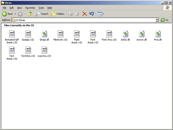
install6

Ad additional CD also gives you a copy of Photoshop Elements 5, Nik Color Efex Pro 2, and Corel Painter Essentials 3.0, which also help to offset the cost the the product.  I didn’t want to open this and negate the serials or licenses of the products contained, but did scan the front side so you can see what you get in the companion CD:
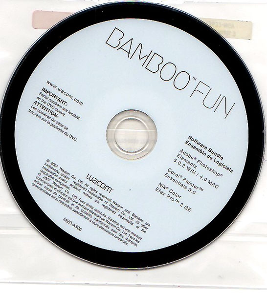
bamboofun0021

Configuration

The added buttons at the top of the tablet make for some very intuitive advancements in its usability and properties.  Rather than cover each of these in detail, screen views of each tab (there are four total) should be indicative enough of the control and customization you can get:
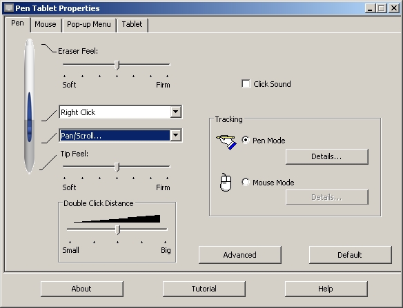
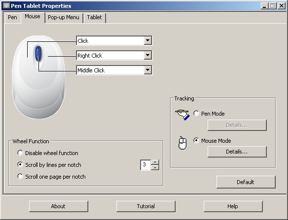
config1

config2

config3

Pop Up Configuration

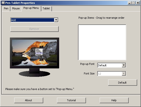
The pop-up tab is probably the only tab that isn’t completely self-explanatory, so let me delve into a little more detail here. The reason why is because you can program common keyboard combinations (like the ones I referenced in my post last Friday) to be controlled from the tablet (provided you have “Pop-up menu” selected as on option on the tablet tab (seen next)…

Here’s how you do it:

First, click the drop-down to indicate what it is you want to program on the tablet.  For me, the biggest advantage would be in incorporating keyboard keystroke combos so I have to switch less between kb and tablet.
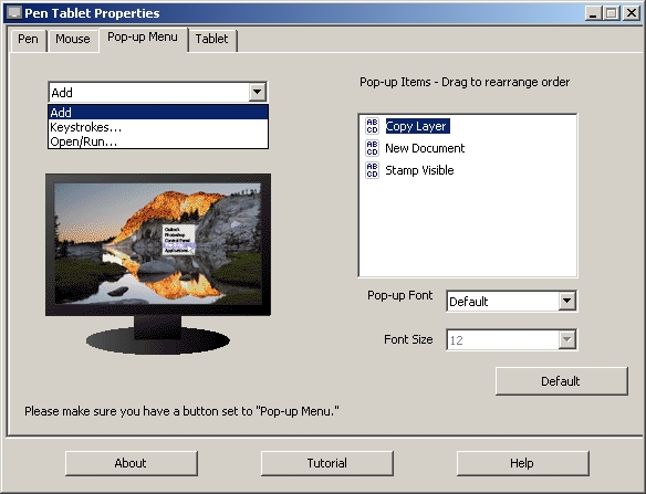
popup1

You’ll get a window now where you can define the keystrokes you want simply by typing that keystroke set in the blank space…
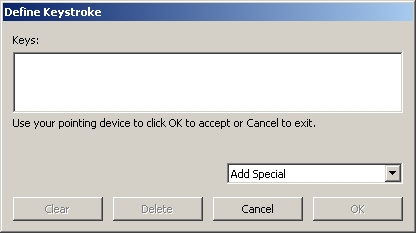
popup2

The tablet will detect your keystrokes and populate the fields
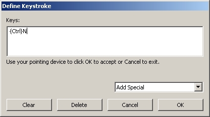
popup3

Then, give your keystroke set a name…
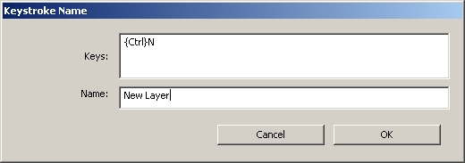
popup4

and Click OK.  You can see the ones I programmed below…
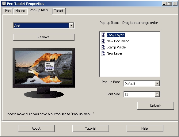
popup5

Last but not least, you can also include special keystroke combinations that are unique to your system (like Printscreen on Windows), as shown next:
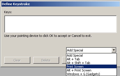
popup6

So, you can see how having the pop-up tab configured with your most commonly used keyboard combinations, as you can reduce the swapping between inputs even more!  Very cool!  And here’s what the right-click menu looks like once inside Photoshop:
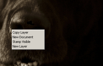
popup7

But, make sure you have a button set on the tablet to “drop down” (as shown next…)
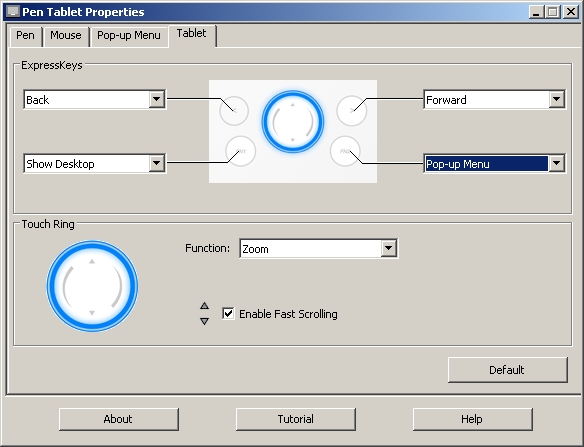
config41

Mechanics

Here is where your specific work flow may have an impact.  On my Windows desktop environment, I have a 19″ and a 17″ LCD, so that’s roughly 36″ of real estate that this tablet (which measures roughly 6×4″) has to cover.  What this means is that movements on a scale that size makes everything larger proportionally speaking.  You can adjust the tablet settings under the pen mode details screen to manipulate for just one monitor instead of all screens, but if I am going to use a tablet, Idon’t want to jump between that, a keyboard AND a mouse…two inputs is all I really would want to switch between, but that’s just personal preference.  But, for those that are interested, here’s how you make that adjustment in the pen settings tab of the tablet properties.  Click on the pen tab of the tablet properties, then the details button to get this screen:
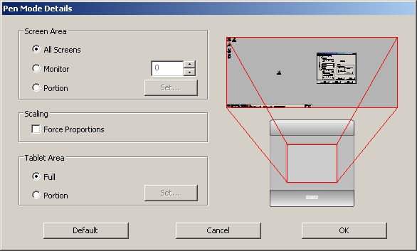
config5

From here, change the button from “All Screens” to “Monitor”.  It will default to the monitor you have set ot #1:
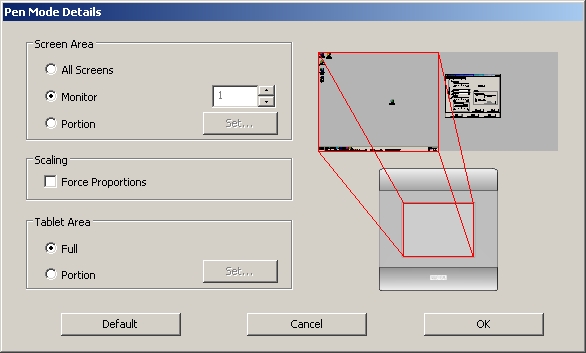
config6

But you can use the arrows to set it to monitor two if you prefer:
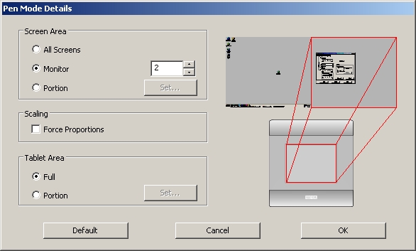
config7

On my Macbook Pro, since I only had the one monitor, the experience was quite different as I had less real estate for the tablet to cover – with only a 15″  LCD of screen space to cover.  So the pen was much less sensitive to location on the touch pad given that less than half the real estate was needed to cover the range of the screen (and I noticed greater position control even when I did just the 19″ monitor versus the 15″ LCD of the MBP – it’s just a happenstance of the tablet size, and the only way to do that would be to increase the tablet size – at the expense of desk real estate space…pick your poison, ya know?)

Usage

Tablets rock!  Let’s just get that bias out of the way right off.  If you want the ultimate in cursor control (and when I say cursor I mean movement of your tool, whether it be a brush, a pencil, an eraser, clone stamp, whatever, it’s just amazing).  The first major difference between a mouse and a tablet is touch sensitivity.  No matter how you tap a mouse, it delivers the same intensity or strength when it paints in Photoshop.  With a tablet, this is not the case at all.  How hard you press determines the strength of the brush.  This is truly remarkable as now you can apply just a touch, or go full hog on anything you want from painting, to clone stamping, and anything you want.  To demonstrate, I created a blank document and selected some brush settings to illustrate what I am talking about.  Take a look:  from left to right are light touches to hard pressing with the pen…followed by dots of the same strength top to bottom.
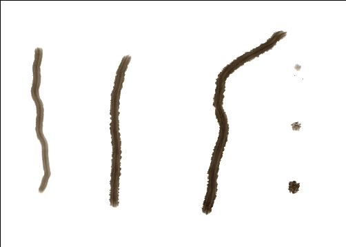
use1

So now you can control things like jitter, hardness, and a whole myriad of options that you didn’t have before (well, at least not to the same degree anyway) with just a mouse.  I know what you’re thinking now – “Great, for graphic design that’s super cool, but how can I use this as a photographer?”  Excellent question!   Ever catch a picture where the eyes are darker and you want to brighten them up?  Well, now you can with greater ease and control both of area, intensity of the lightening (or darkening) by using the pen tool for the Bamboo Fun.  Take a look at the sample below, where I took an underexposed picture of the dog and selectively lightened the eyes and teeth, here’s the before:
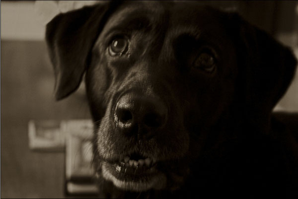
use5

and after:

use4

One of the best parts is that this functionality is there in whatever application you use that incorporates brushes.  I tried it in Photoshop, Lightroom, and Corel Painter Pro (I installed a demo version of the last one for this review).  The Bamboo Fun can also expand your ability to clone things out, say a stray light pole or some telephone wires, or even the nasty -ex that you want out of that super cool shot of you in Hawaii!  The possibilities are limitless both for graphic designers and photographers.

So, this now begets the question of why I don’t have one in my home environment.  The main reason is because I’ve never had the need at home.  Most of the time I am at work, and if I need to work that requires that level of control, the work hardware has always been there for me.  Granted I’ve also gotten used to the Wacom Cintiq which has a much larger surface area, so I have even a greater degree of control over the desktop, cross-hairs, and all brushes, so it’s also a matter of being spoiled – I just can’t afford a Cintiq at home, or justify its need – I am just not that much of a re-toucher either with photos or in graphics design creation.

Additionally, for me, the use is only really there in graphic design, because I am also of the mentality of “getting it right in camera”, so I don’t like to do a lot of edits in photos.  Of course no one is perfect so I do occasionally need to do some fine tuning that requires a tablet.  In cases when I do, I just take the photo in to work and do the retouching there as the tablet does give a much greater amount of control than any mouse or trackball will.

When I’ve not been successful in camera, it’s not that my home work flow is good enough, it’s just that the tools are already there for me if needed at work, so the financial justification really hasn’t been there.   As my personal usage has been increasing lately though, I must admit that I am thinking more and more about adding a tablet to my home work flow.   So, would I would recommend this?

Yes!  This would make a great tablet for anyone who does not have access to a tablet elsewhere, or if you are looking to enter the tablet market – the Bamboo Fun is a great entry level tablet, that takes up minimal desk space while offering a maximum range of precision and control.  I think for my own personal usage, I would probably prefer a larger tablet because I do have the desk space, and have been accustomed (as I said) to the Cintiq, so perhaps the Intuous 4 would be more easily incorporated…but only time will tell!)

Finally, as prone as we are to repetitive motions, and with conditions like Carpal Tunnel Syndrome becoming much more common, the tablet does offer a much less repeated motion tendency than a mouse or a tablet.  So, if you make the move to a tablet, you are only decreasing your chances of things like Carpal Tunnel and repetitive motion problems in your wrists.

Two thumbs up (in Siskel and Ebert style) for the Bamboo Fun from the good folks at Wacom.  Many thanks for the demo product, and I am sure the listening/reading audience appreicates their generosity as well.  Happy shooting everyone, and we’ll see you back here tomorrow for an exciting software review that includes the announcement of our latest contest, which is starting in July!).

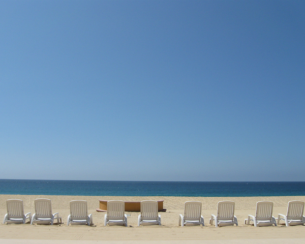
Friday Fab Five

For something new here on the blog, I thought it might be fun to share some of my favorite keyboard shortcuts in Photoshop.  The idea here is that people will share their top five in the comments area and we can get an idea of many more keyboard shortcuts than we ever could have found out on our own (unless of course you are some Photoshop guru like The Photoshop Guys and the trainers/instructors of the world that do this for a living and already know all the shortcuts.)

So, anyway, here’s my Friday Fab Five Photoshop shortcuts and what they do:

  1. CMD/CTRL+J = duplicates your existing layer
  2. CRTL+ALT+SHIFT+E = Stamp Visible  This takes all your visible layers and merges them onto a new layer.  Increases file size, but very cool
  3. CMD/CTRL+’ = (yes, that’s apostrophe) – it activates the grid in your preferences.  Since my grid is set to every 33.33% and one subdivision, it basically shows a Rule of Thirds grid overlay on my images – very handy for compositional cropping
  4. Left and right brackets – decrease and increase your active brush, whether it’s for clone stamp, healing brush, eraser, history brush – whatever
  5. Alt+Eyedropper = you can drag the eyedropper outside of Photoshop to sample a color in another application (great for color matching)

So, those are my five for this friday – what are yours?  Sound off in the comments!  In the meantime, have a great weekend and happy shooting! I’ll leave you with my favorite What the Duck cartoon of the week:

wtd732

Grab the Feed

Photoshop CS3 vs Elements 7.0 – Part One

Ever since Tom Hogarty came on the podcast and I’ve had some time to dive into Lightroom, I am thinking more and more that this is a much better solution for managing all of my photo assets.  Since I’ve found myself spending more time in LR and less time in PS CS3 (Extended), I started debating if I really needed so much horsepower under the hood.  After all, CS3 Extended is quite the workhorse, from performance, to functionality, to footprint, and of course, price. It left me wondering about my upgrade path.

In all honesty though, I think the term “upgrade” may be a misnomer – after all, am I really using all the features of the full version of Photoshop Cs3?  If not, what’s the point in upgrading?  Perhaps I should be looking at a downgrade.  After all, I really do spend less time post processing these days.  So, what are the differences between CS3 and this thing called Elements?  Well, for the loyal readers of this blog, I decided to find out.

First up, I downloaded a trial version of Elements 7.0 from Adobe’s website.  The download is about half the size  of the Photoshop Cs4 download (400+ MB for Windows Elements, and over 800 MB for Photoshop Creative Suite on Windows).  To the geek in me, that means a smaller footprint on my hard drive, and less consumption of system resources.   Something to consider…

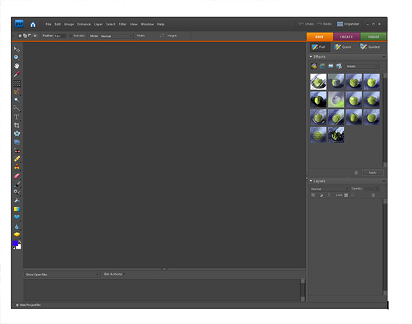
Anyway, I decided to really do a side by side comparison, and loaded CS3 and Elements in their default work spaces, then compared notes.  Here’s what I found (CS3 is first, Elements is second):

Photoshop CS3 Default Workspace
Default Elements Workspace

Wow!  Quite a difference.  I first noticed the much darker color of the work space for Elements.  Not that big a deal in the grand scheme of things, but something that I would necessarily have to adjust to.  So, what else is there?  Well, rather than go over each painstaking difference of the two applications, I decided to just give a quick overview here.  And, with the quick overview, I figured the best place to start would be the toolbars, since that’s what we really need to use in either of these anyway, right?  So, let’s look at them side-by-side:

Photoshop CS3 Extended Toolbar
Photoshop Elements Toolbar

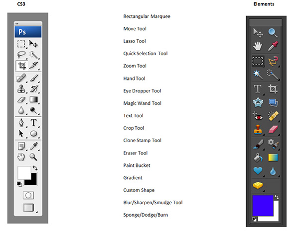
They actually don’t look too diferent when you look at them side by side, do they?  I didn’t think so, and I set out to count the various tool bars.  Know what?  On a quick overview of the 22 tools in CS3, I counted 17 commonalities between CS3 and Elements 7!  That’s a lot of overlap!  Are there more buried tools in CS3?  Most likely.  On quick count, I found 60 tools throughout the CS3 Toolbar.  In elements, 48!  Even still, not a lot extra.  From a percentage perspective, that is 20% additional functionality in CS3 Extended versus Elements 7.0  My guess is CS3 Regular would have less of a difference still.

The question is though – how often do you go searching for some buried tool in CS3?  As a photographer, in all honesty, not that often.  If you think about it, as photographers, we crop, re-size, perhaps straighten an occasional horizon, add some sharpening, and if we want to get really serious with a photo, we’ll do some dodging and burning.  All of these functions are present in Elements 7.0

So, why would you want to go with the CS3 or CS4 version of Photoshop – truly if you want to take your photos to the Nth degree, or do serious work like graphic design, web design, or photo restoration, I can totally see the need for some of the more advanced tools in the Creative Suite.  But more and more, I find myself using CS3 less and less.  Take a look at the commonalities listed below – these are identical features in both applications!  It took me a little by surprise when I noticed the similarities even in tool names.  See if you can find the common tools from the listing below:

Common Tools between CS3 and Elements

So, what other important factors go into an image editing program for me?  Well, having been working in the Creative Suite for a long time – I do enjoy the benefits of layered files for different purposes.  Well, guess what – Elements does that too!  That means you can edit and save files as PSD’s!

I also like using actions to automate my work flow.  Uh Oh…from my initial glance, it does not appear that Elements 7.0 has this functionality built in.  But, can it be added?  Well, a Google search on the topic of “Elements Actions” says yes, so I think I could probably figure it out enough to eek the process to my needs.

The other major functionality I have an interest in is the ability to edit and manage raw files from my camera.  Can I see the raw files?  Sure enough, the ACR converter has made its way into Elements as well!

Adobe Camera Raw Converter in Elements

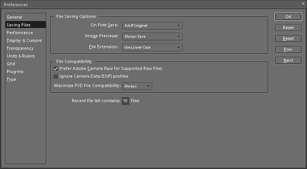
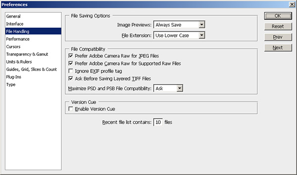
In fact, a lot of the preferences settings seem to have migrated over from Photoshop CS3…look at the same screen from there:

Photoshop CS3 Preferences Settings

As similarities continue to mount, the last major thing to consider is price.  Retail, CS4 runs at $700 for the full price, an upgrade runs $200.  Elements?  Well, I think y’all know where this is headed:  Retail $139 and upgrade for $119.  I don’t know about you, but that is a HUGE cost savings.  It almost seems too good to be true, and given my penchant for not taking things at face value – I will take a look at the image processing capabilities in greater detail next week.  We’ll take a look at noise handling, speed, performance, and see how it does with a variety of images from my Canon 40D.

The biggest downside that I can see is that you don’t have the color management capabilities in Elements that you have in the Creative Suite – I like making some LAB adjustments from time to time, and filters may suffer in availability too – but more on that next week.

For the time being though, given the similarity in apparent functionality, the reduced price for Elements, and the proportionate footprint on my computer – Elements is definitely a contender.  For all I know – as I learn more about Lightroom after the workshop from Scott Kelby and NAPP on Wednesday, the idea of a separate application for image editing may go by the wayside too, especially when the cost for the CS product is 400% that of Elements.

So, what do you think?  Anyone out there using Elements?  Any other downgraders care to share their thoughts?  Have you enjoyed downsizing?  Found things you missed?  Workarounds?  Add-ons?  Tell me more as I continue to explore Elements next week – I’ll add reader observations there too!  In the meantime, happy shooting, and we’ll see you back here tomorrow after the NAPP workshop!

The Rule of Thirds Really Does Work!

When it comes to composing our images – we are always looking for new ways and angles to capture things.  Often though, sometimes the traditional methods work too though.  In fact, I would venture to guess that if shown 100 pictures where the standard rules of composition were followed, and then 100 pictures where standard rules were deviated from, the former would have more shots that found a widespread appeal.  The rationale?  Standard rules usually will work – that’s why they are the standards.  Things like the Golden Mean, the Rule of Thirds, and Sunny 16 are all basic rules of composition and exposure, and if you want to ensure things “just work” – traditional rules really will work the majority of the time.

For the purposes of this post, I am going to talk about one of the most basic rules – the Rule of Thirds.  The Rule of Thirds (or ROT) basically says that if you divide your image area up into a grid, where the horizontal andvertical areas are divided equally into thirds – you will get cross-sections that define where your points of interest should be – often called hot points.  Here’s a diagram to help demonstrate:

rotgrid1a

So, here the frame is divided (roughly) into thirds both vertically and horizontally.  Where the lines intersect, I’ve created red circles to indicate the “hot points”.  These are your points of interest.  If all else fails, placing your subject matter in these areas (or close to them) will dramatically improve your composition.  Here’s a great example:

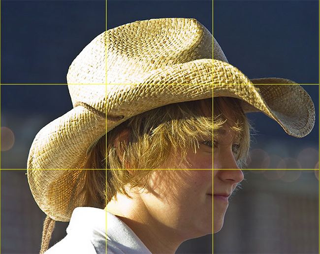
rotgrid2

Here’s a shot of a carriage girl I took back in Charleston.  See where the cross-sections are?  I changed the color of the grid to make it easier to view – so you can tell that her eye is right on the marker for the right-most third grid line.  This really helps the composition that her eye is there instead of elsewhere (often times, there is a tendency to place the eyes closer to the center of the frame – resist that temptation to give your shots that extra oomph!).

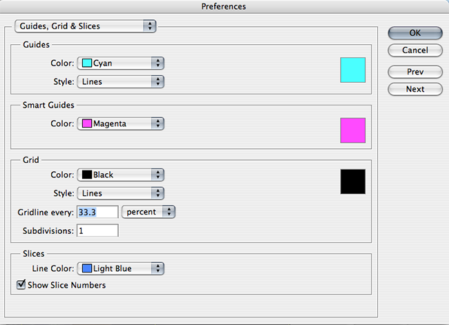
In fact the ROT concept s such a well-known standard, the folks over at Adobe have incorporated that element into their crop tool – so that you can crop your images to adhere to this rule.  Since I will likely get someone to ask – you can create this ROT grid in other variants of Photoshop (CS family), but going to your application preferences and selecting the Grids, Guides, and Slices option.  In there, change your grid size to display lines every 33.3% and number of grids to 1.  Then choose a strong color so that when you display the grid – you can see it!  Click OK and you are done – from now on, to show the ROT grid when cropping or editing in the CS family – simply use the CMD/CTRL key and the apostrophe ( this doohickey  ‘   ) to toggle the grid on and off.  Here’s a capture of the area you need to make the changes:

rotgrid4

There you have it – the Rule of Thirds grid – what it means and how to use it!  Any other rules of composition you would like explained?  Feel free to email, share your thoughts, ideas, suggestions and feedback in the comments or privately (if you rather would preserve anonymity).  In the meantime, go out, take some shots and practice visualizing that ROT grid in camera – that’s what will turn your snapshots into great shots!  Getting it right in camera!  Happy shooting and we’ll see you back here again tomorrow!
Adobe’s DNG Converter

For many of us, an upgrade of one element in our tool kit comes with many unforeseen consequences and additional expenditures.  Just as a new camera body can necesitate the need for larger memory cards, hardware upgrades can also come with software upgrades.  The reason?  Camera file formats!  As camera vendors develop new proprietary formats for their raw file formats (CR2 for Canon and NEF for Nikon as the two predominant players in the game), the need has always existed to update your software to accommodate the new formats for body upgrades.

The best example of this was when I did my upgrade of the Canon XT to the Canon 40D just last year (or was it two years ago now?)…at the time I was using Adobe Photoshop CS2 to process my files.  Well CS2 development stopped as CS3 development started.  My Canon 40D was stuck in between application life cycles, and as a result, I was no longer able to process my CR2 files from the 40D natively in CS2.  Granted, I did upgrade to CS3 because of my interest in the field, but for those that either may not be interested in the software upgrade, or cannot afford to upgrade, there is a free alternative from Adobe – the Adobe DNG converter.

This is a really cool utility and it gets updated on the same schedule as the Adobe Camera Raw utility that is unique to the image-editing applications of all Photoshop applications (CS4, LR, etc.).  The Adobe DNG stands for a Digital NeGative so it may help to think of this as a way of preserving your original data, yet still making it accessible, regardless of what other developments happen in the software world down the road.  I know, we all think that Adobe will be around forever, but the same was also thought of Kodak 20 years ago – and now those Kodak CD’s are becoming difficult to manage.  With that little nugget, it may be useful to consider the Adobe DNG option.  Additionally, the Adobe DNG negative has been submitted to the ISO standards setting organization for acceptance as a universal conversion utility, and are releasing it under the GNU licensing, so it will hopefully always be available for anyone.

With the stage set then,  for those who are not able to or not interested in upgrading, here is a brief tutorial of the Adobe DNG converter (in it’s current iteration as of 4/27/09), with screenshots.  If your folders of images look like this:

dng6

Then the Adobe DNG Conversion Utility may be for you.  It starts pretty easily…you can download the Windows or Mac versions of it from here:

Windows DNG Converter

Mac DNG Converter

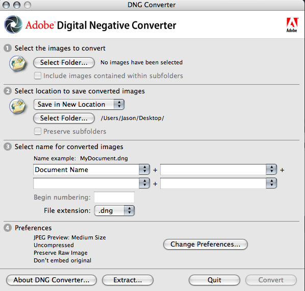
Once you download and install this utility (did I mention it’s free?), start the application to get this screen:

dng1

First off, specify the path where the images are that you want to encapsulate into the DNG format.  You can specify one folder, or you can specifiy a folder and all its sub-folders (in case you want to convert an entire library or set of images at once).  Then specify the output folder and naming convention you want to use.  Once that’s been decided, it’s time to select your preferences for how you convert your images.

dng2

Click on the “Preferences button” to specify how you want to conversion to occur:  Do you want full size conversions or do you want to reduce the image resolution sizes for smaller storage requirements?  (I always choose full size for maximum flexibility.)  What about compression?  Adding compression can further reduce the footprint that each DNG file has on your hard drive.  (It’s a judgement call, but I choose not to compress, again to maximize flexibility down the road.)  What about conversion methods?  You can convert to a linear format, but I don’t like this option because it’s a one-way street (you can’t go back).  Last but not least, what about inclusion of the original raw file?  In most cases I would actually recommend that.  It may increase file size, but this way you have access to the original raw date if your software needs ever change and you have access to software that can better handle the raw data you currently may not be able to manage.  All these are things to consider.  Hopefully, this short explanation of your options and the pros/cons will help in deciding how to proceed.

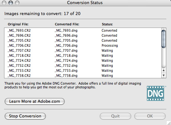
From here it’s pretty straightforward – you’ve specified everything from your input folder to your output folder, naming conventions, and conversion preferences, so now, simply click the button on the lower right to start the conversion process.  You will get a dialog window showing you the progress:

dng3

If you like, you can always click the button in the lower left to stop or abort the conversion process in case you specify the wrong folder or for some other reason.  Once the process is complete, the window will show all converted images.  Simply click “OK” to close the DNG converter utility from that window, as shown below:

dng4

Finally, open the destination folder, and voila!  Your image files will now have thumbnail previews again:

dng5

There you have it, your files are now prepped for one of the easiest, simplest, and most cost effective ways (did I mention this is free?) for both management, archiving, and accessibility – 3 very important things to consider in your image management workflow.

Granted, as with anything else, the Adobe DNG converter utility is not for everyone, as we all have work flows that call for different approaches.  So, what approaches do you use?  Feel free to share your own thoughts, processes, and suc in the comments or via email.  Happy shooting and we’ll see you back here tomorrow!