Cabo Creativity

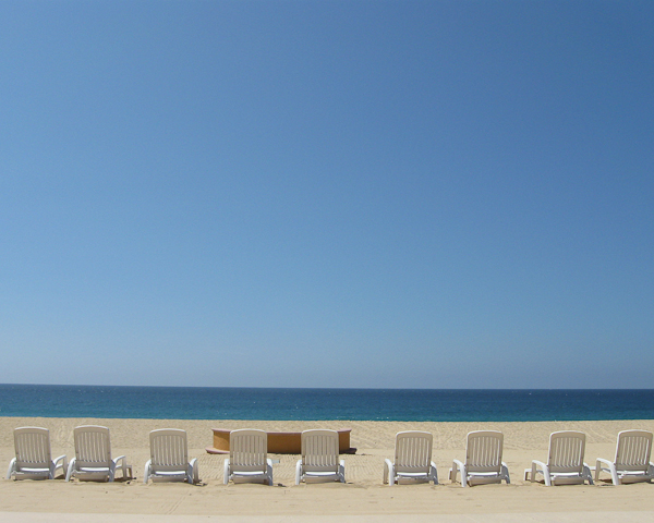
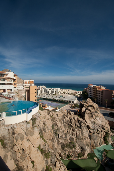
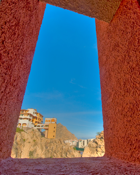
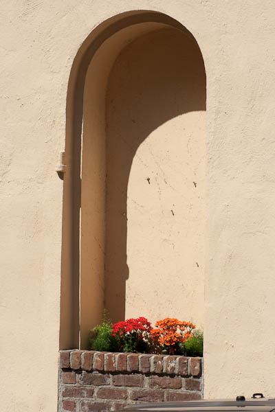
Last week’s first ever 5-day series of written work “The Five Elements of Control” featured 5 distinct ways in which you can control and increase the impact of your work.  Those elements were through controlling for luminance, color, geometry, context, and composition. Hopefully, the perspective can be one many will find useful in elevating their own work.  In taking the task to heart, today (my first day back after a week-long break in beautiful Cabo San Lucas), I am sharing a slideshow of some of my favorite recent shots.  So, rather than suggesting others incorporate these techniques, I am trying to apply them to my own efforts as well. Here is where you get the chance to be the critic for my work, so by all means, share your thoughts, comments, feedback, and perspectives below.

In other blog and podcast notes, don’t forget, the $500 giveaway for the Thinktank Photo Multimedia Bag and Topaz Labs plugin bundle is still going on over on the Flickr site.  We’re in the last week for submissions so we can wrap things up by the end of September, so time is drawing nigh!  The thread to share your pictures (and the guidelines) is here for those interested.  It’s a great opportunity to take advantage of some great products from Topaz Labs and Thinktank Photo (and thanks go out to the sponsors for their generous contributions)!

In case you haven’t noticed the sidebar, there are now short little audio tips being offered up courtesy of the folks over at Audioboo.  The latest comes  the shores of Cabo San Lucas with the peaceful waves of the Pacific crashing in the background!  So, for the feed readers out there, stop on over to the blog and check out the audio tips – some hopefully good stuff there too.

Thanks also to the recording capabilities of my wife’s point-and-shoot camera, you are in for a special treat tomorrow in the form of a Quicktime video!  Until then, here’s the promised stills from the trip.  Happy shooting everyone and we’ll see you back here again tomorrow.  (Don’t forget to let me know your thoughts and feedback in the comments!)

Mexican Harbor
Mexican Harbor
Negative Space
Negative Space
The Power of the Waves
Umbrella Dots
Umbrella Dots
In Honor of Escher
In Honor of Escher
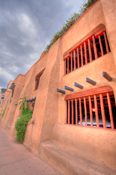
Through a Window
Through a Window

As a little postscript, since many will ask, I did my post processing in Lightroom and Photomatix (yes, some of these are HDR images).  One image did reveal a pretty heavy dust spot on my sensor, so that one did see a round-robin through Photoshop for that one speck.

Five Elements of Control: #5 Composition

You knew it had to come back to this, right?  I know, everyone is screaming by now “But Jason, you’ve talked about the Rule of Thirds until the cows literally came home!”  Truth be told though, most people think about compositional positioning with their subject matter.  While it’s true that subjects are ideally placed on a hot spot or along one of the gridlines in the ROT grid, but you can break the rules too, ya know!  I say, put anything you want on a grid spot.  Or don’t have a specific point of interest!  Make the subject of your photo the space – negative space, as previously mentioned, can be a powerful thing!

You can also think of the ROT grid for any point of interest, not just subject points of interest.  And, since we know that light (luminance, contrast, whatever your semantics prefer), geometry, color, and context can all be points of interest, then you can put any of these there and create visually grabbing photographs.

The greatest part of this exercise though, is that now we are looking at everything in a lot of new and creative ways.  I bet you are asking yourselves lots of questions now:  Does that light look good?  DO those colors complement each other?  What about that round  wheel in a square table – that could be interesting, right?  Keep on thinking and looking at the world around you from different angles and perspectives.  Sooner than you realize it (if not already), your eyes will dart all over the place looking at things and you might not even be conscious that you are doing it.

When we migrate these exercises from the front of our brain to the back of our brains, making them automatic to the point where we no longer need to even think about looking for things – we just do it, then believe it or not, the compositional perspective also becomes second nature.  You are already looking at how the light and colors on this corner of the room are really awesome contrasts to the darker shadows on the other side – and how cool is it that the funnel of light literally cuts through the darkness on that gridline?!

Some days you’ll have epiphanies, realizations, and great moments to capture, while others you may not see as many.  Rest assured though, once your brain and eyes are trained to look for it – you’ll see it everywhere you go.  So, take a look at the world around you – see what catches your eye – ask why if you like, but enjoy your moments, because these are the ones where you can really get creative with composition and take your photography to the next level!  Just remember the Five Elements of Control:

Luminance
Color
Geometry
Context
Composition

Have a great weekend everyone – this officially wraps up my first week-long thematic series of blog posts.  Hopefully you’ve found each one rewarding individually, and I would welcome any feedback, thoughts critiques, and comments, because this will likely become an eBook download.  I’ll expand on each element some more, and include even more photos as examples of each, along with detailed critiques and highlights to help show readers why certain ones work, and others don’t.

So please let me know your thought!   Who knows, feedback may get you a free copy of the eBook and a mention in the credits if you do!  Thanks too, for all the comments already throughout this week, with your comments and insights on both the written word and photographs.  We’ll be back to regular posting starting Monday!  Until then, Happy Shooting!

Grab the Feed

Five Elements of Control: #4 Context

Have you ever seen something that looks so out of place that it catches your eye?  Well catch it with your lens too, because contextual positioning of subjects in interesting or unusual/unexpected areas creates visual interest.  This is what I refer to as controlling the context of your subject.  So many times I’ve heard people tell me “but how can I change the surroundings?”  The answer lies not in changing the surroundings of subjects you want to shoot, butin reversing that idea:  find unusual subjects in your given surroundings.  Say you are on a photo walk and in a city area.  Well, try and find subject matter that contradicts the sense of city.

Additionally, you can also create contextual appeal by the use of negative space too.  See something standing all by itsef, or away from other things?  That’s a picture possibility!  Conversely, something that is amidst other things could be a cue for creative expression.  What if you saw a plastic water bottle among some glass beer bottles?  That could be cool…or what if you had a computer mouse sitting in a mousetrap?  You can create subject and background contextual associations in your own environment too ya know.  Photographers that make good money do it all the time.  (Hint:  that’s called stock photography! 🙂 )

Here’s a few examples to give you a springboard for creativity.  Find something you like?  Tell me below!  (I love to get feedback on photos just like everyone else…)  Got your own ideas?  Share those below too!  Sound off in the comments, and don’t forget to keep on shooting!  (That Flickr Contest thread is still alive and kicking you know – great chance to win $500 of gear, including a Thinktank bag System and a copy of the Topaz Labs PS Plugin Bundle!)

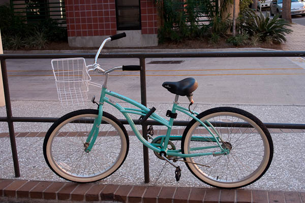
Trapped Bicycle
Trapped Bicycle

Hidden Planter
Hidden Planter

Hidden Planter
Hidden Planter
Alcohol Plumbing
Alcohol Plumbing

Grab the feed

Five Elements of Control: #3 Geometry

Earlier this week, we looked at the idea of how contrast/luminance can impact a photo, and that your creative style may tend toward a wider contrast or a narrower contrast.  Then, yesterday we looked at how the element of color can impact a photo, both in the sense of how colors can balance and compete against one another, and how bright versus dark colors can play off each other.  Since we’re moving from more theoretical to more tangible elements that we want to include in our photos, next up is the geometry of our photos.

So, what is geometry?  Basically, it’s shapes!  Shapes are everywhere, and the types of shapes (or the geometry) can play a huge role in the impact of your photos.  So, it makes sense to include geometry as an element of control.  Since shapes are nothing more than lines that are connected together, this also means we are looking at the lines in a photo.  Whether it’s long rectangular lines of grass or circular lines of a persons eyes, the sharpness of square and angles lines in architecture or the looping curves of ovals in a landscape, shapes and lines can really define our work.  So, with that in mind, let’s look at a few photos here to help illustrate what kind of impact different shapes can have.  Look through the images and see if you can find all the different types of geometric shapes.  What kinds of shapes do you see?  DO they help or hurt the photos?  Share your thoughts in the comments!  In the meantime, Happy Shooting and we’ll see you back here tomorrow for #4 of the Five Elements of Control…(any guess what it is? 🙂 )

Curved Seashell
Curved Seashell
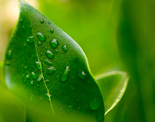
Dew-dropped Leaf
Dew-dropped Leaf
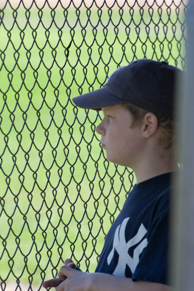
Looking through the Fenceline...
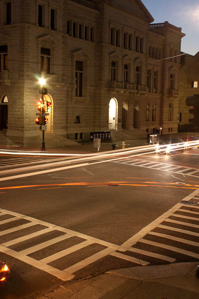
Charleston Street Corner
Days of Yore
Days of Yore

Grab the Feed

Five Elements of Control: #2 Color

Yesterday was all about light and the way that contrasts or changes in that light can have a pretty dramatic impact on your work when you present it to others.  Of equal importance to photography though is the element of color. If you don’t take color shades and variances into consideration, then you have lost an element of control in your photography.

When we think of color, many of us are familiar with the three primaries. Red, Green, and Blue as these are letters of one of the most common color spaces (Adobe RGB).  Surely though, even though we may not consciously think about it, there are more than three colors out there.  Even the traditional axiom of a ROYGBIV rainbow only indicates 7 colors (red, orange, yellow, green, blue, indigo, and violet), and there are way more than that within the color spectrum.  So, let’s take a look at the entire spectrum of color:

The Color Spectrum
The Color Spectrum

Since colors represent particular wavelengths of light, you can see how light and color tie into one another very quickly.  Just because you define something as “red”, doesn’t give a complete description of that color, because there can be so many nuances, shades, hues, or wavelengths of red.  So, in understanding that color is something we can control for, it’s first helpful to know that you are still controlling for luminance, light, or contrast while also controlling for color, because the shades you let come through in your photos will also be somewhat controlled by the amount of contrast, luminance, or light.

Another way in which color can control how people view and perceive your images is to understand the idea behind complementary colors.  Some colors work well together, while others don’t.  For instance, take a look at the photo below:

Yellow Flowers
Yellow Flowers

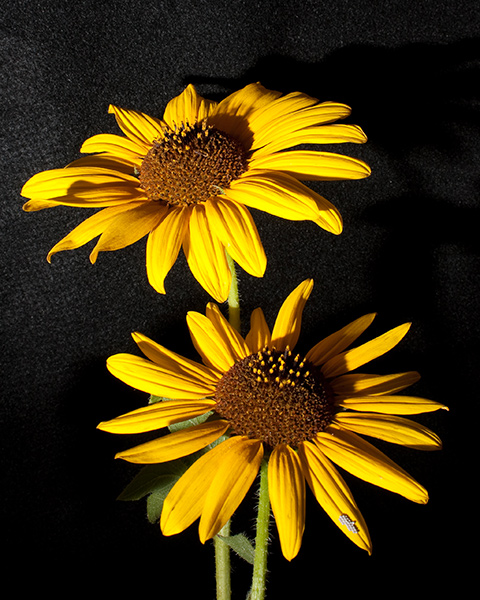
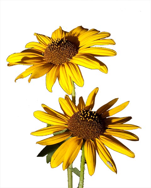
So, in looking at this photo – which do you think the contrasting colors are?  A typical kneejerk reaction would be to say the yellow and the black are the two contrasting colors.  Black though, really from a visual perspective means a total lack of color (black = nothing, white = everything…remember grade school?).  So, really the contrasting colors would probably be the yellow and what?  The greens of the stems or the browns of the center?  A case could be made for either, but I am going to go with the browns here.  If you look back at the color spectrum, you can see that yellow and brown are relatively close together (as are yellow and green) – they are actually right next to one another – so they complement each other nicely.  It’s also no accident that these colors are in use with the black background too.  Because the colors are of the brighter variety, they look better with a darker background.  There’s two elements of color at play here then, complementary colors (colors that work well together due to proximity on the color spectrum) and color luminance (light versus dark colors).  If you want a lighter color to stand out, then place it in a scene where the rest of the background is either much darker (or vice versa).  To show how this works, look at the same image when I replace the background with white rather than black:

Bad color control
Bad color control

See how brighter colors look with a brighter background?  Now granted, the mask job was  rather quick and messy, but you can see how the colors and their background can have a huge impact on the quality of your work.  While this speaks more to the luminance and contrast factor from yesterday, it can also help in understanding how to position colors in your work so subjects can get the attention they deserve.  Pretty cool, eh?

So, which are your favorite complementary colors?  Do you like the yellows and greens?  Or the red and blues?  Or violets and purples?  Don’t forget color shades too – as light never really leaves the picture (both figuratively and literally speaking)!  Which scenes do you like?  Answering these questions in not only the works of others, but also in your own work can help develop your sense of style and define what makes your work unique, so embrace your originality!  Sound off in the comments with your take on controlling color in your images!

Five Elements of Control: #1 Luminance

This week I am doing something special here on the blog – starting a week long series on the subject of Control.  We can control our photography in several different ways, and I’ve seen different outlets talk about each of these (and others) to a certain degree, but I’ve not seen many that address all of these elements collectively.  Since a discussion of all the elements that go into a photograph would be both exhaustive and likely impossible to touch on everything, it would probably be better to narrow that focus (pardon the pun) on some of the more salient elements to consider.  Today, the element of control that I’ll be looking to in more depth is:

Contrast/Luminance

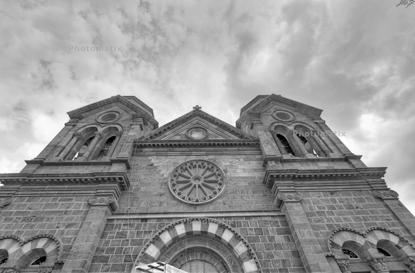
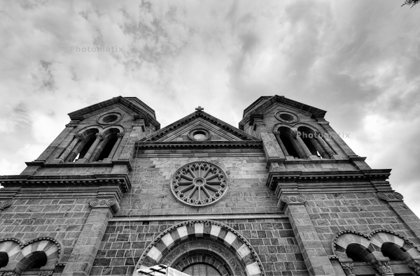
Contrast, or luminance, can be described as the tonal range of light within a photo.  If the tonal range is broad, then that means we have an extensive range of tonality from the lightest point to the darkest point in the photo.  Likewise, a narrow tonal range will mean that we have a limited range of tonality from the lightest point to the darkest point in your photo.  Take a look at the following two photos and see if you can determine which one has a broader and a more narrow tonal range.

Santa Fe Church #1
Santa Fe Church #1
Santa Fe Church #2
Santa Fe Church #2

It should be pretty clear that one has a wider range of luminance to it than the other.  What’s exciting to learn here though is that this is the same photograph! That’s right!  I simply changed the exposure settings in ACR to output a different result.  Different tastes will look at each of these differently, and like one over the other for a variety of reasons.  What’s important to understand here though, more than anything else, is that all I’ve changed is the luminance.  The tonal range or contrast of luminance can have a powerful impact on a photo, either by how it limits and defines focus or by its range and extent of difference between high and low luminance points as we change from white to black.

So, why am I talking about luminance first?  Because it is probably the most important element to control.  After all, luminance (or contrast) deals with the principle of light!  Photography by definition means to paint with light ((look up the Greek roots photo and graphos)  Without understanding how to control for the element of luminance (a.k.a. contrast or light), the rest won’t really matter too much.  Rather than say more or less luminance is better or worse than the other, (because it really is a matter of subjectivity) I’ll simply leave you to ponder a few things between now and tomorrow:

  1. Which one do you like better?
  2. Why?
  3. What other elements of control can you think of?
  4. Finally, what other examples of the effect of luminance can you think of?  Got any you’d like to share?

Feel free to share your thoughts and sound off in the comments or with me directly via email.  Until tomorrow and the Second Element of Control, Happy Shooting!

Covering the Photo Beat

In the latest release of the LDP podcast, a shorter show this week as I prep for some other ventures, but there’s still enough material to really sink your teeth into.  To start things off, Leica released two new cameras in a synchronized announcement including a full frame ranger finder camera for $6995 and a crop factor camera with 12 MP for just under $2K which will release around the holidays.  More info on both cameras here

The other big photo news of the week comes to us courtesy of Apple, with the latest updates to iPods not only by adding features, but also by decreasing cost.  Find out how this all relates to photography (very cool ways) on the podcast today!  You can get Apple-specific details on their main page.

Second up on the show, the contest news which regular readers mostly know about except for the October announcement of two new sponsors!  Find out who the new sponsors are and what will be the giveaway for October in this episode.

Finally, I also let you know about the latest project to be looking for from CB and LDP – a monthly newsletter, and let you know how to become a featured artist in a monthly newsletter.  Details in the podcast so be sure to tune in and catch all the details today!

We cover the usual spate of listener Questions and Answers, so here’s the links to help answer the issues in this weeks show:

I’d also like to give some special cross-promo props to Kerry Garrison of Camera Dojo last week to talk about the Canon 7D!  It was a lot of fun, and I would encourage anyone looking to add photography-related podcasts to their listening libraries to visit Camera Dojo and pick that up today!  (Also, while you are there, don’t forget to say hey in his community too as he’s got a lot of great resources available.  His website is linked here.)

That’s enough news and excitement for one day, so make sure to stop back in tomorrow for more photography news and info as we head into the tail end of summer weekend photography fun.  Happy shooting all!  Don’t forget to visit the Podcast site here and Digg it!  (Or download through iTunes) and we’ll see you back here tomorrow!

Grab the Feed

Follow me on Twitter

Super Santa Fe

As a kind of salute to the Santa Fe trip from this last weekend, I thought it might be fun to do just a photo-sharing day here on the blog so you can see some of the fun stuff from down in Santa Fe.  We did a lot of walking around both days, so it was definitely a photo-walk type of atmosphere.  The opportunity to take a solo vist over to the historic rail yard in Santa Fe also presented itself so I took advantage of that too.  Here’s a sampling from the trip:

Santa Fe Church
Santa Fe Church
At the Rail Yard
At the Rail Yard

Santa Fe Parking Garage

As you can see, we had a good time.  I wasn’t exactly “focused” on photography as these shots are works in progress, but regardless, I did get the chance to practice a little.  As the old saying goes though, we are always our own worst critic, so I’ll throw the critique doors open to the reading audience too.  Do you like the processing?  Composition?  Technique?  Etc.?  Since some will likely ask, all of these HDR composites were done by pulling into Lightroom, then using the new Photomatix software from HDR Soft.  (Be on the lookout for a review coming up on this latest incarnation too as it’s got some nice advancements and feature additions.)

In other news, keep in mind the latest Giveaway is underway over at the Flickr Group.  You can win the Thinktank Photo Multimedia bag system and a Topaz Labs Photoshop Plugin bundle with a combined retail value of $500 just by submitting your favorite “Think in Color” photo to the Flickr thread!  Until tomorrow, hope all your shots are fun ones!  Happy Shooting!

The Benefits of the Back Story

We all know that our photography at its best can stand on its own – no jazzy or snazzy music, no cheesy frames or doohicky slideshows.  However, some of our best (and worst) photos also come with some pretty incredible stories.  Just one read through Joe McNally’s “The Moment It Clicks” will give you unique insight into how setting the stage or giving some insider perspective on a photo or body of work can both add value and meaning.

A while back, I posted a photo with the title “The Boneyard and the Back Story”.  In that post, the story was in the obstacles that had to be overcome to achieve the photo.  For a nostalgic look back, you can read that entire post here.  Since it’s been a while, I’d like to revisit this idea of sharing more photos along with their back story with everyone.

The Road to Folly Beach

The back story isn’t nearly as glamorous as my previous one, but telling nonetheless.  While this may seem to be a pretty cool shot of a sunset in a marina area, what makes it more meaningful to me is that this was taken in South Carolina.  The dichotomy?  Sunset – on the east coast!  Usually sunrises are associated with facing east and sunsets are facing west, so catching a shot like this at sunset in SC was particularly pleasurable.

How did it happen?  Through networking of course!  When I used to live in SC, a few friends and I started a photo club in the area.  It became relatively successful with a peak membership of 40-50 members.  It still exists today but I do not participate to the same extent that I used to.  Well, a young guy joined the club as he started learning and studying landscape photography.  He lived in the area near this scene and knew of it.  After tracking the sunsets for some time (at least a year or so, which is impressive enough), he knew the time of year to visit and capture images much like the ne above.  Not only did he share this knowledge willingly, but he also invited me to go capture the scene with him one evening.

From my perspective, it was a successful shoot!  But, what about the rest of the audience?  Does it work for you?  What about your own photos and back stories?  Feel free to share links to images and your own stories with the blog either in the comments or with me via email.    Don’t have any yet?  Then make that your next assignment – go in search of a photo and journal the back story!  In the meantime, happy shooting (and story making!)!  We’ll see you again tomorrow.  Don’t forget the September Giveaway with that huge prize package of the Thinktank Photo bag System and Topaz Labs Plugin Collection.  The Flickr thread is open and ready for business!

Grab the Feed

Taking it to the next level!

Writing, writing everywhere

We all have aspirations of taking our work to “the next level”.  How we define our “levels” of success is largely a personal matter.  Here I am always happy to share my aspirations and goals with the larger community.  It is likely no secret that as a blogger, the written word is an enjoyable “tool” for me.  In writing both blog posts here, and articles for the PhotographyBB magazine (and special shout outs and thanks to Dave Seeram, editor-in-chief of said magazine), it has become pretty clear that writing for blogs and writing for magazines requires different approaches.  To that end, there is some content on the blog that has never been incorporated into any magazine.  Likewise, some magazine content has never seen the light of the blogosphere.  Well, that convergence begins today, courtesy of my good friend, Eizabeth Gast (a.k.a. “Firgs” of Design by Firgs).

In looking at her work online with her own blog, and her social presence as well, I thought she might enjoy reading an article I wrote for the magazine.  Well, she has helped with editing, and it now also has a great blog form to it as well.  Since she was so instrumental in its transition from magazine to blog, I offered it up to her for use if she liked – needless to say, I think she liked it enough because it’s on her blog today!  Thanks Firgs!  You are the best!  If you want to read more about the importance of how social networking can play into photography – stop over and read her blog.  Heck, stop over anyway and tell her thanks for me! 🙂

The Comment Contest Winner

In other news, the Comments Contest was a huge success!  With only one repeat and one tweeted link, the count totaled 15, matching the highest total ever received for a single post!  After taking out the repeat and the tweet, lucky #13 is the number I plugged in over at www.Random.org (another link I picked up from Firgs!).  Wit the Random Number Generator (drumroll please…) the winner in the Comments Contest is – believe it or not, lucky #13!  That winner is is andie! So, Andie, if you could drop me an email, you are the lucky winner of a $25 gift card to B&H Photo!

The “Win a Wacom” Giveaway

Submissions for this giveaway are now closed.  Over the next few days I will be going through all the entries and winnowing out the best of the best and choosing a winner!  Be sure to tune in as we move toward Friday!

The Super September Giveaway

Remember the Topaz Labs software I mentioned yesterday?  And the Thinktank Photo Multimedia Bag System? Yup, it’s now time and they are up for grabs in the latest and greatest giveaway over on the Flickr page.  A new thread has been created (yes, a little ahead of schedule), so feel free to start putting your work in there.  The direct link to that thread is here.  The theme is Think in Color, so I am sure a rainbow will appear in short order, with lots of creativity!

I was going to do a write-up of some more plugins from the Topaz Suite, but time and space just got away from me, so if you wanna see more about this great plugin set, be sure to stop back in tomorrow as I promise to have that review together for your reading enjoyment.  On that note, have a rockin’ day and happy shooting!