Creating Compelling Captures

We always are striving to make our images more compelling – to bring the viewer in closer, and to connect better wit our audience.  I have had people ask me pretty much the same thing, but in may different ways and it basically comes down to the something like this: “I get the technical, but it’s the creative side of making compelling images that gets me stuck – what can you suggest?”

It’s the age-old question, and if I had all the answers, well, I’d be filthy rich!  The reason this is the case is because what is compelling or inspiring for one person will be different for another, and yet another, and even a fourth or fifth person.  The truth of the matter is that there is no magical silver bullet of what to do to create compelling images…but there are some things that we, as photographers, can rely on as starting points in our search for compelling captures.  Here’s 5 compelling capture tips that I’ve come up with:

  1. Color – striking colors are always noticeable.  We see the world in shades, tones and nuances of color, so seek out those types of images where color is powerful.  D0 this, and your chances of creating compelling captures increases exponentially!
  2. Light – Surprise surprise!  I’ve talked about light before, and it’s influence in photography (it’s all about light in photography, even the word itself translates partially as light).  Find powerfully lit scenes and you’ve found a compelling moment.
  3. Emotion – Photo journalism relies on this more than any other genre, but if you want to tell a story with your images, one way to do so is to evoke a sense of emotional connection.  Bringing out the emotion in the viewer by presenting scenes that are filled with emotionally charged elements – whether it’s a controversial image of a war zone, or the passion of a mother and her unborn child, these types of scenes stay wit us for a reason, because of the emotion tied to it.
  4. Action – In the words of Joe McNally, “action trumps everything.”  Action shots also connect with the viewer because it speaks to a particular moment in time more than anything else.  That moment a soccer player connects their foot wit a ball, or the moment a bullet shatters a wine glass – it’s something that sparks interest in the viewer, and cannot be ignored as a source of compelling interest.
  5. Eyes – Spoken from the rulebook of a true portraitist, when you have the faces of people or animals in an image – make sure you can see their eyes.  Remember, like the old saying goes, “The eyes are the windows to the soul”, and if you want viewers to connect with an image, one of the most compelling ways to connect with a portrait is to give a hint of what’s inside, and that is almost always done through the eyes of the subject.

So, there you have it – 5 ways to create compelling images.  These are, of course, adages, and there will be exceptions to these rules at times, but as a general rule of thumb, these tips can help you create compelling captures.  There’s also more to it than these 5 ideas, because you know that no single person can completely encompass the ideas behind what creates compelling captures.  So, I would invite you to share your own ideas for what you look to in creating those decisive moments?  Is it something here?  Is there something else you look to for inspiration or to capture something compelling?  What captures your interest when you look at pictures?  Sound off in the comments!

Don’t forget, the November contest has started and a literal bundle of prizes is at stake for some lucky participant so get your creative caps on and throw an image (or two or three) in the Flickr thread.  If you don’t play, you can’t win!  🙂 Until tomorrow then, keep on shooting those compelling images.  Thanks for stopping in and we’ll see you then!

Let Me Light the Way

It’s kind of funny how things go in circles.  As a regular reader of the Strobist website (as I am sure many of you are), I found it interesting that David was covering the RayFlash from ExpoImaging and comparing it to other styles of ringflahses over the last couple of days.  The reason for my interest – today I am actually going to share with you some thoughts on the RayFlash specifically. Continue reading “Let Me Light the Way”

Don’t Touch that Dial

This week we take a look at the dial on your DSLR – what do they do and is it worth it taking it off the Auto Mode?  Or even putting it into the auto mode?  What are the benefits?  Pros? Cons?  There’s thoughts both ways and I’ll look into each and give a few answers on this weeks show.  Also on this weeks show, I had the opportunity to talk with Matthew Bamberg, a well-known and respected photographer and author of digital photography books.  We had a great chat that you definitely are going to want to tune in to to get some tips tricks and places to go for great photography.  Check out the links in the sidebar for his books at Amazon and his website too, over at the hosted version of the podcast with the folks at Personal Life Media.

Lastly, the listener questions and answers, and some contest news rounds out the show too!

  • Daguerreotype
  • Best Scanners for photography
  • Windows 7 – is it for photographers?

Lots to talk about, and a great time all around, including the theme and announcement for the November giveaway!  Thanks for tuning in, and don’t forget to “Digg” the podcast over at PLM, or offer a review in iTunes, or even share your comments here on the blog.  Where do you put your dial?  What do you think of a DSLR in auto mode?  Is it good or bad?  Did I call it right?  Share your thoughts…the listening world wants to know! 🙂  Here’s the web links for stuff we talked about on the show:

Happy shooting everyone and we’ll see you back here tomorrow!

[display_podcast]

Software Review: Noise Ninja

With the October Contest underway where the winner will walk away with a fully licensed copy of Noise Ninja, courtesy of the folks at PictureCode, today is a great day to give everyone an idea of what makes this program one of the industry leaders.  Since I have talked about the presence of noise in your images before (read that post here), re-hashing the principles of what introduces noise and the artistic benefits and image quality downsides of it in your images isn’t really needed.

Instead, here I will simply share some of the interface, and a few before and after shots here so you can get an idea of how well this software handles noise in your images.  So, enjoy!

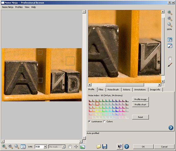
First up (after entering your license code), you’ll have a screen that looks like this:

Noise Ninja
Noise Ninja

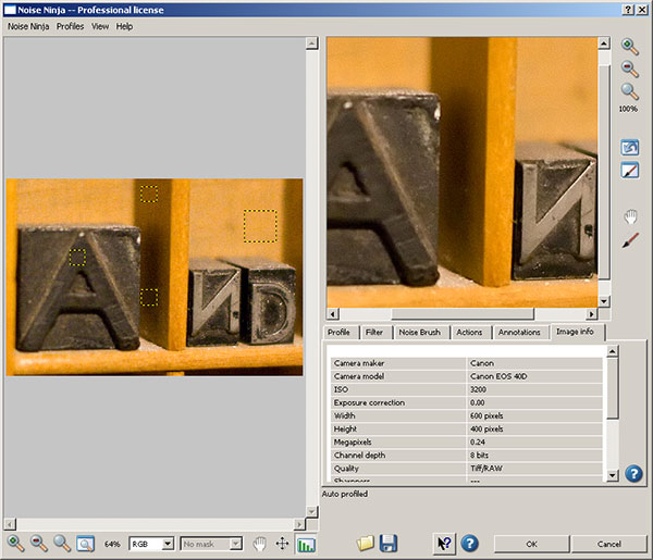
You can see the yellow squares in the image on the right that shows the sections scanned to determine the noise profile for the image selected.  On the right, a closer view of what the image will look like (or at least a close approximation) after the noise reduction is run.  You see how you can make certain adjustments on one of several tabs.  On this main tab, you can see the options for Image Profile, Profile Chart and radio buttons for luminance and color values, along with the reset option.  I actually leave these alone most of the time.

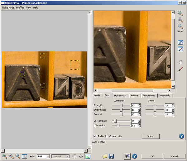
On the second tab is where I vary my noise reduction adjustments (and I would venture to guess most people make their valuation adjustments based on the image used).  Here’s the options available to you:

Noise Ninja
Noise Ninja

You can see here that many more detailed adjustments can be made to the strength, smoothness, contrast, USM amount, radius, color noise, and then checking whether you want the processing done quickly (turbo) and applying the settings to coarse noise situations.  I made my adjustments to 12 for the strength, smoothness and contrast (and typically use these ones for most images with noise).

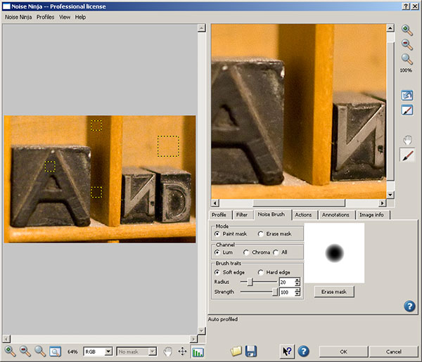
In the next tab, as shown below, you can see the noise brush, where you can apply the noise on a paint mask or an erase mask, specify the channel (luminance, chroma, or all) ad the quality of the brush trail by not only the type of edge, but also by radius and strength.  (This is very handy if you want the noise reduction faded across the image so as to leave some noise behind for artistic effect!  Normally I don’t make adjustments here either – but it is fun to play!)  Take a look at the interface:

Noise Brush
Noise Brush

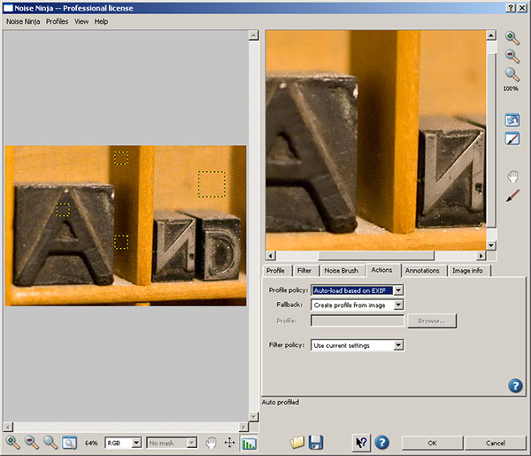
The Actions tab, as shown next, defines how Noise Ninja operates when it’s loaded.  Specifically, here is where you can tell NN wither the profile is by default configured based on EXIF data or to create a profile from the image, or to use a specific profile. This can be very handy as well if you are batch processing a lot of photos that were shot under the same or similar circumstances so that a profile doesn’t have to be loaded each and every time.  The fallback, and filter policies can also be defined here as well.  Here typically I leave the default settings alone as I prefer not to batch profess since my type of work is more geared toward fine art and individual edits rather than massive quantities.  To each their own I guess – take a look at the interface:

Noise Ninja Actions
Noise Ninja Actions

The next tab is the annotations tab.  I almost never use this, as this is a place where you can add additional EXIF and metadata.  Since I prefer to take the values from camera rather than adding my own specific notations, this tab doesn’t get any use from me – but it can be handy if you want to vary settings based on things like manufacturer, Model, FIlm type Megapixel count, ISO level, etc.  A second tab lets you add even more…see the interface captures below for reference.   Noise Ninja to me is isn’t about editing exif data though – it’s about noise reduction, so I skip these tabs.  Take your pick:

Noise Ninja Annotations Tab
Noise Ninja Annotations Tab 2

I do occasionally reference the Image Info tab though, because some useful information can be obtained there as well.  Things like the manufacturer, model, and more specifically, the ISO setting at which the image was taken.  ISO settings can be an indication on the amount of noise that was introduced due to camera settings and thus, how much can be reasonably applied.

Noise Ninja Image Info

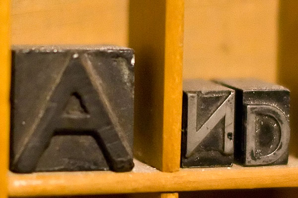
You can see that my first image, shot at ISO 3200, was subject to some pretty intense noise on the 40D.  So, I ran the process, and take a look at the before and after results:

Before

Before Noise Ninja processing

Some pretty heavy noise, as expected, so let’s just look at the image after processing:

After

After Noise Ninja processing

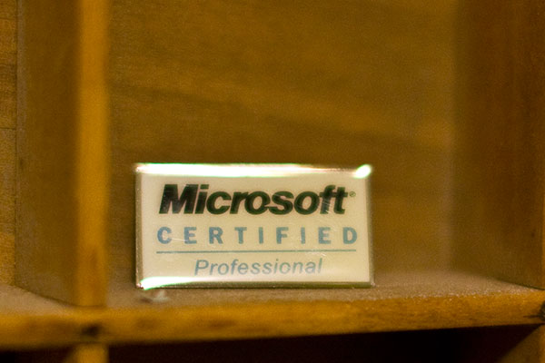
See the difference in grain?  Yeah, I was impressed too.  But is it always the case?  I ran another couple images through NN and got the same or similar results on other objects in my print box.  (Which, by the way, is a great resource for test shots when looking into lens and gear performance on a wide variety of things like noise, white balance, macro, depth of field, and much more.)  Here’s another sample crop just to show you for comparison sake:

Before NN Processing 2

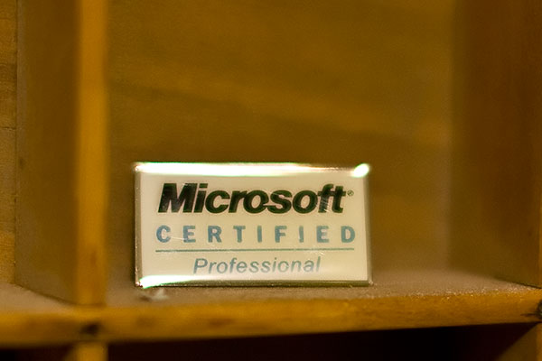
and after…

After NN Processing 2

Again, some impressive results.  When push comes to shove, results is where it counts in my book and PictureCode delivers at a superb value.

Now granted, there are other noise handling programs out there, and if you ask a dozen people what they use, 5 will say one, 5 will say another, and 2 will offer up another alternative.  When push comes to shove, it really is up to personal preference on which one “works best”.  For me, it doesn’t really matter as long as you are aware of what noise is, what it can do to an image, and how to fix it.  The tool you use is up to you.  I think Noise Ninja is probably recognized well enough for a reason, and the results here seem to suggest why.

The rest I’ll leave up to personal preferences, and if you would like to contribute your own thoughts, by all means, share them here in the comments or with me via email.  If you want to try it – you can download a free copy from the folks at PictureCode here –  or simply participate in the October Contest over at Flickr and win a copy from them for free!

That’s it for today – happy shooting all, and we’ll see you back here again tomorrow!

Got an App for That?

Since the next hardware review item as not arrived yet, today’s post is something of a blog announcement about a new feature I’ll be rolling out here shortly.  As you can tell from the title, it’s about applications on the iTunes store.  For users of the iPhone and iTouch, applications can be pretty handy tools (and diversionary too if you’re not careful!)

Well, as you may recall, a while back during the “Comment Contest” I asked people to contribute their favorite iPhone/iPod photography-related applications.  While the iTouch has not been fully capable of testing each of these, I’ve tried most of them and am putting together a new set of posts (don’t ask me where it’s going to go, because I am starting to run out of days in the week!) to cover the latest in Photography applications for those on the go.  So, for today, I am going to do the first application review:

Photoshop.com Mobile Application

In doing so, I figured it would be best to start at home – and by that I don’t mean here at the blog (although it would be kinda cool to develop an application where you could submit photos to the Canon Blogger critique threads and contest threads straight from your iPhone!).  No, I mean starting with the source – the editor we all know and either love or hate – Photoshop!  Believe it or not, the folks at Adobe have come out with a cool little application that you can connect to via your iPod or iTouch through a web interface at www.Photoshop.com

Here’s what it does – it allows you to store your photos online, edit, and share them with family and friends, create photo albums, and galleries.   Now before someone chimes in and says “Flickr already does that”, I will concur that Flickr is probably not going to be de-throned in the online photo sharing space any time soon.  But here’s a couple cool things that you get on Photoshop.com’s site that you don’t get on Flickr.

  • You can customize your background
  • You get more storage (2GB free)
  • More scalable service (it’s not just free and pro, there are different scales of services for whatever needs you may have)
  • You can link Photoshop.com to your Flickr account (but not vice versa)

So, it’s kind of a cool little service.  What I like about it is that the interface is much more conducive to sharing photos on the go.  For those of us with limited storage on our mobiles, it’s nice to be able to just log in to a web interface and share 2 GB worth of photos and have it look both classy and professional (sorry Flickr, but your interface needs an update…).

It’s free to join (you do need an Adobe Account though – also free), and can register a personal web space as well.  I’ve already done so, and you are welcome to view my account thus far at http://canonblogger.photoshop.com as I explore this some more to see what else is there to do.  You can create your own account at the main page of www.photoshop.com, and upload/share photos and videos in as little as five minutes too.  Some other applications I am taking a look at include HDR for Free, iHandy Level, and of course, the uploader applications for things like Flickr and Twitpic.  Some games have made their way into my iTouch (don’t know how that happened! 🙂 ), I’ll try to keep those out of the blog and keep things photo-centered.

If this topic takes traction, and people express enough interest in it, then be sure to stay tuned for future reviews and write-ups on iPhone and iTouch applications.  In the meantime – if you’ve got an application that you think is the bee’s knees, then feel free to share it here.  Suggestions for applications?  Share those too – I’d love to hear everyone’s thoughts.  As Apple is prone to say, I am prone to ask – “Got an App for that?”  Ask here and I will do what I can to find out and review for you!  Happy shooting all, and don’t forget to upload your photos for the October contest over on Flickr. The theme is FALL and it’s sure to be a good one – 3 pics a piece, and it’s underway right now.  Happy shooting and we’ll see you back here again tomorrow!

Photo Framing Follow-up

After the blog post on Wednesday, and the number of comments received, I thought that the next podcast would be well served to discuss the idea behind matting and framing in more detail.  As luck would have it, that podcast just went live earlier this afternoon!  You can catch the podcast over at the Personal Life Media site here: Learning Digital Photography

Here’s the Show Notes:

In this latest episode of Learning Digital Photography, the Grand Prize winner from the September $500 giveaway is announced, and the October contest opens up – ready for your entries.  The theme this time is Fall (open to interpretation).  Specs, guidelines, and such are discussed including dimensions, dates for submission and more.

Also in this episode, a primer on framing your photos:  things to look for and avoid when matting and framing work.  I look at what gallery and show fine art venues usually require versus home or personal use.

Finally, the popular listener question and answer segment returns, with some great ones coming from all over the globe!  Download today!  Happy shooting!

The links mentioned in the show follow as well:

Rich Charpentier’s Website and Blog

Flickr Contest Thread

Redimat

American Framing

Don’t forget, every time you “Digg” the podcast over at PLM, or subscribe and write a review on iTunes , you are helping others enjoy the fun and thrill of photography.  Feel free to also use those venues as well as the comments here and contact with me via email if you have an idea or thought to share about the show.  Thanks, as always, for listening and reading.  Have a great weekend, happy shooting, and we’ll see you back again on Monday!

Grab the Feed
Follow me on Twitter

Framing your work

Framing your work can be an expensive proposition.  Once you get an archival mat, conservation glass, and a custom frame created for your print – you can start spending upwards of $100 for something as small as an 8×10 print.  Depending on what it is you want to accomplish though, you could easily be spending as little as $10 per print to mat and frame.  Here’s a few things to consider, and some explanations why:

Classics are called classics for a reason – they work!

I like classic looks, and the museum style frame suits that look – a thin black border, simple white mat, and picture inside there.  Not only does it keep focus on the image, but because I can buy these easily and in bulk, which helps keep costs down.  Also, it makes ordering new materials easier (these will never go out of style…)  Even if you end up going through a frame shop, getting a classic style can make it easier to match things up down the road.  So, what if classic is not your thing?  That’s cool too – but remember, the more off the beaten path you go in framing, the tougher it can be to duplicate and repeat down the road (which can also increase costs).

Be aware of the learning curve

Buying things in bulk means you will have to do a little of the legwork yourself.   For instance, say you buy 50 mats from some online reseller and save money there.  Congratulations – but do you know how to mount a print to a mat?  You can tape a print, hinge it, or even super glue it.  Each will have pros and cons, and your results will vary depending on how much you know before dipping your toes in the water – so read up on attaching prints to mats before deciding to DIY.  (Quick tip:  You’ll ne to stockpile various supplies depending on your eventual display method including things like hinges, foam core board, low tack tape, perhaps a few cans of spray-on adhesive and perhaps a few Exact-o blades if you are cutting your own mats to custom sizes.  Heck, they even make mat cutters that you can get at hobby shops!)

Some Supplies
Some Supplies

Don’t Go Overboard

Much like the mat work, framing can be tricky in and of itself.  Making your own mats can be initially be pricey to get all the tools you will need (see above) .  Framing is no cheap project either.  Making your own frames involves getting long lengths of the borders, cutting at precise angles, and making sure it all seams together cleanly.  It requires patience, attention to detail, and specific tools which can be a drain on the wallet (Have you priced a miter saw at Lowe’s or Home Depot?  Even the cheap ones aren’t real cheap!)  So, if you want to go the DIY route, know that some startup costs will be associated with it.

Storage Issues

Physical prints, physical mats, physical frames, physical glass pieces – all of these take space.  How do you store all this stuff and in some semblance of order?  First off – find an understanding and encouraging significant other?  Don’t have one?  Make that a requirement if you do!  The amount of space that is involved in storing not only the obvious stuff, but the not-s0-obvious stuff, can be staggering!  I have so many boxes of materials it really is ridiculous.  It helps to have a system though, and labels are always a good idea.

Shoeboxes make great sizes for lots of things

Never have enough storage

********

So, there’s my trifecta of tips for framing your work. It’s just a starting point, but will hopefully help when you decide to start framing your work for display.  The results can be rewarding, but like anything else,  with a little work, pre-planning and preparedness, you will be well on your way to having a gratifying gallery of imagery!

Some Prints on the Wall

Some More Prints on the Wall

Keep in mind though – I certainly do not have a corner on the tips and tricks associated with matting, framing, and displaying your work…there are many other elements to consider and be aware of.  Just peruse the comments here to see a sample of what I am talking about – oh wait, that means you gotta share your own tips, tricks and ideas in the comments too!  So, sound off – what else do people do when preparing prints for framing?  Any styles that work?  Any vendors to recommend?

That’s it for today…thanks for stopping in, and be sure to stop back again tomorrow for more photo goodness.  Happy shooting and we’ll see you then!

And there’s more!

First there was the blog…  Then video tips got added…  Then a podcast came to fruition…  Audio tips got added…

And now:  A Newsletter!

That’s right, I am happy to announce that the inaugural issue of the Canon Blogger Newsletter (CBN) is now ready for download.  It’s pretty much an introductory issue more than anything else, in hopes of doing three things:

  1. Tempting your taste buds (photographically speaking)
  2. Letting you know what’s in store for future issues
  3. Getting some preliminary feedback

As with anything, the first incarnation will have room for improvement, so here’s what I’d like to know…What are your thoughts on the design and layout?  Content?  Creativity?  Please let me know what you’d like to see as this really is your newsletter!

Here’s the link to…  download the Newsletter Here

Last up, the September contest giveaway is closed to entries and finalists announced.  I am waiting to hear back from the vendors on the grand prize winner, btu while we await that news, the October contest forges on.  This month, the lucky winner gets a free license of Noise Ninja, one of the best known and most widely used software resources for photographers.  Coming from the folks over at Picture Code, this is an $80 value for the Pro Bundle – well worth the money.  To win this, simply enter a recent photo in the Flickr Contest Thread, for October – the theme for the contest is FALL! Good luck to everyone – let’s start snapping!

On that note, hope everyone had a great weekend.  Surely there’s photos out there, so keep on shooting! (Don’t forget to sound off in the comments section with your thoughts on the newsletter!)

Grab the Feed
Follow me on Twitter
Enter the Contest

Hardware Review: XRite Colorimeter

Eventually you knew it was coming – the subject of color management.  Now before you mosey along, or your eyes glaze over, rest assured, this is not going to be the typical discussion of color management.  I am not going to talk about LAB color vs CMYK, vs RGB, or anything like that.  And even though the term “colorimeter” may sound like something Marvin the Martian was going to use to destroy Earth in the classic Bugs Bunny cartoon (that was the Illudium Q-36 Explosive Space Modulator), there is nothing overly scientific in today’s post.

Well, that’s not entirely true – it is scientific, but I certainly will not portray to understand any of that.  Instead, I am going to show you how easy it is to calibrate your monitor using this device.  Now I am looking specifically at the one from X-Rite (I own the Gretag Macbeth version from before X-Rite bought them), but color management has become as easy as a couple of mouse-clicks these days.  So, you don’t have to know anything about color gamuts, RGB, CMYK, LAB, or anything like that to know you are getting color accurate images.  Check it out…

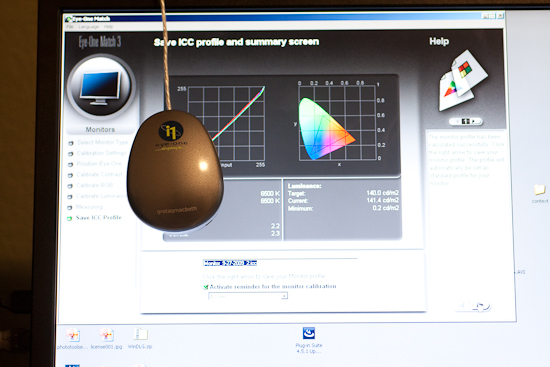
After installing the software from the CD, simply connect the device and start the software.  The device is the colorimeter (also known as a calibrator in some circles), and it is shaped like a computer mouse or a hockey puck.  It has a cable that connects it to your computer via USB, and is good for either CRT, LCD, or laptop displays.  Additional software components also enable you to calibrate things like projectors, scanners, and much more.  Here though, I’ll be showing you how it works with a computer monitor.

Once the puck is connected and placed on the monitor, simply go through the wizard to calibrate everything from Contrast, to Brightness, and your RGB colors.  It’s pretty straightforward…just open the display settings for your particular monitor type, and increase or decrease the values until the indicator is as close to center as you can get it.  You’ll notice that I am calibrating a Dell computer monitor, and it is a Windows-based computer, but the process is just as simple on a Mac.  (I just got my Windows notification though, so figured it’d be easier to kill 2 birds with one stone there.)

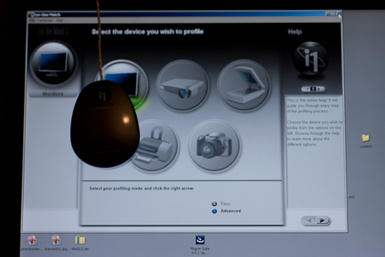
Here’s a couple of screen shots to give you an idea of the process.  The first step when launching the software is to specify your white point and monitor type (if you are calibrating a laptop, pick the LCD).  Next up, decide whether you want to go the easy route or the advanced route.  I would recommend the advanced route, as even that is very easily accomplished, and these are the screen captures I am using here:

CRT or LCD
CRT or LCD

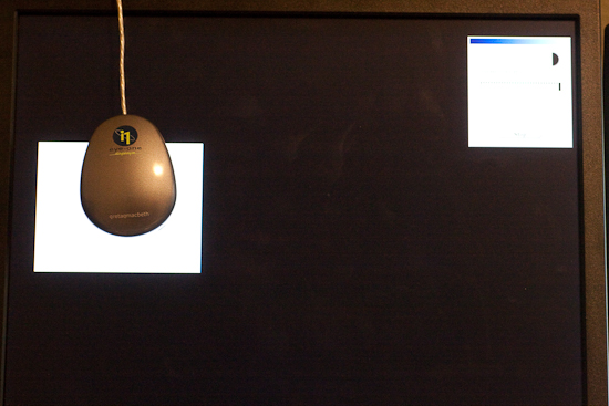
Next up is the screen capture of the contrast display.  In the upper left, the software shows the current contrast setting compared to the desired setting.  On the left is the colorimeter.  The Brightness (or Luminance) window is pretty much the same layout, so I am not going to repeat the screen capture here.

Calibrating the Contrast

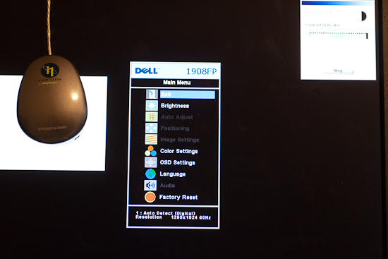
Here’s a screen capture of the first stage in setting the color values for my Dell 19″ LCD.  The software readout is on the upper right, the colorimeter is on the left, and dead center is the display menu for the Dell monitor.

Calibrating the Color

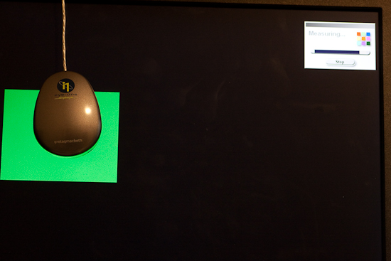
Once your contrast, brightness, and color settings are defined for the monitor you are using, the software will run through and configure the graphics card, monitor, and display output settings.

Calibrating the Color 2

Once all the settings are complete, a profile is creating in your system folder.  For Windows, that is in the system32 folder.  You can give it a specific name, and set the schedule on which you will be reminded for a new profile to be built anywhere between 1-4 weeks…more on this in a minute.

Setting the Monitor Profile

As you can see, it is as straightforward and simple as can be – even on the advanced settings where I defined the color (RGB) settings.  So, why doesn’t everyone do this?  Good question!  This device cost me roughly $200, which is likely not cheap by average standards for equipment (especially that which cannot be attached to your camera!), but if you really want to get quality results, the price is minimal.  I have mine set to update every 2 weeks (my LCD display has a tendency to shift colors easily, and LCD’s in general are known for color shift especially as they get warm and cool down when turned on and off.)  The benefits are huge though as your prints will be more accurate whether you print at a lab or print at home.  In the case of the former, no color correction is needed (and if you use MPIX Pro, there is no color correction done), and in the case of the latter, you will use less ink and paper in test runs before getting the results you want.

Keep in mind that this is just the procedure using the X-Rite, and I am sure others could just as easily recommend the Spyder Pro series, or some other colorimeter.  With that in mind, if you have an inkling one way or another, feel free to share your own experiences in the comments.  Which colorimeter do you use?  Do you like it?  Not so much?  What do you like/dislike about the process?

Whether you like the X-Rite method though, or some other model – calibrating your monitor is an important part of working with a color managed work flow if you want to produce accurate and quality prints.  After all, it is still about the print.  Don’t forget to share your thoughts in the comments!  Until tomorrow, happy shooting and we’ll see you then!

Peruse your archives

First off, I’d like to extend a big time “Thanks” to Andie Smith for bravely stepping up to the plate and delivering a home run of a first Guest Blogger post.  With 17 responses to her post, it is already ranked among the top five posts ever!  Make sure you stop over and check out her blog and portfolio.

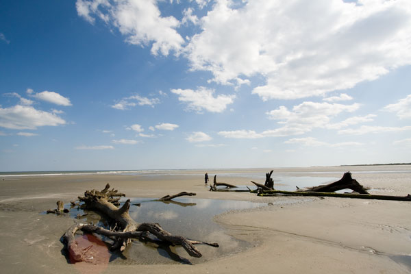
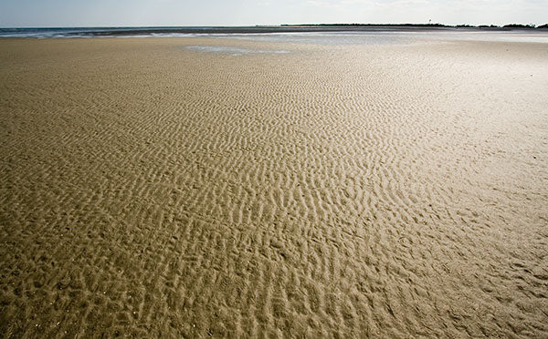
For this Friday, I’ve got a fun little photo tip for you and that is to peruse your archives occasionally.  You may find something of interest where previously you didn’t.  Since inspiration and creativity can strike at any time and anywhere for a different number of reasons, if you don’t like an image immediately, consider just archiving it for a while.  I do…and every month or so I peruse my own archives to see if some gem escaped my first glance.  Here’s a few that initially didn’t strike my fancy where now I am thinking “Hey, there might be some potential there!”  What do you think?

SC Beaches
SC Beaches

SC Beaches
SC Beaches

Last but not least, don’t forget, the $500 Giveaway for a Topaz Photoshop Plugin Bundle and and Thinktank Multimedia Photo bag system will close for entries tomorrow at midnight!  (I had thought it was tonight earlier, but in referencing the Flickr thread, realized it’s tomorrow, so you got a 24 hour window to get your own photo creations in.  One person did ask if “Topaz” had to be in the picture and the clarification was made that ANY color is fair game (or even the lack of color if that’s how you interpret it…)  The Flickr thread to enter your photos is here:  $500 Giveaway

That’s it for this week, have a great weekend, happy shooting and we’ll see you Monday!