What a great day to release a new podcast – with the final release of LR coming out very soon, I had the distinct opportunity to talk with Rob Sylvan, author of LR2 for Dummies, and the forthcoming Taking Stock. We talked a lot about Lightroom, working at NAPP, and took a few listener questions and answers. More photo news, additional Q&A, and a new feed for the podcast start today, so be sure to download the latest show. You’ll notice I have pulled the feed back to this site, and the format is more iTunes compatible (m4a) so you can now see pics and chapter segments. Continue reading “Lightroom 3 Q&A (Beta)”
Category: news
Nothing But the Tail Lights
In the course of pursuing creative inspiration, I’ve often found that just picking a subject and sticking with it can be a good exercise in creativity. Taking something and focusing (no pun intended) on that subject and only that subject can help you see things differently. The exercise is good whether your subject is flowers, thumb drives, coffee mugs (which I’ve done in the past), or in this case – tail lights!
[cincopa 10624678]
As you can tell, some of the shots are pretty cool, others – well, not so much. Some are out of focus, some are boring, but a few just pop and stand out. Also note that I’ve not done any post processing of these. I just imported into Lightroom 3, re-sized for export uniformity, and boom! – done. While I grant you it’s not always showcasing the “best of the best” of your work, it’s is important though not to eliminate shots from the project, at least initially…because these “throwaways” can help you identify what works and what doesn’t work. What makes certain shots stand out and why? These are all things to look at when doing little mini projects like this. So, pick a subject and fire away! Feel free to share your own thoughts on what works and what doesn’t in the comments, and hopefully this will help kick-start some other projects! Happy shooting all and we’ll see you back here again tomorrow!
Photo Montage Tuesday
Normally, I start the week with either a hardware review, a software review, or something along those lines, but there’s a couple things that have bumped the traditional schedule. So, check these tidbits out to start the week:
First off, Scott Kelby has announced the 3rd Annual Worldwide Photo Walk! It’s a pretty big deal now as there are some major sponsors that contribute prizes to this, and it’s just a super cool time. There are usually a couple that start up for the Denver area, and if you’ll be around, let me know and I can post which group I’ll be in so you can join (or avoid) as needed! 🙂
Next up, I am having a couple really exciting podcasts coming up in future weeks, so my one that I recorded over the weekend will never see the light of day – it was a solo run, so not as much fun as, perhaps talking to Rob Sylvan (Also a NAPP Helpdesk writer) or Martin Bailey! They are coming up soon, and we’re recording soon, so get your questions in via comments, email, or the free 800 line: 866-809-8663!
In other blog news, you may notice three new sponsors in the sidebar: Adobe, NAPP, and Red River Paper!
- Adobe – So, if you’re trial version of CS5 is almost up – order the full version here and you can still take advantage of great savings. Just come through the side panel link here to get the same pricing as elsewhere, and when you do, you’ll be helping me keep costs to a minimum on the blog and podcast!
- NAPP – For the NAPP link – you can sign up for a membership through this affiliate link and get lots of special bonuses, and the referral also helps to keep costs down too…(I think you get like 2 additional months free or something like that).
- Red River Paper – These guys are terrific – not only have they donated prizes in the past to monthly giveaways, but their continued support and service to both myself and readers/lilsteners is now available through the affiliate link in the sidebar. Enjoy (especially their latest Pearl Metallic paper – totally rocks!)!
Finally, speaking of contests, the May giveaway entry deadline has passed and the winner of the free copy of PTGui Pano Software is: AlinNZ! Congrats to him and to Alin – if you contact me via email, I’ll get you in touch with PTGui to have them send your license key to unlock the software! Great photo, and thanks to all for participating!

Click the photo to be taken to his photo stream and comment on his excellent body of work there as well. Congrats, and for those interested in the June contest – the news is posted on the Flickr site with all the details, so head there for more info. I’ll go into more details on it later this week, so keep on feedin’ on the blog! Happy shooting and we’ll see you back here again tomorrow!
What Kind of Photographer Are You Anyway?
Just for fun, this holiday weekend – What kind of photographer are you? Choose the option most appropriate… 🙂
[poll id=”9“]
Hawking your wares…
It sounds painful, and in the current climate, it can be. For some though, this phrase may not sound familiar, so let me expand a little here – I am talking about selling your pictures. It’s competitive for sure, as there are many more of us than there were a mere 10 years ago. That, combined with the fact that buyers are paying less for them than before due to shrinking budgets – does not mean that no one is buying photos. It just means you have to look in more places. One such resource is the publication “The Photographer’s Market”.

Published annually, the 2010 edition is available through your own favorite reseller whether it be Amazon, Wal-Mart, Borders, Barnes a& Noble or where ever you prefer (I got mine for $19 from Wal-Mart, just sayin’…)
The important question that everyone always asks is “Are there really significant changes made from one year to the next?” I can tell you whole-heartedly, the answer is yes! I’ve had pages dog-eared in the 2009 edition and in 2010, some of the buyers have changed addresses, changed their pricing, their submission guidelines, and others have gone completely gone belly-up. We all know what can happen if you don’t follow submission guidelines 😉 and getting lower prices than anticipated isn’t much fun either.
So, go out and get your 2010 edition soon…because we are nearing the halfway point and (as you all know) submissions should be put out about 3 months head of when you can really expect any kind of response/payment. So, what does this mean? It means right now, here, today…in May and June – you should be shooting pictures with autumn in mind. Think colors, places of interest, subject matter, etc. It also means that in August and September, your winter and holiday submissions should be hitting the email deliveries post haste.
Other things to consider when submitting images to buyers? Lots!
- Look for buyers in your own demographic – response times can be quicker
- Look for buyers that are interested in the subject matter you have lots of pictures in – if they want more, the last position you want to be in is one where you don’t have anything else to give…(kind of like the Boy Scounts: Be prepared!)
- Follow buyers recommendations and submission guidelines. Not following these can get your images rejected for no other reason other than “too big” or “too small”, or “wrong file type”. It’d be a shame to lose out on possible financial opportunities simply because you didn’t read the directions! 🙂
- Look for buyers that are receptive to submissions. Ones that take 8-10 images per year are much less likely to consider your portfolio of 20 images. Others that take 20-50 per month (think magazines that need lots of new content regularly) are more likely.
- Don’t forget your query letter. This is an important element of the submission process, and you need to come off with the right impression. Spelling errors, grammar errors, and other faux paux items await, so get up to speed on this as well (hint: come back tomorrow for a post on this item alone!)
- Finally, don’t put all your eggs in one basket! I know of one very successful photographer who puts out 30 query letters a month (that’s one a day!), and on average, he sells about 1/3rd of them. (And this is a really good return rate!) Normally, the response on query letters is about 1 in 10, and buyers happen about half of that time, especially for new submissions…(they tend to like repeat submitters – it shows they are serious, they are familiar with the body of work the editors are looking for, and they are regularly shooting new content).
The thing is – this is just the tip of the iceberg! There are so many more factors to consider about submitting your work to potential buyers, and this is all part of the larger business of selling photography. Most important in all of this is to remember that running a photography business is more about the business than the photography…you need to be diligent, dedicated, and always keep at it, no matter how many times you may here those hateful words, “No thanks.”
With that in mind, what other techniques do readers use to increase positive response rates to query letters? Any other tidbits, pearls of wisdom, food for thought, suggestions, or ideas that you’d like to share? Sound off in the comments! Happy shooting and we’ll see you back here tomorrow!
This is only a test (but a fun one)…
As many of you know, the forums for the National Association of Photoshop Professionals (NAPP), is a place that I really enjoy spending my spare time in. It’s an excellent resource for a number of reasons: first of all, I learn a lot! Second, some great questions come through there that get my brain going. Third, and most importantly, when I contribute to discussions in there, it often turns into some meaningful content I’ve created to help explain things. That content then becomes some very useful tools in creating – yup, blog posts for the readers out here in the non-NAPP world!
For instance, someone was asking in the NAPP forums about methods to ensure all their files are output to a minimum of 50 MB for delivery to a client. It was a great question with lots of useful contributions. I decided to throw my two cents in, with a few suggestions that not only supported those made by others, but also include some tangential information. My thoughts were that a client asking all images to be at least 50 MB suggested that the client doesn’t understand color very well…because different colors have different degrees of data to them. Translation? Some colors will produce larger inherent file sizes .
I ran a little test to help demonstrate this by taking some pictures. Since I really wanted to get a complete illustration I sought out to find scenes that were 100% red, 100% green and 100% blue. Naturally, I didn’t have a lot of luck in the real world, but I could produce them easily enough in Photoshop. So, here’s what I did:
1. Created a new document, 800px square, and filled the background with a pure red, green and blue:


2. On each new fill, I pointed my camera at the monitor (which is calibrated every two weeks*), and took a picture. Here’s some screen shots of what the histograms looked like on the back of my camera LCD:


As you can tell, the histograms show that the colors are pretty spot on to where their anticipated locations should be…if you read the details below the histograms, you’ll also notice the amount of data that was in each image, but to make sure I was reading the data correctly…
3. I then copied the files to the computer, and without any editing on white balance or anything, looked at the file sizes. The results were pretty interesting:

So, the color blue will result in a larger file size than red and green carries more than blue. I also noticed that each color was successively brighter, which supports my understanding that more light in a scene also produces more data. Since some colors are inherently “brighter” than others on the color wheel, they will also naturally have more light.
It was an interesting test/exercise to illustrate that different colors carry different amounts of data. This also ties into the theory of “exposing for highlights and developing for shadows”. It makes sense…because more data is available from brighter colors and less data is available in darkness.
*Finally, it bears mentioning that I do have a rather envious setup – you see I was given permission to paint the office any color I wanted recently. I chose an 18% gray. The office was then lit with a daylight balanced bulb from one desk lamp, and the window is normally covered with a black felt. This, when combined with a calibrated monitor, profiled paper makes for a pretty good environment in ensuring color accuracy. This little “color test” for someone else also was a good test for the office environment, and the results there were pleasing indeed.
This post has gone on much longer than I had anticipated, but it was a great chance to expand a little bit on a couple of topics:
1 – What happens with color in your pictures.
2 – How that impacts your file storage needs and requirements for clients
3 – The importance of working in a good color managed environment
If anyone has any questions, comments, or input of their own on the subject, please feel free to share your thoughts with me via the comments section or via email. Happy shooting, and we’ll see you back here tomorrow!
It's a process…
With the latest release of the Creative Suite from Adobe, I have added yet another item to my learning library. For those of you that follow me personally, you also probably know that I have recently added two projects to my learning library, databases and PHP. Neither of these is very intuitive to me, so it’s taking a bit of patience to remind myself that we all have learning curves, and that learning is always a process fraught with frustration.
I take it for granted some times that certain technologies just “make sense” to me, and wonder why others can’t get it…the answer is because it is new to them. Even in the field of photography, I often find myself in unfamiliar waters, and it can be a bit daunting. So, when you feel you are at your wits end in learning some new procedure or technique for capturing and developing your images, remember, everyone is has some cross to bear with technology. Zack Arias did a humorous bit recently on his blog that illustrates this to certain degree (especially the last bit where he is reading a magazine and…well, I can’t do it justice, so just watch it here!)
Another one that this reminded me of was the conversion to digital TV that just happened last year. For many of us, it seemed “about time”, but for others, it was likely frustrating. I must admit, that right now, db admin stuff feels much like this to me:
[display_podcast]
This was sent to me via email, and I can’t find a reference for it online. The creator is Spike Feresten and the show is called “Talkshow” . If anyone can share a reference that he has somewhere online, email me or share it in the comments. Regardless, it very much typifies my frustration with SQL right now…
So, where are you in your learning process? 🙂
An exercise in silence…
As creatives, we often can find ourselves just not seeing anything new…even if given a theme to go out and discover. In times like these, it’s sometimes beneficial to stop looking outward and start looking inward. I am not talking about Yoga, meditation, or even pontificating the meaning of life. Although these are equally viable options for getting out of a creative rut, I am talking about looking at your own past work. While we all have done this from time to time, I found a recent little twist on this practice helpful. Look back at your work with a theme in mind.
The monthly contests here encourage everyone to go out and capture new work with a theme in mind, and creating new work is always a good thing, but sometimes, when given a theme, and then looking back at archives, you can find new meaning in older images, when looking with a different perspective.
For instance – I was reading an article over on Nikon (yes, I read Nikon’s website – we all know it’s the photographer and not the gear by now, right?) about the value of sounds. The article was talking about pet photography and that you can get certain expressions if you catch the right sound (full article here:). It got me to thinking – what would the lack of sound look like in an image? So, I decided to close my eyes and try to imagine what a photo of silence would encompass: the serenity of a flower, the peace of a beach or the darkness of an evening or morning sunrise or sunset when it’s just you and the landscapes, even the chill of the day with snow covering everything in a blanket of quiet.
It gave me such a burst of inspiration from my own archives that I decided to go through and pick these specific ones out with the idea of “silence” in mind… Of course I couldn’t just leave something like this alone – so I added a little taste of music that I thought would be appropriate:


This is, of course, just my own interpretation. What are your thoughts when you think of a series of images that captures “silence”? Would you set it to music? How many images would you include? Here I had 8 images…was it too many or not enough? Sound off in the comments, as it’s really the viewer thoughts and input that is always so valuable!
Podcast: Play in new window | Download
Migrating Photoshop to a New Computer
Over the past three years or so, I’ve had several people ask me about what’s involved in migrating from one installation of Photoshop to another, or what’s involved in moving from an old system to a new system. With Photoshop, it’s just not as easy as it is with other applications for a number of reasons:
1. Dependencies – While Photoshop is insanely popular, this popularity has spawned an entire industry of third party applications called plug-ins that get installed into Photoshop. If you simply remove Photoshop without considering these 3rd party “apps”, you could lose their functionality. There are also other things that become part of your work flow in Photoshop that you may want to save too, including actions, scripts, font folders, brushes, and much more.
2. Licensing – Because it’s not a cheap application, Adobe has to carefully manage licensing, which means that any serial number can only be activated twice before it gets “locked”. This allows you to have an installation on a desktop and a laptop, or a work computer and a home computer. Well, if you go an just un-install or delete the files for Photoshop, you may find yourself unable to activate again should you re-install on a new computer. The way to avoid this is to ensure you de-authorize (or deactivate) before uninstalling. This will free up the license for use again.
3. Other add-ons – Photoshop also has other add-in elements like automation tasks you may have added over time. I have a few from On One, Topaz Labs, and a few others that I’ve gathered over time. Make sure you check to make sure these don’t have installers with licensing too, because that can also be problematic for a software migration.
4. System settings – Unlike e-mail, some settings and preferences don’t stay with you during the course of a migration. So, it’s often helpful to grab screen captures of various setup windows so that you can get things configured just right once you get in your new digs! Here are the 11 screens you may want to capture before un-installing off any computer:
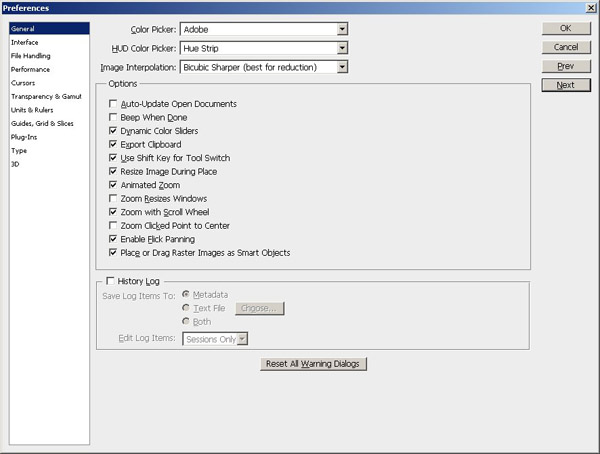
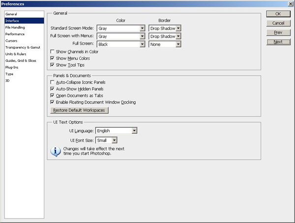
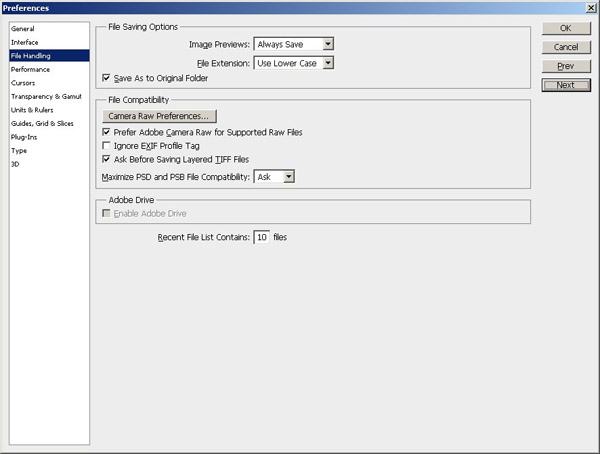
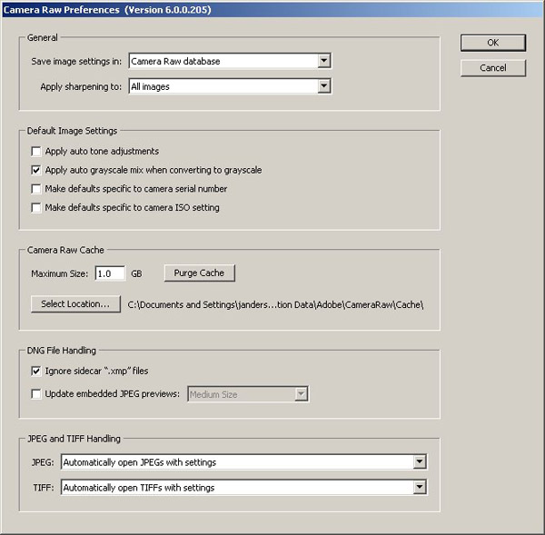
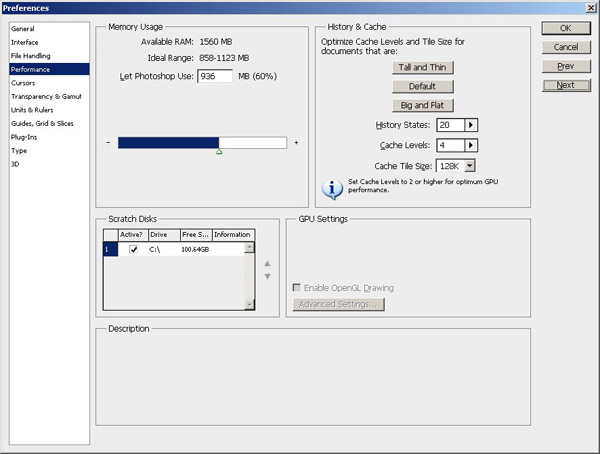
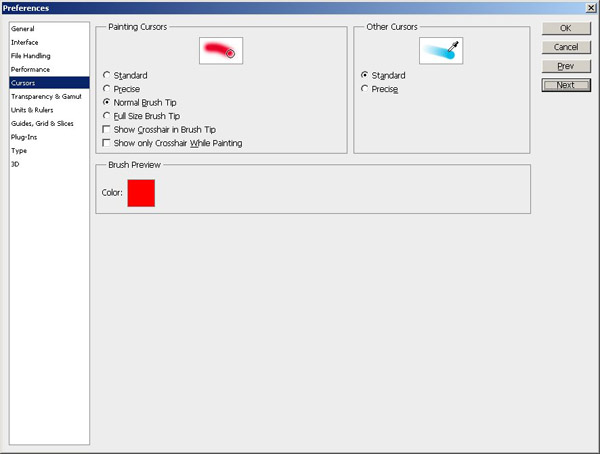
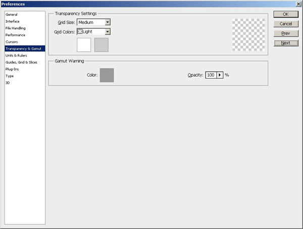
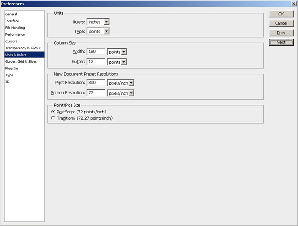
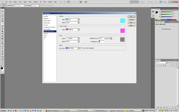
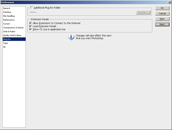
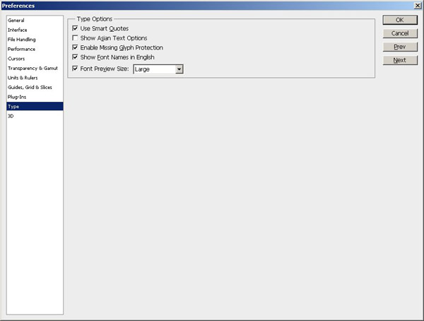
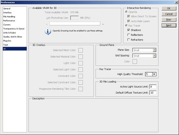
As you can tell, there’s a lot to consider. And, given the length of this post already with the included screen captures, to make things easier in terms of reference information, I’ve put together a step-by-step procedure to migrate Photoshop from one computer to another that you can download for free! Enjoy!
Happy shooting and we’ll see you back here again tomorrow!
What smart phone do you own/want?
Courtesy of the previous post, I’ve added a poll to the blog (which I rarely do anymore)…so you can sound off anonymously:
[poll id=”8“]
Share with your family, friends, colleagues, whomever – I’m really interested to see where people are in this whole smart phone deal…have a great weekend!