The Topaz Labs Plugins: Details

Another exciting plugin from the folks over at Topaz is the Details plugin.  This smart little plugin is, well…not so little.  A simple click from the Filters Menu chugs at your processing speed for a good while as it scans, reads, and takes your image through several unique variations of detail adjustments.  With 12 variations in this single plugin, you can take your image from bland to beautiful in just five minutes or so (depending on computer specs)!

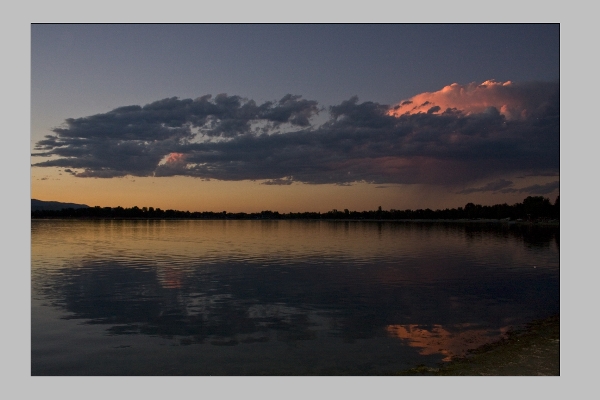
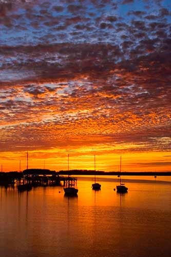
Check this out.  I took a sunset picture from here in Colorado a few months ago, and ran it through the entire collection.  Here’s the original image:

original_blog
Original Sunset Straight out of Camera

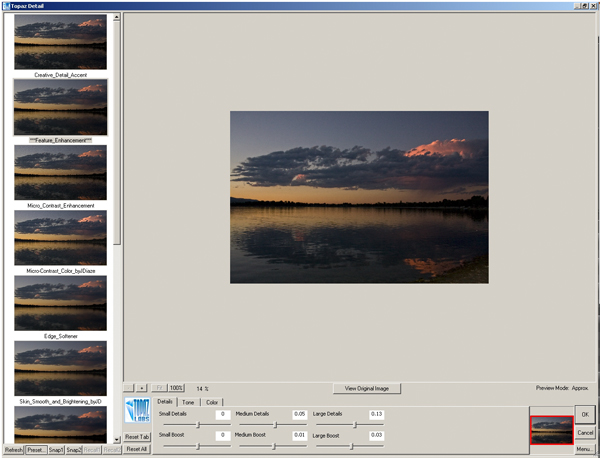
Sure, it’s an okay shot, but could it be better? I sure don’t remember it being that plain looking when I pressed the shutter, so let’s take a look at some of the options available in Topaz Labs Details Plugin:

Topaz Details
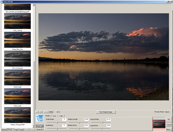
Topaz Details
Tobaz Labs Details panel - Set 2

With twelve total options, I was stunned.  A slight difference between this plugin and the Adjustment plugin is that this one does appear to chug a little slower – each time it had to re-scan the entire image and the scratch disk filled up further, so by the end of the 3rd edit, I had given up on an action for PS.  Just find your favorite initially based off previews (they are pretty close) and run with that for your output.

What I did like is that the sliders at the bottom were still adjustable for further image customization from the default “out of the box” adjustments that Topaz Labs gives you.  I also liked the number of options too.  In the Adjustment plugin the options were just a little too overwhelming for me – but 12 is just about enough.

My last note though, would be that once you have the plugin loaded, it shouldn’t have to reload again with the same photo still open.  A quick scan of the exif data should be able to say “same image” and scan no further.  That would allow for actions, and quick galleries of the various options for viewing full size images of the various options rather than the smaller previews.

What about the CB Crew?  What are your thoughts on this short review?  Have you used the Details plugin yet?  If so, thoughts on the usefulness?   Got a favorite details adjustment?  From here (I know it’s small), which ones hold the most appeal for you?  Oh yeah, the last thing – do you want this plugin free?  Then get your photo in the LDP contest today!

Anyway, happy shooting and we’ll see you back here tomorrow!  Don’t forget to enter the contest… here’s the link to the Flickr thread!

Grab the Feed

Post #498: A few shots from the Photo Walk

You’d think these would be shots from the Scott Kelby Photo Walk, but that’s only half right.  Ever since the first photo walk last year in Golden, CO…several of us kept the concept cooking with regular meet-ups (through www.meetup.com, a great place to organize get-togethers for any type of group, not just photography).  Anyway, this meetup group has been getting together on a regular basis (monthly to semi-monthly depending on season)…and we had our August photo walk back at historic Golden CO (in honor of last years Scott Kelby photowalk that was held there).

Since I am on the subject of photo walks, before the pics, it helps to say a few words about these gatherings.  They are probably one of the most enjoyable things about photography, because you get together with people that share the same passion you do for the craft.  You get to trade shots and techniques, talk shop, and gear, post processing – the works.  I have made some great friends from both photo walks, so kudos to Scott Kelby and the NAPP organization for hatching the idea for these types of get-togethers.  While the activity has always been around to a degree – the awareness and energy that they’ve brought to it are astounding!

Okay, enough fan-dom for the day – here’s my photo gallery shots I’ve worked on thus far.  Got a few regular shots and an HDR using the trial version of Photomatix (I still haven’t ponied up to buy this…I need to do that soon!):

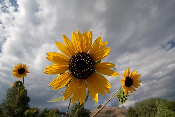
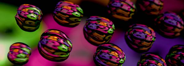
_MG_7899
Large Sunflower

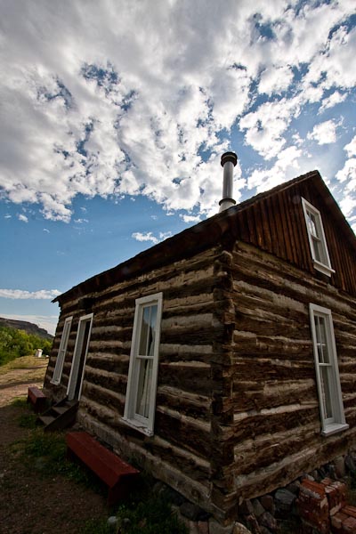
Farmhouse
Farmhouse
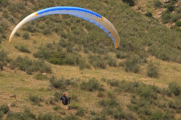
Para-sailing
Para-sailing
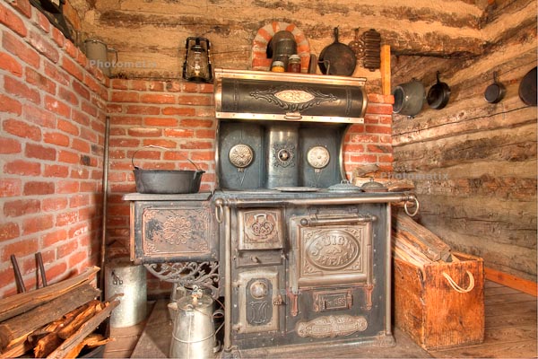
Wood Stove
Wood Stove

I know these are all pretty much snapshot material, but it’s part of what makes photo walks so much fun – just random pics, and socializing!  Unless of course you take your photowalking more serious…  On that note, share your thoughts on photo walks in the comments.  Do you find them useful?  If so, for what?  If not, share those thoughts as well.  Chime in, as comments are always appreciated!  (Oh yeah, can anyone tell which one is the HDR?  No peeking for the “photomatix” stamp!)

One final note – we are in the final days of the August contest over in the Flickr threads.  This month, the prize is a Wacom Bamboo Fun!  (I reviewed this last month on the blog, and you can check out the review here.)  The retail value of this is $100, and the submission count is a little lighter this go around, so your odds of winning are even better – for now!  Anyway, like the Lotto, if you don’t play, you can’t win – and this one is free!  So, share your “fun” themed shots today in the Flickr group – see the thread for more details here:  Bamboo Fun Giveaway

Okay, that’s all the photos, news, and contest info I have for this 498th post.  We’re closing in on magical #500 – only a couple days to go, so stay tuned as the posts will likely get more and more multimedia filled.  And, if you tune in to #500 – a great giveaway exclusive to that day will also be announced!  So, as we count down the days remaining, keep on shooting.  Until tomorrow, hope all your shots are great ones!

Grab the Feed

Follow me on Twitter

Great Scott, Mat, and Contests, Oh My!

Heh, cheesy headline, but they all seam together on this week’s episode of Learning Digital Photography!  Yup, the podcast is done, and for those that didn’t catch my Twitter tease, this week I had the distinct pleasure of talking with none other than Scott Bourne on the show!  If you don’t know who Scott Bourne is, then you’re living in a cave.

Scott is a regular contributor to Mac Break Weekly, This Week in Photography, and owner/operator of PhotoFocus.  You can find him there, via his Bourne Media Group online presence and a bazillion other places like Photoshop World, Aperture Nature Photography Workshops, Bosque Del Apache, and much much more.  I could link to it all but that would take an entire post of it’s own, so will point you to his main presence at Photofocus and Twitter:

http://www.photofocus.com

http://www.twitter.com/scottbourne

We had a great talk on this week’s show, covering his photo background from Motocross to Wedding work, and of course his Avian work as well.  We took a look at a little of the gear side, got some nuggets on branding and the business side, and even had a chance for a couple twitter questions.  Great stuff and all packed into a mere 30 minute interview!  Thanks again to Scott for taking the time to talk to me on the podcast!

Other content from the show includes a discussion on some of the things to consider on matting and framing (hence mats in the title), and an in-depth look at the finalists from the last LDP contest.  There’s also nuggets and links for other contests out on the web as well as what to look for in future LDP contests, so some teaser stuff there too.  All in all, a great (but long) show so grab it from your preferred source point, whether with the folks at PLM, or in iTunes!

Here’s the links, as promised from the show!

Mats and Framing

  1. American Frame
  2. Redimat
  3. Guide to Preservation Matting

Contests

  1. OnOne Top Ten Finalists
  2. Wacom Giveaway
  3. Bogen Imaging Macro Giveaway
  4. Music/Band Photography Contest

Gear: Ring Flash

  1. Canon Ring Flash
  2. RayFlash
  3. Metz Ring Flash

Technique: Causes of Blur

  1. Camera shake
  2. Subject Shake
  3. Sharpness/Depth of Field

So, there’s the link love for the show – it was a lof of fun this week, but the weekend is almost upon us.  This Saturday it’s another photoshoot with the Meetup Group and then some night photography as I prep for the next article of PhotographyBB Magazine! Make sure you get out and do some shooting too.  Have a good weekend everyone and we’ll see you back here on Monday!  Happy shooting!

Grab the Feed

[display_podcast]

And the winner is…

Ladies and Gentlemen,

Here today, I am happy to announce that the winner for the OnOne Software Plugin Suite Giveaway has been decided.  So, without further ado, please give it up for Pete Petersheim!  Pete submitted the following image to the LDP contest thread, which got the ultimate nod:

Pete Petersheim's Winning Image

Click the picture to go to his Flickr thread, wish him congratulations on a job well done.  Note there are two images in his Flickr thread, a cropped version (which was entered) and the full-size one.  I think that regardless of which he had entered, it would have won the day.  The colors, composition and impressive post-processing, as well as his unique flair for something unique is just superb.  Congrats Pete!  Send me a Flickr mail message, DM me on Twitter, or email me here and I’ll get you the contact info for the folks at OnOne to get the software prize out to you in short order!

To all the entrants – thanks so much for participating – we all learn so much from one another it really is amazing to see the artistic talents that inspire in new and exciting ways!  For a full look on the entrants and the finalists, there are web galleries here:

All OnOne Entries

The Top Ten

I’d also like to take a moment and thank the folks at OnOne software for their highly generous contribution – since the winner has been announced, it’s probably appropriate to note that there is also a very generous discount being offered on the entire suite right now through Thursday, August 13th!  Save $150 off the bundle, which is an amazing savings.  So, for those who are still interested, the time is still there to save a lot of money on the package – just tell them you heard about it here at Canon Blogger/Learning Digital Photography!

With the July contest completed now, it’s probably a good time to turn our focus to the August contest – you can win a Wacom Bamboo Fun valued at $100!  I reviewed this tablet a while ago here, so if you’d like some feedback that’s a good starting point.   But, don’t forget to enter your images – you can pull from archives this go around, and submit up to three images in the Flickr Thread!  More details are also available on Flickr!

That’s it for today, so congrats to Pete!  Thanks to Wacom!  And  Happy Shooting!  (We’ll see you back here again tomorrow!)

Grab the Feed

Pick a theme – tell a story

When working on capturing your own creative vision, here’s another useful tip in getting the most out of your work – pick a theme when looking for creative inspiration.  A theme can be a useful cornerstone or building block which you can use as a springboard to get started on projects.

The reason why themes are such useful tools is because this can also give you the basis for telling a story, which is a commonality of many powerful and evocative works, whether that story is natural beauty (landscapes), urban decay (architecture), romantic moments (wedding photography), etc.

I’ve put together a short list of a couple great starting points for themes to tell your creative stories:

  • Laughter
  • Faces
  • Circles
  • Skies
  • Glass
  • Fences
  • Freedom

Any themes that catch your eye – give you a creative idea?  What about other ideas or themes?  I’d love to hear your ideas, so feel free to share them in the comment section, or via email.  You can reach me, as always, at jason <AT> canonblogger <DOT> com.  Happy shooting everyone!  Don’t forget the August contest to win a Wacom Bamboo fun is underway – with the Flickr thread up and running here:  Win a Wacom! Now, to kick start the weekend… a little WTD humor:

WTD768

Grab the Feed

We’ll see you back here on Monday!

Teaching to Learn…

For those of you that don’t know – there is a cool little feature available for iPhone and iPod Touch users called AudioBoo, where you can record up to three minutes of audio soundbites and share online.  It’s a pretty neat little feature, and allows for short bursts of ideas.  I shared just such a recording (they are called “boos”) this evening after I left the Exposure Denver photo club meeting.  You can listen to the recording here or continue reading below my thoughts on the Exposure Denver experience!

Speaking of which, the gang from the group was so cool – everyone was so welcoming!  They asked me to come in and share some tips and insights on Lightroom, which I was quite flattered but honored to do. If you want to learn more about Exposure Denver, follow the link to their blog where they have news of upcoming events, activities and more.  These folks take it to the next level with regular galleries, themes, critiques, reviews, and yes, you can sell prints at the shows!  A lot of thought, time and preparations go into the group and everyone contributes!  It was quite an energizing and motivating dynamic and has me very excited in ways that I have not even explored yet photographically and creatively.  My head is literally bursting with possibilities.  And why is this?

Because I was thrust into a teaching role, on a subject I am (or was) admittedly not an expert in!  I have no idea how it all started anymore, but this further confirms what I’ve known from prior experience in another field – the best way to learn about something is to try and teach it to someone else.  It forces you to get up to speed, get current, and learn more than you did before.  This happens in three ways:

You do research to prepare your class note, talking points and handouts.  I learned so much just from pulling all these resources together.

Others in the class will know things you don’t.  Without fail, this always happens.  There is no way you can expect to know more than everyone else on a subject you are teaching unless you have 20 years of age and experience over the audience.  But I was not in front of kindgarteners this evening – these were peers (and several were even a few steps ahead of me).  We each brought value to the table and while some probably learned a lot from me – others schooled me!  (But in a good way!)

So, if you want to really get your fingernails dirty, dig into something and know it better than you ever did before:  try teaching it!  I did and learned more than I ever have before about Lightrooom.

Filling the Frame: Flowers, Faces, & Fixtures

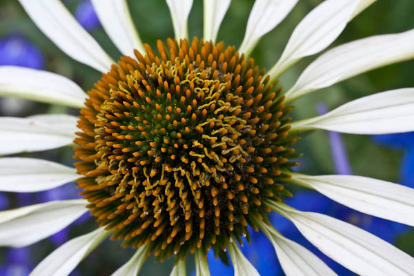
Rules of Composition are all around us, and we are reminded of them all the time.  Terms like Rule of Thirds are bandied about by everyone (including yours truly, having blogged about it myself here, here and here).  Other terms and compositional “best practices” and rules of thumb include things like “The Golden Mean”, “Sunny 16” and many many more.  But one that I have found to be most successful is the one of “filling the frame”.  This holds true for many types of photography.  For instance, there’s floral photography:

Filling the Frame in Downtown Denver

There’s also portraiture:

Filling the Frame with a Face

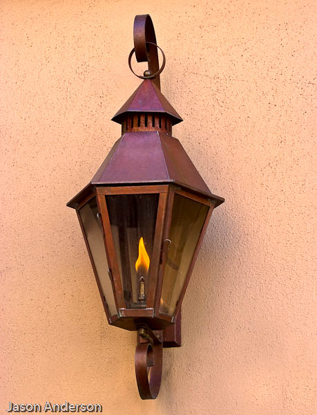
Architectural work also can use this concept:

lamp post

The one that probably does not lend itself too well to the compositional approach of “filling the frame” is landscape work.  But, as we all, know, exceptions often prove the rule!  And as much as I hate to admit it, and agree with the rules, here’s one that can almost always be used to improve your photography.  Here’s three reasons couple reasons why filling the frame works a lot of the time:

  1. It eliminates distractions – everything else around it becomes cropped out of the scene, leaving the viewer with nothing to grab their attention but the subject of the photo.  In the first shot, what else can you see besides the flower?  The second?  The third?  There is literally nothing else to look at.
  2. It accentuates lines and points of focus or interest in your pictures.  In the first shot – your eyes can’t help but go to the center because that’s where all the lines are pointing.  In the second, the girls eyes are a natural point of focus, and then in the third – the flame naturally draws you in as well as the sharp lines of the lamp itself.
  3. Backgrounds become blurred and/or beautiful! Bokeh, or soft blurring of out of focus areas is a natural side effect of getting up close and personal.  And if your f-stop is set lower to catch more detail, you are likely in close enough where the entire background is one consistent color like in the latter two shots.

This is, of course, just my 2¢.  What are your thoughts on filling the frame?  Does the approach work or is it too “in your face”?  These are questions that will likely be posed until the end of time, because they are by their very nature, subjective.  nevertheless, in sharing our thoughts, we can increase our appreciation of, and become more cognizant of the works of others and grow as artists.  So, share your thoughts in the comments!

In the meantime, happy shooting, and we’ll see you back here again tomorrow!

Grab the Feed

Galleries Addendum

Yesterdays post on how to get into galleries generated some great questions and comments both via email and on the blog, so in the interests of keeping that interest and momentum going, here’s a few more tips on Getting Into Galleries, courtesy of Dave Warner from LensFlare 35 and Rich Charpentier (who I’ve interviewed here on the podcast).  Thanks guys for chiming in and offering your assistance!  Onto the 5 additional tips:

  1. Make sure the gallery shows photography – if gallery owners deal primarily with paintings, sculptures, metal work, and such, the odds of being accepted are much less.  This involves actually doing a little research into the gallery.  Perhaps a visit or two during different showings could help determine whether the venue is appropriate for your work.
  2. Make sure the gallery shows your type of work – if you are primarily a landscape artist and the gallery primarily shows urban gritty work, portraiture, or architectural types f work, then again, reconsider the venue.
  3. Contact the gallery – let them know you are interested in being considered, and give a few small samples via email.  Ask if you can schedule a time to visit with them.  Like Dave and Rich said, nothing can be a bigger turnoff than showing up unannounced and possibly interfering with a scheduled appointment or client sale.
  4. Be professional – treat a prospective gallery showing like a job interview.  Just like you wouldn’t want to show up with 4×6 photos in a binder album, also don’t show up on site wearing cut-off shorts or be un-groomed.  It’s not just your work that is being considered, it’s YOU.  If you are accepted into the gallery, in all likelihood, they will want you there for the opening day, so people can meet you, learn about you and interact with you.  If you don’t present yourself with your best foot forward, then clients and gallery owners will probably be less interested.  Once you are big and famous, sure, being unkempt can be part of your “flair” or quirks, but until then, you are just messy!
  5. Be prepared to be told no.  It’s tough to hear, but don’t take it personally if at all possible.  Running galleries is a business, and when it comes to running a business, it’s not personal – it’s just a business decision.  Consider also that gallery owners get many many requests from aspiring artists, and simply do not have room or space all the time.  In the most recent podcast, Matt Timmons mentioned this briefly.  Just because someone says no, doesn’t mean a lifetime of “no”.  It just means “No” today.  Ask again in a few months.  Sometimes people like to see persistence, especially if your craft is getting better.

So, there you go, two days of tips on getting into galleries!  Ten tips total, so go forth and good luck!

Speaking of luck, best of luck to everyone who has been submitting their “Numbers” themed photo contest running right now over in the Flickr forums.  I took a quick glance this morning, and there are just shy of 50 entries.  Amazing given that only one entry is allowed per person!  And there’s still time – you have until midnight tonight to get your picture in.  The winner will walk away with a free copy of the OnOne software Plugin Suite (valued at over $500 retail)!  If you are thinking of getting in the game, now’s the do-or-die moment.  Like they say in lotteries – you can’t win if you don’t play!  Here’s the link to get in the game:  Numbers Contest

Have a great weekend everyone – Happy shooting and we’l see you back here next week for the latest and greatest in photography news, nuggets, interviews, reviews, and all that goes into Canon Blogger.  We’re closing in on some pretty fun dates, including the 500th post, the 2 year anniversary of CB, 1000 Twitter followers, and much more, so be sure to pick up the feed.  I know I had mentioned the next contest on the podcast as well, so be sure to stop back in Monday for the news on what the theme is, and to pick up the tag on Flickr for the thread.

Grab the Feed

The Rule of Thirds Revisited

We’ve all seen the term used, and the approach should not be a novel one to most of us at this point.  Heck, I’ve even talked about it here before to a certain degree.  But today, I’d like to take the Rule of Thirds and look at it from two distinct approaches:  landscape and portrait photography.  The reason is because the rule can be applied in different ways and these two genres illustrate well how the same rule can be applied completely differently.

To start, let’s just review real quick…

The Principle

The Rule of Thirds is a general rule of composition that suggests we divide our image up mentally into horizontal and vertical thirds to try and compose things interestingly.  In general, the rule suggests that you can make things more interesting by placing the subject either on a hotspot or on one of the imaginary lines.  I’d written on this in the past, so even have a demo grid to illustrate it:

Rule of Thirds Grid
Rule of Thirds Grid

The problem comes in defining what is interesting.  Do we place our subject on a hotspot or on one of the lines?  It also is a matter of which hotspot or line to place your subject on.  Think about it, we can put a subject on the lower third or upper third, but which looks better?  One person may look at the picture and say the upper third looks better, while another may say the lower does, and yet another may say that the image calls for breaking the Rule of Thirds and centering the subject!  Clearly, there are many different interpretations.  Today though, we’re focusing on the two distinct approaches of using the hotspots versus the lines.

The Results

The upshot here is that it seems the hot-spot approach works well with portraiture while the linear approach seems to work well with landscapes.  If you look back in your own image libraries, I bet your favorite landscapes have the horizon on one of the horizontal “thirds” lines.  If the horizon is on a bottom third, then the emphasis is likely on the sky, while if the horizon is on an upper third, the emphasis is more focused (pardon the pun) on the foreground.  Here’s a few examples of landscapes that incorporate the Rule of Thirds to illustrate what I am talking about…

folly_sunset
Folly Beach, SC
bull_island
Bull Island, SC

Can you see the “thirds” lines?  I could do the overlays, but think you can probably get the gist.  But now, try to visualize the hot spots in these images.  A little trickier isn’t it?  I think it’s because hot spots as subject points in landscapes are scarcer.  This is not to say they do not exist because they do, and there is sufficient evidence to support that, but overall a landscape image is more about the entire scene, and the best way to convey that scene is by composing to accent the best elements, which are often the lines – whether it’s lines of water rippling, lines of trees, or lines of mountains and such, the best way to position these is with lines rather than hotspots.

Likewise, if you are shooting portraiture, some of the best results I’ve seen have been where the subjects face (and particularly, the eyes) land on a hotspot.  Take a look at these examples here:

JoAnne
JoAnne
Armani
Armani

Can you see the hot spots and where their eyes are?  I could do the overlays but again, think you probably get the gist here.  Where are the imaginary “thirds” lines though?  Not as easy to imagine here either, and for similar reasons.  Because it seems as though portraits tend to lend themselves toward what I am calling “hot spot composition”, while landscapes seem to tend toward “thirds line composition”.

Then again, I could be completely off my rocker – so what do you think?  Is there merit in the idea?  Should I patent this, write my first book and become insanely wealthy?  Or, is this a farce?  Should I give up trying to come up with new ways of looking at classic approaches to composition?    Okay, obviously I am probably somewhere in between these two extremes, not completely off in Bizzaro world, but also not poised to make a mint either!  Regardless, I’d really like to hear the reader thoughts on this approach – do you notice certain types of photography lend themselves toward particular rules of composition?  If so, which ones go best with which rules?  What about the “why”?  Why do you think some rules seem to work better for some images and others not at all?  Or, do you tend to avoid the rules of composition and make things up as you go along?  Chime in with your thoughts in the comments or via email.

Happy Shooting and we’ll see you back here again tomorrow!

Mask Pro 4.1

Okay, I know the folks from onOne have been very generous with their contribution of a copy of the OnOne Plugin Suite for the latest giveaway here at Canon Blogger/Learning Digital Photography, but I have to say that I am literally blown away by this offer even more.  As I delve into each tool more and more, I am totally amazed at the functionality and how easily it really makes things.  For those of you that watch Photoshop User TV, you’ve seen what I’ve seen – ads from OnOne claiming that masking is made so super easy that you can swap backgrounds and composite images together in a snap – it’s a breeze, right?

Well, we all know that ads only show you the quick and flashy parts of things, not the nitty gritty.  Let me tell you here and now – the Mask Pro really has no nitty gritty – it really is that easy.  Take a look at these sequences:

First off, an image I merged together during a trip to SC last summer.  It looked like it could make for a nice HDR, so I did some tone mapping and got this result:
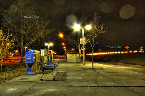
originalhdr

Needless to say, it didn’t really have the “wow” factor I was looking for.  (I should also throw a mention in for the folks at HDRsoft that produce Photomatix, the HDR software utility that I was testing at the time I originally put this HDR together – still working on a review of that – I lost the trial version after re-installing XP, but will get that back shortly.)  Anyway,  given the success I’d had with some other images in HDR and the background I tried, figured it was worth the effort to blend in a different background.  Here’s the results.
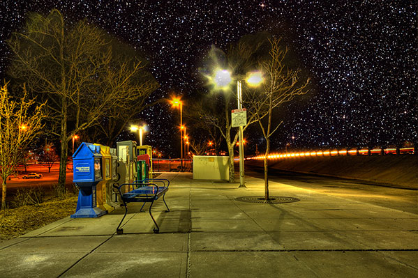
hackjob

Keep in mind, this was after literally hours and hours of painstakingly selecting branches, twigs, and  what not literally zoomed in to almost the pixel level.  Still, not that flattering a result and clearly a less than “stellar” job.  I relegated that to the “learn from your mistakes” folder and had not really touched it since.

So, this was my test for the Mask pro – could it do what I couldn’t after at least ten hours of agonizing masking selections and duping to repeated layers to start up the following day?  Well, let’s see, here’s what happened.

After installing Mask Pro, I loaded the tone-mapped HDR image into Photoshop.  Then, rather than taking any time to tweak, I went straight to Mask Pro (after all, it should do the work for me, right?).  After a short 7-slide presentation on the tools, my first screen looked like this:
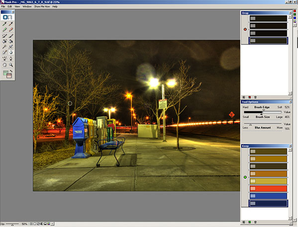
maskpro1a

Before I go on, let me explain how the tools on the right ended up how they were.  You see, Mask pro gives you eye dropper tools to select the colors you want to keep and the ones you want to subtract.    So, I went and selected the green eye dropper to define the colors to keep.  I clicked a few parts of the branches and signage, which took the better part of 5 seconds.  The end result was this color set:
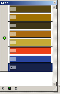
keep

Then I switched to the red eye dropper to define the colors to drop.  I clicked a few parts of the sky.  This took another 5 seconds or so.    The end result was this color set:
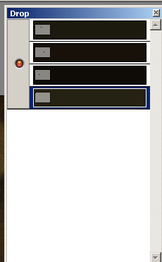
drop Lastly, I clicked the Magic Brush tool, from the Mask Pro tool panel maskpro_palette

and just started painting around the sky.  I certainly did not take my time, as I was running on my Windows desktop which has a single core 2.3 Ghz celeron processor (it chugs when I load my browser fer Pete’s sake).  So, I dealt with about 5 minutes of a magic brush tool as it calculated the mask to apply as I painted impatiently across the image.  (After all, I wrote these blog posts after dinner, so time = sleep here.)

So, after about 5 minutes and 10 seconds, I have a mask that looks like this:
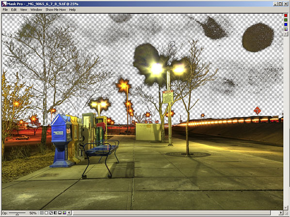
maskpro2

Yes, that was after 5 minutes!  I could already tell this was a wickedly intuitive and powerful tool (and I mean that in the best of ways), so I just stopped there and decided to take it back to PS for final cleanup and adding the new background.  To do that, I simply clicked the File menu, then “Save/apply” (another 2 seconds)…

Now back in Photoshop with the original image.  It looks the same, but take a look at the layers palette:
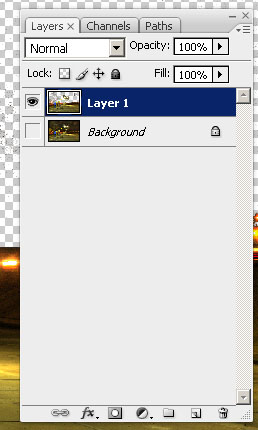
layers2

I know the low-res and smallness of captures for the blog make this hard to tell, but at this point I am pretty much ready to bring in the new background.  My only last step in PS is to duplicate the layer I just created from mask Pro to clean up the big blotch in the upper right, and a few specks in the rest of the sky on the third layer.   So, now I am ready to bring in my starry background again.  I place the object in the PS document to get this (for the record, I went with a different starry background to go for a more realistic effect rather than the Harry potter look of my swimming pool shots):
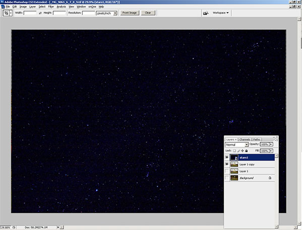
layers3

Finally, I just pulled the stars layer to sit below the Mask Pro layer and here’s the resulting layout in Photoshop:
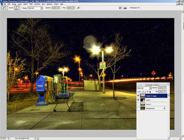
layers4

The last bit took all of another minute, tops (remember, I am working off a slow processor.  The final result, which took literally less than 10 minutes (the first took over 10 hours):
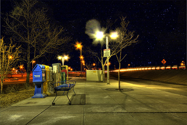
finalhdr

Such is the power of the OnOne mask Pro – just one of the multiple plugins that are available in this Suite.  If you want this kind of power and malleability in minutes, then enter the giveaway today.  it can literally save you hours, if not days, of post processing!  Here’s the Flickr page for photo entries and here’s the link to the rules.

What can I say – OnOne rocks!  Just to give you a true frame of reference – it took me about an hour and a half to write this post – and that includes getting the screen captures, then sizing them for the blog.  I also interspersed some Twitter time and surf time as well, so it’s not like I was really in any kind of “zone” or anything.  It was just another task in an evening of multi-tasking.  The original one took me over ten hours of processing and that was with no other apps running, seriously.  I was restarting the computer just to free up the RAM for usage only by PS every evening.

This feature alone can save you days of time in the digital darkroom.  Don’t delay and enter to win today! Happy shooting and we’ll see you back here again tomorrow.

Grab the Feed