Creative Composition – Vignetting Photos

In general we learn that placing your subject dead center in the frame is something to avoid – creatively speaking it can kill a picture.  While this holds true as a general rule, I was walking into work yesterday morning and the sky was a brilliant blue, with the capitol bulding of Denver right dead center in front of me, and I thought that might make an interesting attempt at breaking the rules if only I had my camera….and then it dawned on me, I did have a camera.  Granted, not my trusty 40D, but the smaller Powershot As500 IS.  So, on a whim out it came and I snapped off a few frames of it.  The vertical came out the best compositionally speaking, but it still lacked something to bring it into what I would consider the “creative” realm.  After all, it is a rather mundane shot, and something you would expect the typical tourist to capture.  So, how could I create interest…and then it dawned on me:  vignette!  That would bring the eye in more, focus attention where I want it to go. So, into Lightroom I went, and sure enough it did create a little more visual interest.  I thought I’d share that view with you here today:
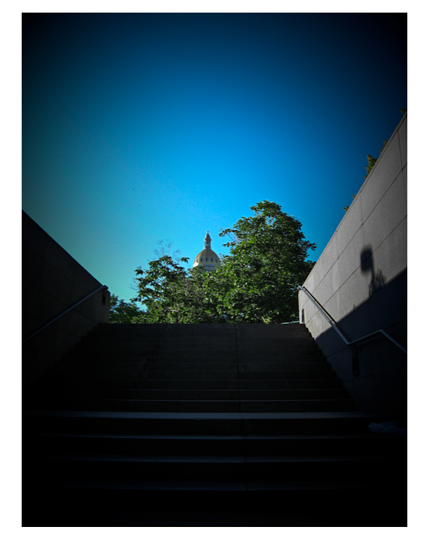
vignette

Granted this is still something that I would probaby personally consider a snapshot from my library of countless snapshots, but it does serve to illustrate that post processing in software can create more visual appeal and vignetting is one way to achieve those ends.  So, the next time you are about to toss a shot, ask yourself:  Could I improve this with a little vignette?  Give it a whirl – you never know whegn a little vignette might surprise you!

On that note, it’s always helpful to remember that post production work can make or break a shot.  Yes, the better your images are to start with, the less work you have to do in post, but that is not to say that post processing is a bad thing…so regardless of whether it’s a little dodging here, burning there, perhaps a litle vignette, or even applying some plugin processing from your OnOne Plugin Suite 4.5, always be willing to explore!

Oh wait – you don’t have the OnOne Plugin Suite 4.5?  Well, go figure, just the luck – today starts the July photo contest here on the blog, and entries are now being accepted in the Flickr thread here for some lucky reader to win their very own copy of the Plugin Suite from OnOne!  Pretty cool as this is a retail value of $500 for this package, so you can imagine the creative possibilities!  Feel free to capture away, and share your favorite shot in the contest.  You can find all the rules from the announcement post yesterday, but get out and shoot for your chance to wina free copy of this great software suite!

For those of you expecting the podcast today – year-end in state work means processing financials so we were working late today to get a lot of T’s crossed and I’s dotted before the clock struck midnight – so the podcast did not roll out today, but I promise it will roll out tomorrow and I’l be talking more about the photo contest then too, as well as answering viewer and reader questions, so if you have any to throw out in the mix, now’s your last chance to get questions in before the show goes live tomorrow!  Got a questio about photography, gear, software, tips, tricks, techniques?  Share it in the comments or with me via email.  Happy shooting for now and we’ll see you back here tomorrow for the podcast.

Grab the RSS Feed

Coulda beena contenduh

Actually, all 53 of the images that were submitted to the Lightroom Giveaway I’ve been taking entries for on the blog were contenders.   Truly some great images were submitted to the Flickr Thread for the giveaway I’ve been hosting for the past month.  Some really great images.

The rules were simple:  Take any two pictures you like in May, share them on Flickr thread (& be family/work-safe) and you are eligible to win a copy of Adobe Lightroom – courtesy of the good folks over at Adobe (especially Tom Hogarty who was kind enough to make an appearance on the podcast to talk about the product and to take so many listener questions!

Anyway, I said that after the close date (end of May), I would pick the ten images I thought were best and forward those on to him for a grand prize winner decision (not that there’s a 2nd place, runner-up, or anything like that).  well, in perusing the images Monday and Tuesday, I really couldn’t decide on ten.  There were just too many images that I felt deserving.  Such is the case of contests and giveaways though – and the role of judge is a lot harder than I thought it would be.  But, I did winnow the entries down though – just couldn’t go lower than 14.  So, without further ado, here are the 14 finalists!

Lightroom Giveaway Finalists

Naturally, rather than display the images in the blog, I figured it’d be appropriate to do so in a web gallery, created at the hands of Adobe Lightroom!  Hopefully, this will also give people a little more insight into not only Lightroom, but into critiquing your own work and prepping contest submissions.

That’s it for today – congrats to all the finalists, ant thanks to everyone who participated – it was a lot of fun to see everything.  We’ll see you back here again tomorrow, and hopefully I’ll hear from Tom soon on who the lucky winner is for the free copy of Adobe Photoshop Lightroom!  Keep on shooting, and we’ll see you back here tomorrow!

Grab the feed

Airtight Viewers – Web Gallery Options Reviewed

Initially, this week was supposed to be the second in a series of software review posts to take a more detailed look under the hood at Photoshop Elements as an alternative to Photoshop Creative Suite.  Truth be told though, the more I poke under the hood with Adobe’s Lightroom, the more hooked I get.  One of the absolute best features (in my opinion) is the web gallery options available to you in Lightroom.  The options are endless!  You can go from standard HTML, to Flash-based templates, and hybrids, with customizations galore.

One of my favorites though, is how Adobe integrated a certain type of web gallery – those from Airtight Interactive.  Not sure what the deal was, but the delivery of images via these methods is just amazing!  So amazing, that I had to visit the website of the developer a while back just to see for myself.  The best part is that this guy developed even more than what’s in Lightroom.  I literally could get lost in these viewers, and as a fan of imagery – cannot imagine anyone similarly inclined that would not just love these displays.  Easy to install, a snap to finish, and Adobe Lightroom integration – what’s not to love.  Rather than go into the nitty gritty details, I’d rather just let the products speak for themselves in a few web galleries I put together.  There are four main ones, with three having Lightroom integration:  Simple Viewer, Tilt Viewer, Auto Viewer, and Postcard Viewer.  Each holds appeal for me, and depending on the imagery I am delivering, I can see where each may be the one of choice.

Airtight Simple Viewer

For me, the go-to one is the Simple Viewer though.  Clean, simple, easy lines, and somewhat traditionalist, the simple viewer allows for intuitive and easy navigation while delivering your images with precision and clarity.  This type of display option is great for people who enjoy looking at images, but also don’t want to have to think about how to do anything.  Just click and serve up the next image.  Clean, simple,and to the point.  Artistic types and non-artistic types alike will enjoy this for the ability to rapidly peruse many images fluidly and easily.  No muss, no fuss, just photos!

Here’s a sample gallery from a little photo project I did over the weekend.

Airtight Tilt Viewer

A little tricker to manipulate for the one viewing the show, I can see why Adobe didn’t want to incorporate this one into their web presentation.  Where the Simple Viewer is easy to manipulate for even the most simple-minded, you   actually have to have a little acuity and dexterity to maneuver your mouse to control this slideshow.  I think portfolios that would work well with the Tilt Viewer are ones that are are more edgy and off the beaten path.  The grunge type look is pretty popular right now and these galleries work well in this kind of display because the viewer that comes here is more artistically inclined to begin with, so they probably enjoy the “tilted view”.

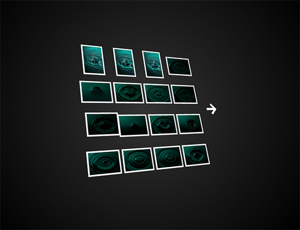
Here’s another sample gallery from that photo project I did over the weekend, as well as the preview of it in a browser:

Airtight Tilt Viewer Preview

Airtight Auto Viewer

By its own definition, the auto viewer is  “designed to display a linear sequence of images and captions”.  Photo journalists may find the chronological characteristics of their work to fit well in this viewer, as would sequential types of shots.  Event photographers would find some appeal in this also because it delivers up a single image at a time, which gest every image some “face time”, whereas the Simple Viewer is more of a mass display where the viewer can just pick out their favorites to view closer.

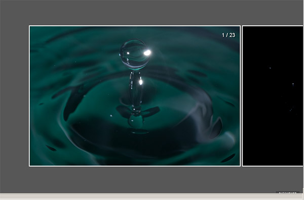
Here’s that same gallery viewed in this style.  Because of the nature of this project, it actually may look a little disjointed, but only because I purged out some less than desirable shots before creating each gallery, so there could appear to be gaps.  When approached from a more journalistic approach, that element could easily be managed with more inclusion.  For RSS readers, here’s a snapshot of the gallery in a web browser:

Auto Viewer Preview

Airtight Postcard Viewer

Here, the gallery has a great blend of classic photo gallery look and feel, while also incorporating a more “regular” sense to it.  The very name “postcard” suggests that anyone could look through this album and feel like they were a part of it.  Journalistic styles and event work would find appeal here again, but this style also lends itself toward the enthusiast or “prosumer” who wants to share their works with family and friends, but wants to do it with panache or style.  My only nit is that you only get one page of photos in either the LR or PS versions so images will extend above or below your page limit.  So, with this in mind, keep your galleries under the 20 count or keep the images smaller.

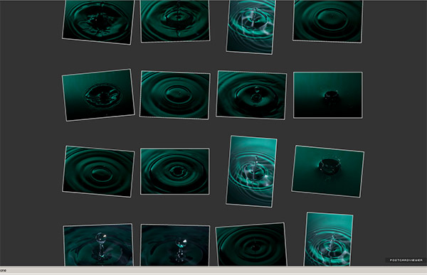
And finally, the photo gallery from this perspective, and a quick view:

postcard

*****

Having seen and read about each flavor, it’s your turn now.  What do you think of this approach toward web galleries?  Any particular favorites out there?  What about other web gallery options?  Any alternative approaches that people find unique or that offer an interesting way to display images?  Sound off in the comments, and let me know what you think – one may just end up getting reviewed! 🙂

In the meantime, happy shooting, and we’ll see you back here tomorrow!

Grab the Feed

Steady as She Goes…

This first day after a long Memorial weekend, things are a little slow out of the starting gate, but as luck would have it, slow and steady is the theme for today, because my gear review that I postponed from yesterday is none other than the trusty tripod!

The tripod is probably one of the most basic and easy-to-understand pieces of equipment in a photographer’s gear bag – yet likely one of the least used.  I can’t tell you the number of times (myself included) I have heard someone utter “Argh!  I left my tripod back in my car!”  We’ve all done it, so the question becomes one of how to ensure you take the tripod with you.  The answer lies in making the right investment the first time.

FOr me, the first investment (because we all invariably try this route first), was a cheap an economical one from Wal-Mart for roughly $20.  I was quickly disavowed of its ability to support even a Canon XT with a 70-200 lens on it.  I went so far as to weigh down the plastic center column with my gear bag to little avail.  It was just not built for my gear.  Perhaps such a tripod would be good for the P&S crowd, because I would rather not disparage any gear intended to provide an increase in stability.

Anyone who goes to any length to increase their camera stability recognizes the benefit of a tripod.  So many pictures out there can benefit from increased stability – yet they continue to pepper the internet in perpetuity.  So, if you really are strapped for cash – something is better than nothing.  But, if you would like to invest a little in “some legs” (parlance for a tripod among photog-types apparently), then take a look at Bogen/Manfrotto.

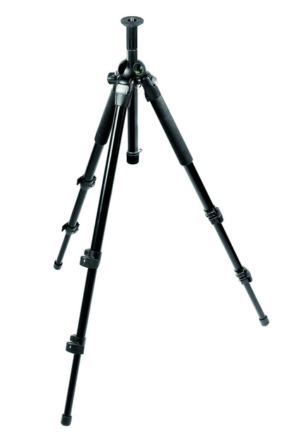
Bogen/Manfrotto gear is recognized as one of the industry leaders in tripods, monopods, and camera equipment.  Another serious name in the game is Gitzo, and I’ve heard good things about them too – but for my money, I went with Bogen a few years back in my pursuit of stability.  My choice?  The Bogen 3021BPro:

tripod

This set is really sturdy – made of aluminum and an extended eight of nearly 70″ (69.29 technically), this was a great investment for me.  I stand at 6’1″ (73″)  so the height appeal was a major contributing factor.  Cost-wise, it also came in within my range at roughly $150-$200 new.  With quick-clamp leg extensions, and the ability to set up at varying ranges of 25°,  43°, 73° and  90° it was a great investment for me.

With the stability and low price though, came a downside – weight.  The legs themselves weigh in at a little over 5 lbs, but I did not plan on being very mobile with the set.  So, it was a great starter set for me.  The reason why I said “set” though is because any good tripod also needs a good head.  You’ll notice from the inserted image that the legs have a lonely screwmount at the top.  This does not give you much mobility for the camera when attached, so you really need to also invest in a head.

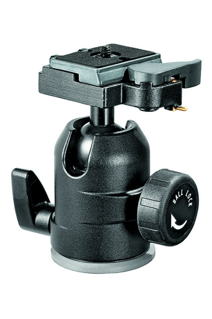
The head attaches to the tripod, and then in turn attaches to your camera and allows you a little more flexibility in moving the camera position around to get the right angle on your shot.  There are many types of heads including trigger mounts, ball heads, and pan-and-tilt heads.  Rather than get into an extensive discussion of the various heads as well, here it’s sufficient to say I chose the ballhead route.  Specifically, I went with the Bogen 488RC2.

ballhead

This is super nice because it allows you to pivot your camera around very easy and go from landscape to portrait mode in a snap.  Also nice is the fact that the head comes with a quick-release plate, basically allowing you to go mobile from your stationary tripod in a snap.  I’ll go into the various heads and how they work in some future post.  For here though, I got the ehad at about $120, so for less than $300 total, I had a pretty decent workhorse for a tripod/head set.   Here again, the only downside I can think of is weight.  The head also weighs in at 1.5 lbs so I am getting near 7 lbs of tripod weight total.  It doesn’t sound like much, but if you’ve tried lugging a tripod/head combo around on a photowalk, it can get pretty heavy pretty quick if you don’t have some strapped method for carrying it while walking or traveling.  For the most part though, it’s lasted me well and worked gloriously – when I remember to take it out of my car!

Eventually I will probably either upgrade this set of legs to the more lightweight, yet also sturdy, carbon fiber material that is becoming more cost effective.  At the time when I got this set, carbon fiber was very new on the scene, and thus very expensive.  As we see the presence of carbon fiber increase in the market place, the price has also come down some.  Not a lot, but enough for me to start considering it.  In all likelihood, I could see myself hanging on to this set for studio or location work while also adding to the gear bag with the more lightweight carbon fiber legs for on-the-go types of photography.

All in all though – if you don’t have a set of legs, this would be an excellent starter set.  For under $300 your pictures will undoubtedly see marked improvement – that’s assuming of course you don’t forget the gear in your car!  Happy shooting all and we’ll see you back here again tomorrow!

Photography Secret #1249871

There are so many tricks and little tips to taking better photos – it often seems like millions, doesn’t it?  Well, it does to me.  I thought of one last night that thought the listening audience might enjoy.  This one is a toughie though (because it’s not that easy to do)…are you ready?  here goes:

Shoot for fun

Yep, that’s it.  I say it’s tough because we can often forget about the fun factor.  We get caught up in the gear, the software, rules of composition, ISO’s shutters, apertures, marketing, advertising, booking gigs, constantly on the go, and all that stuff.

Last night I went out shooting with a buddy in downtown Denver – he’s only in town for a couple days, so didn’t have a lot of time.  It was a last minute thing too, so not like I had time to do any major set up or preparation.  Instead, we walked the 16th street mall – I showed him a slice of life in downtown Denver.  We saw some street musicians and other performers, hit some of the tourist sites like the Performing Arts Center, Denver Post Building, etc., etc., etc.  This is all stuff I’d seen before (and taken shots of before).

The difference last night?  I was just out with a friend, shooting the breeze, talking about photography, laughing and joking around, then we grabbed a bite over at Maggiano’s, a great local Italian restaurant.  It wasn’t all about the photography though – we were just having fun.  Yet, we both got some photography in there too, because we’re both photography enthusiasts.  (Well, I am an enthusiast, he’s a professional – his career deals a lot with photography, so he knows a bit more about it and does a great deal more.)  We were just out having fun.  And we (or at least I) had a blast!

Plus, he gave me a few pointers, so that’s always a good thing – to learn a little while having fun.  But without the fun, the experience just isn’t the same.  So, if you want a little secret to taking great shots – make sure you are having fun!  If you’re having fun, you are more relaxed, and can go with the flow, letting creativity and inspiration come to you.  I know I had a lot of fun, and some creative moments came out of our outing last night.  So, to the rest of you – make sure you shoot for fun every once and a while – it can really help energize you!  I’ll try to get a gallery of shots together for posting later – but until then, just keep on shooting.  Thanks for stopping in and we’ll see you back here tomorrow!

Say Cheese?

Ever wonder why we’ve heard photographers say that when taking your picture?  Think about what happens when you do – your facial features open up, your mouth opens slightly, and you get a little upward curvature in the corners of your lips.  (Unless of course you concentrate on specifically not doing that.)  Whoever thought this up eons ago was well ahead of the curve, because knowing how to take good portraiture encompasses entire volumes of books on the subject.

Volumes exist on what lenses to use, how to light, depth of fieldand much much more, but perhaps the most valuable information on how to take great portraits comes not just from technical awareness, but from personal interactions, and how to get people to act natural yet emotive and to let that come through in your work.  While no blog post could entirely exhaust the subject, here are ten quick tips on taking better portraits:

  1. Establish a connection – portraiture is about connecting with someone through the image.  If you don’t connect with them through the camera, then there will be no connection in the print.  Make sure you connect with your subjects in some way.  Get to know about them, because that knowledge can transform your vision into really beautiful works of art.
  2. Relax the subject – Connecting with your subject means they feel comfortable around you – now the key is to get them to feel comfortable in front of the camera.  Many times this is much easier said than done, but when you do get them to relax, the poses will come more fluidly, and you’ll get better results.  One way I do this is to just start taking pictures of things around us as we talk and connect.  The whole idea of hearing the shutter can be scary to some people, so by hearing it almost to excess and know it’s not on them can mitigate the “scary” factor.
  3. Choose a background – if you are in a studio environment, this is fairly easy, but if you are on location, keep your eyes out for backgrounds that provide contrast to the subject.  Are they wearing light clothes?  Look for a dark background.  What about props to give a little more meaning.  Are they sports fans?  Have them hold a football, or stand by a basketball hoop.  Backgrounds can help give more definition to your subject.
  4. Have a purpose – try to think of reasons why you are taking the picture.  Is it to record an event, or is it for a model?  What about a head shot for a business executive?  If you think of why you are taking the picture in the first place, that can help give you ideas for how to compose it.  For the event, it’s about the moment, while the portrait it’s about just the person, so give some thought to how to enhance their best qualities and minimize flaws.
  5. Create separation – this is crucial to giving definition to your subject while minimizing distractions.  In the on-location areas, look out for things like power lines, nearby light sources and other objects that may detract from the subject.  Here it also helps to keep a wider aperture so that any distractions can be effectively blurred out of focus to minimize their impact.
  6. All about the angles – Some people have great profiles.  Striking features can be accented from certain angles and can give greater impact and meaning.  Shooting from below can suggest power and strength (for the business executive), while shooting from above can minimize a body style that is more robust.  Even profile shots can be stunning if done right (hint:  try shadows there).
  7. Lights, lights, lights – photography is all about painting with light, so portraiture is no exception.  Whether it be modifying existing light with reflectors, diffusers and shoot throughs, or creating your own light with strobes and flashes positioned off to the side or from above, lighting can create a wide variety of moods and bring images to life, especially in portraiture!
  8. Watch the eyes – for any subject, whether human or animals, we like to have the eyes in focus.  It’s just the nature of people to look at the eyes in a subject, so make sure the eyes of yours are tack sharp.  Seeing a persons eyes have often been said to be a mirror to their soul.  You can get playful eyes, soulful eyes, sad eyes, sparkling eyes, weepy eyes, tear-stained eyes, angry eyes, hungry eyes, passionate eyes… (you get the eye-dea!)
  9. Clean that skin tone – this means make sure that you are keeping the tones in check.  If the skin is too orange or too blue, add or remove some flash or ambient light.  Here the key is in white balancing your images.  Take along a grey card (even something as small as a 3×5 card can work) and you can set your white balance off that – your skin tones will be spot on if you do – and save you tons of post processing time.
  10. Less is not always more – let’s all just admit it, it’s a digital world.  Those pictures are really just data packets and with data being as cheap as it is, we can afford to take more shots.  This can help with blinkers, and if you want to try several poses or wardrobe changes, or lighting changes, or location changes, or group changes (think weddings). or weather changes (think sunlight versus rain, versus cloudy), or….I think the gist is clear again here.

So, there’s ten nuggets.  I tried to be brief yet have some detail, but you can never have enough time or space to really cover something with so much to talk about in a short blog post.  With that in mind, what about your thoughts on portraiture?  Add to the pool!  Got any ideas, DIY tricks or nuggets that work for you?  Share them in the comments or via email.

Before signing out for the day, I’d like to give some special thanks to a few people.  First to Derrick Story for the helpful link from his blog post today about the tethered shooting write-up.  It’s always nice to get what I like to call “a nod from the Gods”, but not only did he write a post about my write-up, he also submitted it to the Imaging Insider, who subsequently included the write up on their site.    Second up, I’d also like to throw some NAPP-Love back to Karen from “Pursuing Photoshop” (a.k.a. Mitzs in the blogosphere, also a member of NAPP) for her link back to the Adobe Photoshop Lightroom contest currently running here on the blog – thanks Mitzs!

Oh yeah, and finally, don’t forget the Photoshop Lightroom contest I announced in last week’s podcast – it’s running over in a thread on Flickr, and the images are starting to come in.  Some really nice ones so far, but there’s plenty of time left in May to enter!  Good luck to everyone!  Well, enough content for one day, so happy shooting and we’ll see you back here tomorrow.

The Sigma 70mm Macro

Next up in my gear bag is the Sigma 70mm Macro lens.  This is one sweet lens.  With an aperture that goes down to f2.8 this is legally classified as “fast glass”.  It’s got some super nice bokeh, and has an impressive range for it’s sweet spot – ranging from roughly f2.0 – f11.  Seriously, it’s tack sharp through that entire range.  It’s got the characteristic touch and handling of all Sigma lenses with its brushed matte black coating.

Other features include the manual on/off switch for auto-focus, which is typical for most lenses these days, but one thing I particularly enjoy is the limiter.  While this is also characteristic for macro lenses, it helps to keep you within a certain range of focus so it doesn’t have to search as long before finding that tack sharp point.  This toggle can be turned on or off any time, so it really helps when you are in Macro mode or shooting portraits.  Oh yeah, did I mention this does a nice job at portrait work?  The 70mm fixed focal length means I don’t have to get too up close and personal like you would with a 50mm lens, but I also don’t have to be as far away from the subject so it’s still fairly easy to interact with subjects.

If I had to list downsides, they would be that without the limiter on, it can take a while to focus, and that it is somewhat noisy when it is searching.  I am very spoiled by the USM features of Canon bodies, and wish I had the Sigma equivalent (HSM – Hypersonic Moter), but that was just not available in this lens at the time (and don’t think it is to date…).  Lastly, I don’t like how the lens shade prevents you from capping the lens when out in the field.  If the lens hood is on, the cap simply cannot be in place.

As with any fixed focal length lens, it forces you to compose with your feet (if you want a tighter shot, step forward a few paces, and if you want to go wider, step back).  But it does give you tack sharp results each and every time.

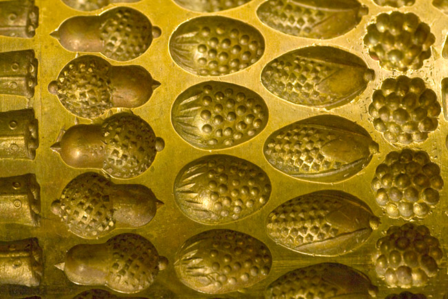
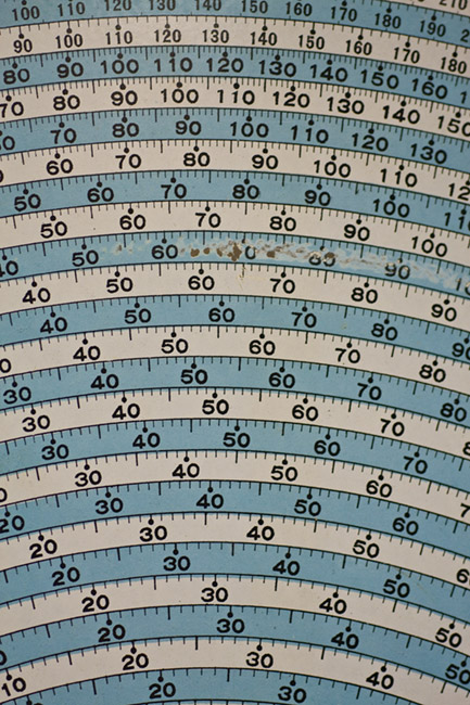
Here are a few sample shots I took with this lens, both in normal mode and in macro mode over the weekend for this post.  My in-laws were in town so we did the tourist-y thing.  First off, we visited the Hammonds Candy Factory where pictures are not only welcomed, but encouraged – so, my camera in ahd with 70mm attached (intentionally only went out with one lens each day…), I got some good samples of each category, except Macro (you need a tripod most times when shooting Macro work – at least I do in anything but the brightest light!):

Still Life

Candy Form Press
Candy Form Press

Some of the wonderful candies at Hammonds

Candy Swirl
Candy Swirl

Weights and Measures

Weights and Measures

Portrait

Cute as a teddy bear!

There you have it – the 70mm Macro f2.8 from Sigma – the third lens in my bag.  Coming up next week, the 70-200L f4.0.  it’s an oldie but a goodie!  What do you think?  How does the Sigma 70 Macro stack up based on what you’ve read here?  Like it?  Love it?  Hate it?  What other macro lenses do you have experience with?  Share your thoughts in the comments!  Happy shooting and we’ll see you back here again tomorrow!

Don’t forget about the Adobe Photoshop Lightroom Contest announced over on Learning Digital Photography!  Win your own copy of LR by sharing images in the Flickr thread here!

Creative Vision – or not!

When looking at image composition, many of the things we use as our foundation are the typical rules of the trade – things like the the Rule of Thirds, Sunny 16, Golden Mean, etc., etc., etc.  While these rules are all well and good, and they definitely are some of the fundamentals that we all incorporate as we see to create beautiful images – they do not constitute the entire picture (pardon the pun).  As photographers, we should also be challenging ourselves to look at things in unique and new or innovative ways.

For instance, take the Eiffel Tower.  This particular piece of architecture has been around for so long now that photographers have had an opportunity to capture this from pretty much every angle and in virtually all lighting conditions.  You would be hard pressed to come up with a new angle or an unused lighting style for this monument.  So, what if you take a trip to Paris – should you not even bother with a picture?  Of course not!  Snap away, be a tourist  want and get your other half mugging next to the Tower.

The same could be said for the Sistine Chapel, the Venus de Milo, or any other of thousands of historically significant and/or interesting works.  And seriously – what do you think would happen if you went on a trip to Paris, came back and said “Nope, no shots of the Eiffel Tower, been taken too much already, no sense in taking yet another shot of it.” If your family is anything like mine, people would look at you and wonder – “But, you’re a photographer!”

The point here is that you don’t always have to be “on” and looking for that next great shot.  In fact, the minute you stop trying so hard to find inspiration, in general, the faster inspiration finds you.    Let the boring snapshots happen – they’re fun, and a great way to connect with others.  Imagine being at some social function and you’ve got your camera.  Are you looking at the light, wondering what aperture/shutter settings you can feasibly hand hold at without over cranking your ISO, or are you enjoying the time spent with family and friends?  Before you answer that – answer this – which circumstance do you think will provide more inspiration and creativity?

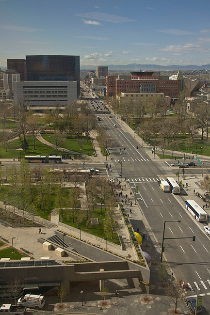
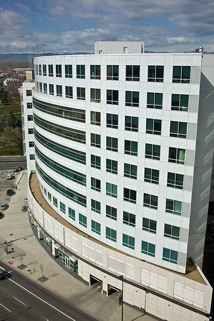
Just the other day I was delivering some computer stuff to another building, which happened to be 14 floors up.  Sure, I have my camera with me – and I looked out the window.  Aerial photography has always intrigued me, but I had never given it another thought – until the other day.  So, didn’t really think much and pointed my camera out the window, just having fun and taking a few snaps of the scenes:

denverabove1

Quite the boring shot eh?  Certainly not even close to being on par with something like the Eiffel Tower, the Louvre, Venus de Milo, or anything like that.  It’s pretty much a scene of nothing.  But from nothing, and from not even trying to always be “on” you can find your creativity and inspiration.  This shot was taken only ten seconds apart from the previous one:

denverabove2

Okay, so it’s still not as breath-taking as any of the other historical monuments, but you gotta admit, that curved line of the building receding into the distance is kinda neat, eh?  This isn’t really looking for props or accolades though.  The point here is to not let yourself become too preoccupied with achieving your next great “hero” shot on every capture.  That is only setting yourself up for failure because no one can attain that.  Sure, it’s important to try and stretch your creative muscle, and try new captures, and experiment with new styles, using different lighting and all the stuff that goes hand-in-hand with being a photographer, but remember, before you can be a photographer, you gotta be a person!

Enjoy photography, but don’t forget to live your life!

Don’t forget to pick up the feed for the blog and the podcast – all during the month of May, you could be shooting to win a copy of Lightroom!  One of the best ways to do that is to just go out and have some fun.  Forget about the details from time to time and just enjoy life – because that is when you will most likely get your hero shots – when you least expect them.  So, just enjoy life, and enjoy photography – the rest comes naturally!  Happy living and we’ll see you back here tomorrow!

The Rule of Thirds Really Does Work!

When it comes to composing our images – we are always looking for new ways and angles to capture things.  Often though, sometimes the traditional methods work too though.  In fact, I would venture to guess that if shown 100 pictures where the standard rules of composition were followed, and then 100 pictures where standard rules were deviated from, the former would have more shots that found a widespread appeal.  The rationale?  Standard rules usually will work – that’s why they are the standards.  Things like the Golden Mean, the Rule of Thirds, and Sunny 16 are all basic rules of composition and exposure, and if you want to ensure things “just work” – traditional rules really will work the majority of the time.

For the purposes of this post, I am going to talk about one of the most basic rules – the Rule of Thirds.  The Rule of Thirds (or ROT) basically says that if you divide your image area up into a grid, where the horizontal andvertical areas are divided equally into thirds – you will get cross-sections that define where your points of interest should be – often called hot points.  Here’s a diagram to help demonstrate:

rotgrid1a

So, here the frame is divided (roughly) into thirds both vertically and horizontally.  Where the lines intersect, I’ve created red circles to indicate the “hot points”.  These are your points of interest.  If all else fails, placing your subject matter in these areas (or close to them) will dramatically improve your composition.  Here’s a great example:

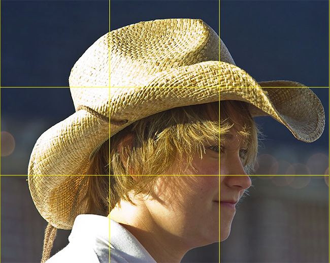
rotgrid2

Here’s a shot of a carriage girl I took back in Charleston.  See where the cross-sections are?  I changed the color of the grid to make it easier to view – so you can tell that her eye is right on the marker for the right-most third grid line.  This really helps the composition that her eye is there instead of elsewhere (often times, there is a tendency to place the eyes closer to the center of the frame – resist that temptation to give your shots that extra oomph!).

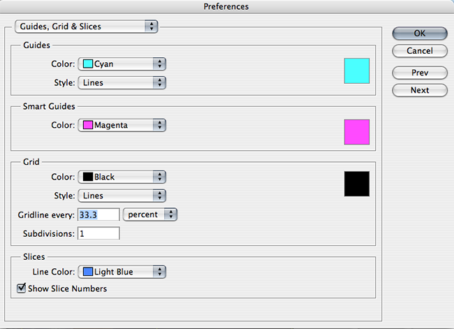
In fact the ROT concept s such a well-known standard, the folks over at Adobe have incorporated that element into their crop tool – so that you can crop your images to adhere to this rule.  Since I will likely get someone to ask – you can create this ROT grid in other variants of Photoshop (CS family), but going to your application preferences and selecting the Grids, Guides, and Slices option.  In there, change your grid size to display lines every 33.3% and number of grids to 1.  Then choose a strong color so that when you display the grid – you can see it!  Click OK and you are done – from now on, to show the ROT grid when cropping or editing in the CS family – simply use the CMD/CTRL key and the apostrophe ( this doohickey  ‘   ) to toggle the grid on and off.  Here’s a capture of the area you need to make the changes:

rotgrid4

There you have it – the Rule of Thirds grid – what it means and how to use it!  Any other rules of composition you would like explained?  Feel free to email, share your thoughts, ideas, suggestions and feedback in the comments or privately (if you rather would preserve anonymity).  In the meantime, go out, take some shots and practice visualizing that ROT grid in camera – that’s what will turn your snapshots into great shots!  Getting it right in camera!  Happy shooting and we’ll see you back here again tomorrow!

Come on Ride the Train

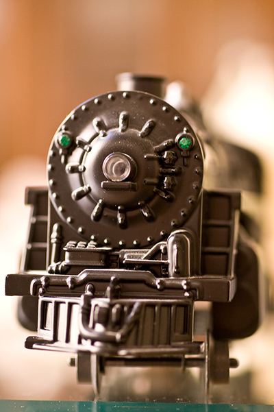
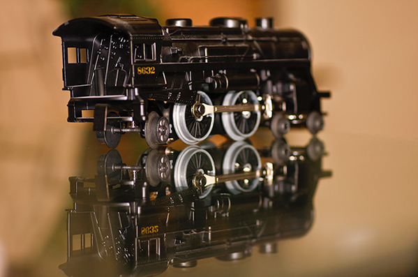
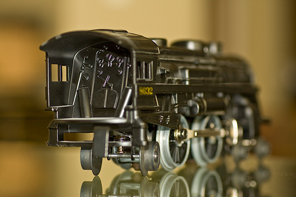
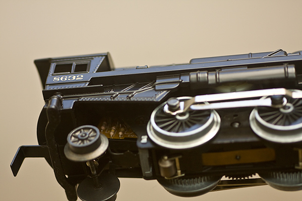
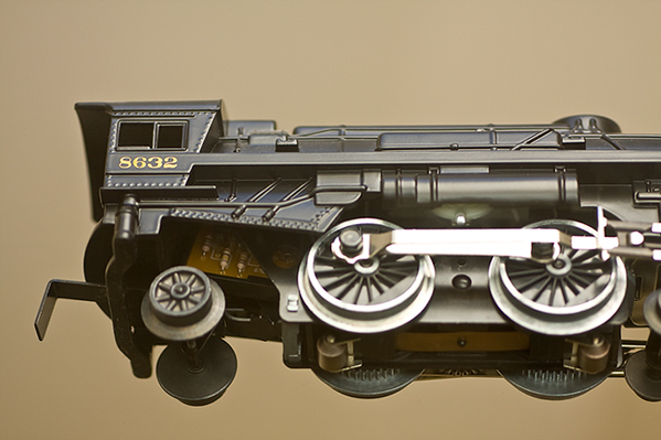
It’s somewhat fitting this week that yours truly is making serious use of the mass transit in Denver because a project that has finally come to fruition is a photo-themed shoot of trains.  I’ve always found them quite interesting, and only recently did I come into possession of a very high quality model train to pose as I desired for specific types of compositional and focal impressions.  Since the podcast isn’t quite finished, I figured now would be as good a time as any to share with you a sampling of my Train project…

_mg_8969

_mg_8959

_mg_8964

_mg_8966

_mg_8967

So, there’s the “Train Series”.  I tried various lighting scenarios, depth of field, and compositional approaches to see the effect each has.  I know which one(s) I like the best – what about you?  Any favorites, thoughts, feedback, criqitues?  What about your own themed projects?  Any sources of inspiration?  feel free to share them in the comments section!   Happy shooting, and we’ll see you back here tomorrow!