Triptych Photography 101

If I were to say the word triptych to you, many folks wouldn’t know for sure what I am talking about. Let’s be honest…in photography, there are lots of crazy semantics to understand! Everything from ISO’s and apertures, to shutters, diopters and f-stops, ASA’s and guide numbers are all part of the craft. Heck, there’s even one called the “circle of confusion” – and you can quickly get lost in the sea of words and acronyms in photography. One that I can’t believe I’ve not talked about here before is a TRIPTYCH! It’s pretty simple actually when you break it down really though, so fear not. Here’s your beginner’s guide to triptych photography!

In a triptych, all you are doing is taking three photographs and putting them together in sequence. The sequence can be three photographs all composited into one montage (say in Photoshop), they can be individual prints that are assembled in a wide frame, or even three framed photos that are hung horizontally or in close proximity to each other on a wall. Traditionally, triptychs follow a theme, whether it be a series of photos over time (a house in the Spring, Summer, Fall and Winter), a person with different poses, or a landscape cut up into a left, center and right framed photograph.

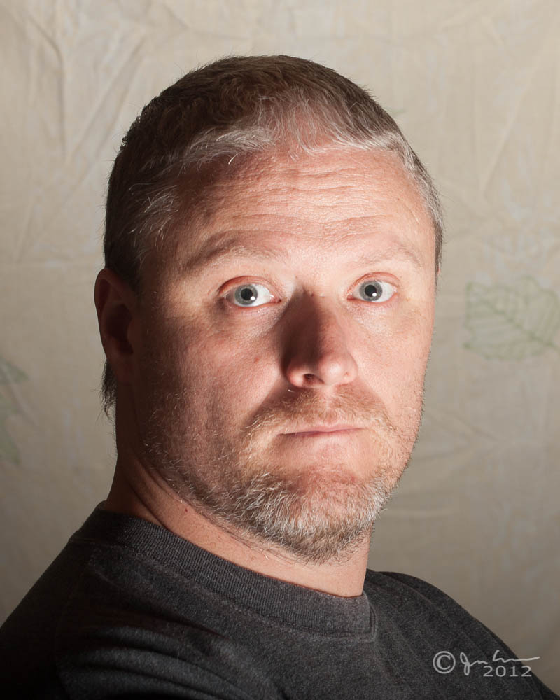
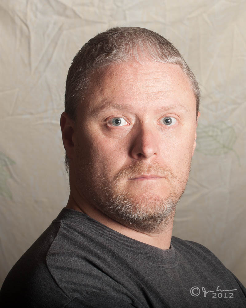
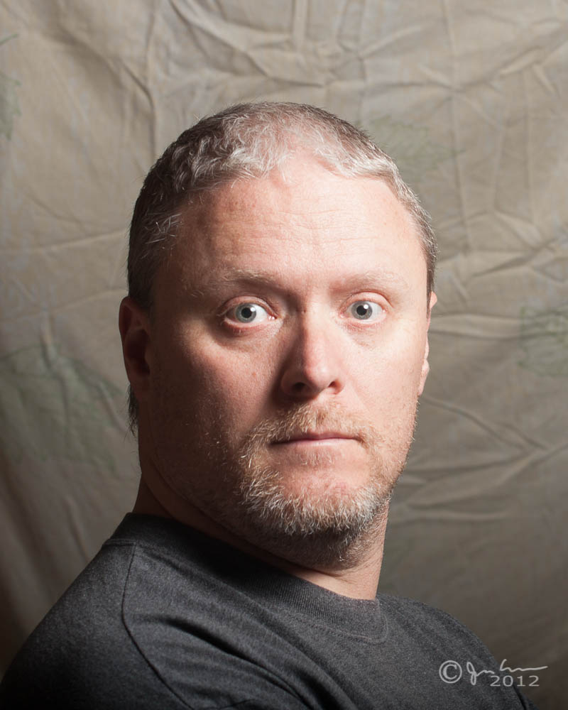
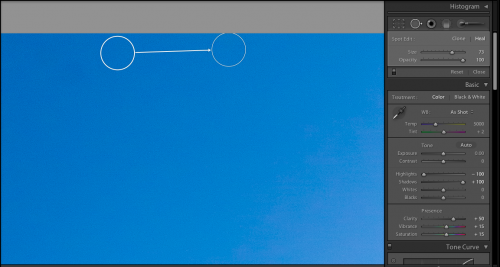
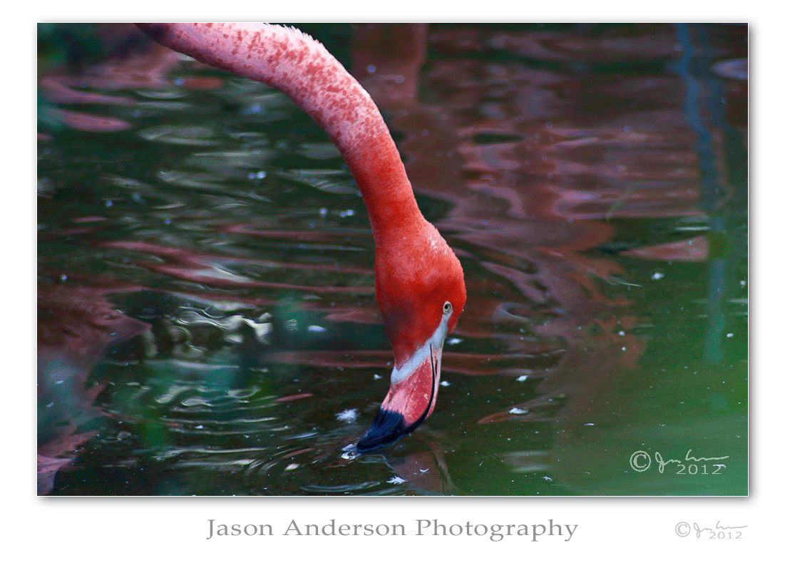
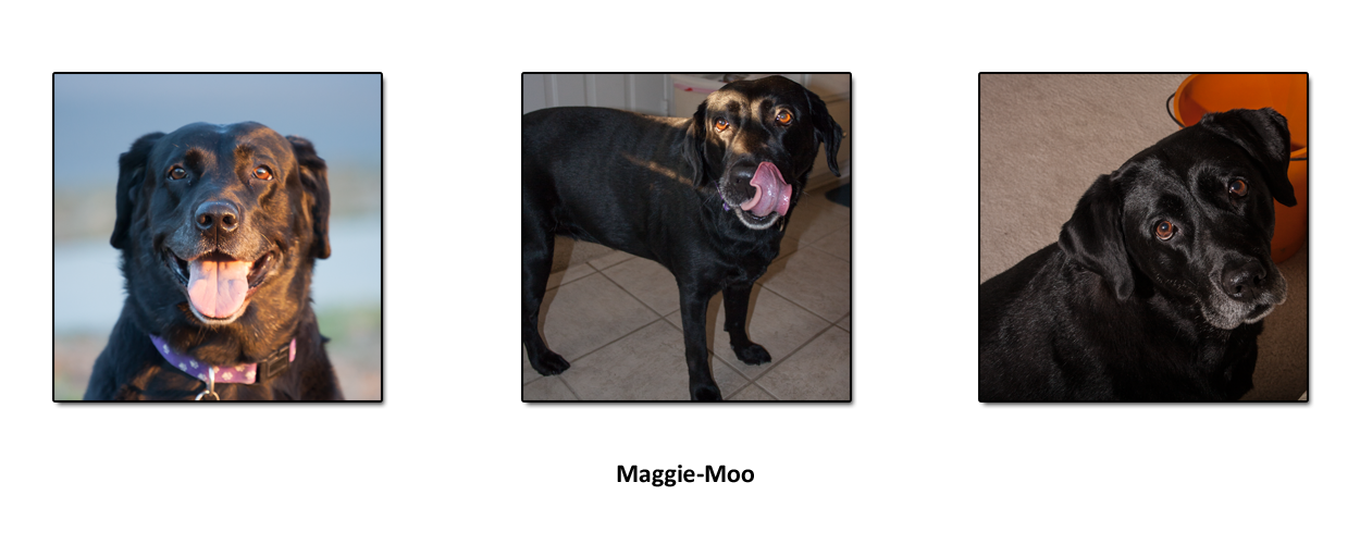
Triptych photographs can be a lot of fun, especially if you have the digital capacity to preview how things might look in sequence like this. Here’s a few examples I’ve done digitally to give you an idea. First, a posed series:

Triptych Portrait - Maggie
Triptych Portrait – Maggie

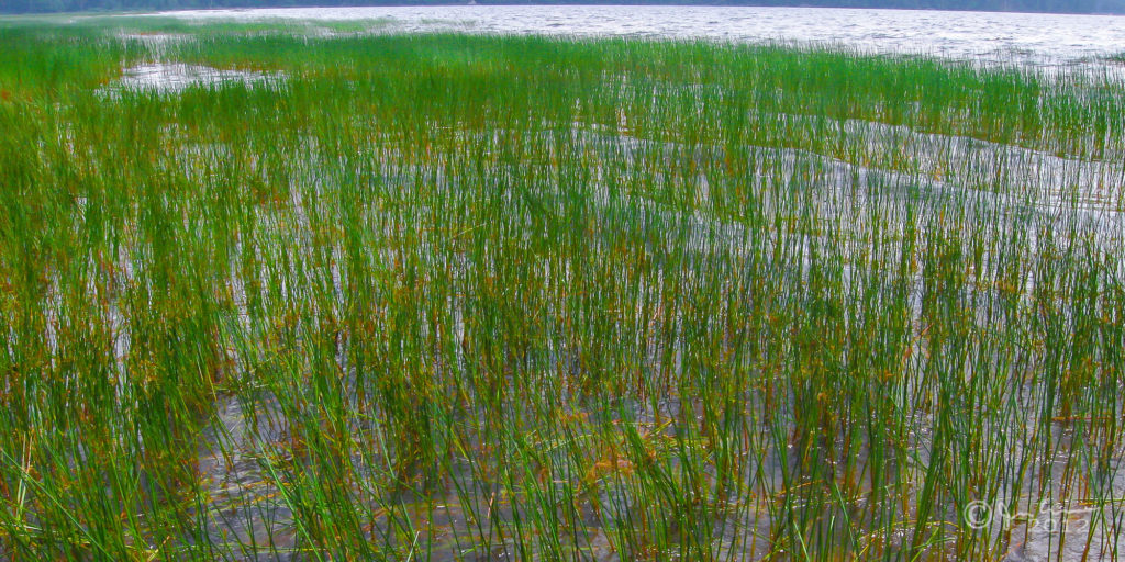
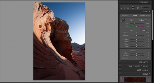
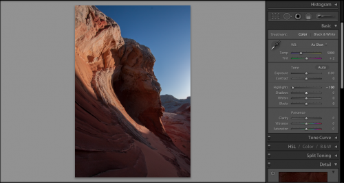
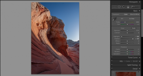
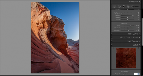
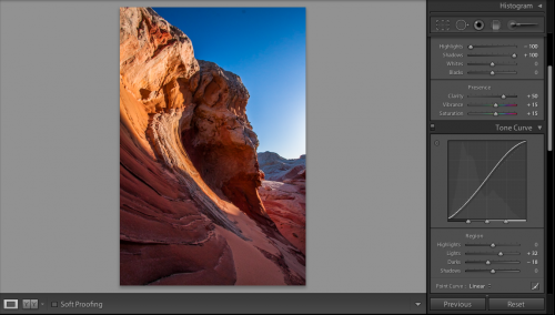
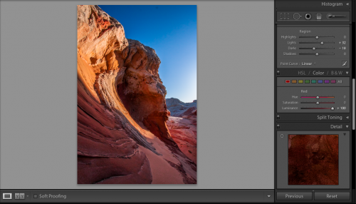
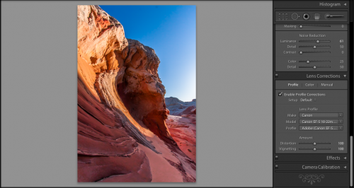
And now a landscaped series:

Triptych Landscape - Weeds
Triptych Landscape – Weeds

See how a landscape can have various elements in each, to visually tie things together? This is similar to, but quite different from the effect of a series of portraits. I’ve seen some wonderful triptychs where people have assembled longitudinal poses (say a dog as a puppy, at 4 years and in their senior years), triptychs of seasonal changes in a landscape, and even triptychs that juxtapose color, black and white, and sepia filters on photos.

Triptych Boneyard Beach

Add to it the ability to angle photographs from the top left to the bottom right, or from the bottom left to top right, and even up and down to create an entirely different effect. Matting and framing choices also factor into how successful a triptych display would be. You literally are bound by nothing more than your imagination. As the folks at Canon are keen for saying then, where does your imagination want to take you today? Follow that path unique to you! To that end, I’d like to hear from the reading audience, here’s my questions back to you:

1. Do you find triptych styles of presentation appealing?

2. Have you done any triptych work in the past that you’ve posted either online or in your own house or gallery?

Shooting for fun or money

For this first of two holiday weeks for the year, the blog will be turning to more of an esoteric theme. Tips, tricks, tutorials, and the like are all fine and dandy, but this week I’d like to pose a question fo whether we are shooting for fun or money!

While clearly we all start in the craft because we love it as a form of expression. We are captivated by capturing the moment, painting a scene with light and color. if we learn the craft well enough, and our eye gets discerning enough, others may ask us to take pictures for them! Or even better, ask if they can have a copy of something we’ve already done. Praise is a wonderful ego boost and source of flattery, and while we all may mask it with self-deprecating remarks, humor, or coyness – no one likes the compliment better than someone who wants to pay them for their work!

“Getting paid to do something you love” is an oft-quoted sentiment, as is the idea that “if you love what you do, you’ll never work a day in your life”. But, truth be told, if you make your living in photography, there is going to be a certain amount of pressure to perform – or produce results. And the minute to take something you love and try to earn a living at it – the pressures of running the business side will reduce the passion you have for the subject. It’s the nature of the beast. You have to eat. You have to have shelter. If you can’t afford those two necessities, how much will you really “love” working as a professional photograper?

The shot today is a perfect example…I absolutely love this shot:

Adirondack Weeds
Adirondack Weeds

From a critique perspective, this is a horrible shot. The angle is all wonky, the horizon isn’t straight, there is really no subject, and I probably butchered the saturation in post production. But, for me…when I was canoeing with my family this last summer, we were cooling off in Raquette Lake, and I was sipping a lukewarm beer. My brother and brother-in-law were to my left and right…the nephews were out galavanting around being pirates or whatever young kids pretend on trips like this. We were cut off from the world (well, not really, but as close as one can get since there was no cell reception, and only a 9-5 Park Ranger available to sell you firewood at $5 a bundle)., and this shot reminds me of that day. I loved that day, and for that reason, I love this shot!

This shot will never sell though – for no one else except those on this trip, this shot is meaningless until now. I cannot make anything off of this picture. Yet I feature it today on the blog because I took this shot for fun…

The comparison shot I am about to show you actually sold for me on iStock. Now granted, it’s not like I’ve made a ton of money off of it (it only sold once or twice), but it actually sold!

I was on a photo walk, scouting out areas for the South Carolina Photography Guild (now defunct), and the shadow of the guy on the crane, along with the wet bricks from where he was repairing and cleaning the masonry work just stuck out for a reason. I took it from a few angles and this one was the best of the 3 or 4. In the end, it was kind of a boring shot, but it was pretty tack sharp, and when I opened my first iStock account ages ago, figured it’d be a good sample to submit to show I had enough of a grip to consider stock work. The image was approved, along with 4 or 5 others, and my istock account was opened. Within a few days, there was a sale on this shot. Do I like it? Not really. It’s probably on some construction workers website, or someone wanted it for a church bulletin, or a school project or other long-since completed project. It doesn’t really inspire me though.

Which image brought me more satisfaction? Which one brought you more? Would you pay huge amounts of money for either shot? Probably not. I wouldn’t either. Thus, this is the dilemma we face.

It’s no secret that most photographers don’t make huge amounts of money. Yet, somehow the ability to say that “I am a professional photographer” is something said often with a sense of pride. Is it because you know the crap out of pixels, shutters, and apertures? Or is it because you made 50.1% of your revenue from photography last year? Or is it because you love to hear the sound of the click? Last but not least, could it be the excitement at seeing something you made come out beautifully on either a printed tangible piece of paper or in a web page…saying “this is my artistic vision that I want to share with you”. Why do you take pictures? What motivates you?

Monopods can Make Music

So often, photos that inspire you are ones taken from new angles, or from angles that you can’t normally get to, or think to get to.  Monopods are great tools in this regard…you can extend a monopod up over your head for more of an aerial perspective, or even turn it upside down to get an angle that might be otherwise pretty awkward or uncomfortable to get into just to get a unique shot.  I love my monopod!

While the good money will always add features and functions that don’t exist on lower end models, I do think that even the most basic of monopods can be useful – to the degree that even going with a Wal-mart brand or generic named vendor can be a sound investment.  If you are talking about just getting to a place you can’t get to on your own (or even with a tripod), the difference between aluminum and carbon fiber on a monopod doesn’t have as much impact here in my opinion.

Now if you are going for the stability factor, yes, a sturdier monopod would likely yield better results, but how much better do you expect from a single-legged support mechanism?  Seriously – even with your own two feet, you can get pretty steady with your shots if you use a good holding technique, tucking your arms in, leaning on a wall or tree, and going between breaths (or shooting between heartbeats as my former Drill Sergeant said in the Army.)  How is one foot going to get you more stability than two feet?  On it’s own, not much, so I don’t sweat much over the vendor here…

Check out these low angle shots I got with just a Wal-mart tripod and some creative thinking:


The Denver Art Museum, shot near midnight.  The camera again, was upside down (I rotated it in post), and I held the foot of the monopod to get this low view.  EXIF Data:  ISO 100 33mm f/8 8 second exposure (it’s a tad blurry when you zoom in…)

This serene harbor was shot with the monopod, and the camera braced up against a tack shop.  EXIF data:  ISO 100 18mm f/11 5 second exposure

I shot this waterfall with the camera upside down and me holding the foot of my monopod while the camera was as close as I felt comfortable putting it close to the base of the waterfall.  EXIF Data:  ISO 100 21mm f/11 2.5 second exposure

This shot was taken with my monopod and the camera braced against a streetlight.  EXIF Data:  ISO 800 22mm f/22 4 second exposure

Portrait Lighting Basics – Part Two

Previously on the blog, I took a look at various lighting positions and their impact on portrait lighting.  We looked at scenarios where the light is in front of, behind, and off to an angle on our subject. Check out the photos and results here.  Now that we’ve found the best position in that regard, it’s also helpful to consider the angle of the light.  Will it be better coming from below, at eye level, or above the subject?  Some of the things we’ll look at include the quality of light, amount of shadows, and even catchlights in the eyes.

Let’s start with the light coming from the lower angle:

See how the quality of light hitting my face looks really nice, but there are some pretty substantial shadows as the light trails off to camera left.  Shadows are not necessarily a bad thing, depending on what it is you want to accomplish, but it’s worth noting the degree of shadow when lighting from a lower angle.  Last but not least, look at where the catchlight is hitting my eyes.  This reveals the location of the light, but also gives a little bit of added interest to any portrait.

Next up, let’s see what happens when we move the light to at eye level:

Here, the light is able to wrap around and reduce a bit of the shadows on the backside.  This may have to do with the fact that there are some white cubboards behind me in the garage/studio too, but this is a known behavior of light spilling over from this angle.  Note also that the catchlight is now near the middle of my eyes, but off to camera right.

Finally, let’s take a look at the results when lighting from above:

Here, the shadows are also lessened due to light spill, and the catchlight is also re-positioned.  Note that in all the setup shots I am using ETTL and not really dialing in the light at all, so in all scenarios the quality of light is a bit harsh for my own tastes.  Discussing ETTL versus manual settings is a separate discussion though, and here I just want to help illustrate what happens to portraits when you start moving lights around.

 Which setup do you like best?  Does the quality of light change for you?  What about the catchlights?  Make sure to subscribe for future articles just like this one on learning the fundamentals of lighting!

Portrait Lighting Basics – Part One

When it comes to photography and lighting, so many are immediately put off that they go running off into the night, panicking unnecessarily.  Previously on the blog I had talked about how to set up a flash with an umbrella, and five things to be aware of.  You can read those herehereherehere, and here.

Now that we know how to set up our lights, it’s time to take a look at where to position our lights. You have a couple choices: directly in front, off to one side, or behind your subject.  We can talk about this until the cows come home, but it always is easier to show than to tell, so let’s take a look at each!

Here’s what happens when you put your light directly in front of your subject:

See how everything looks kind of washed out?  It’s not very flattering, so maybe we can move the light behind our subject and things will look a little better…after all, this isn’t really very good, right?

Here’s what it looks like when you put your light behind your subject:

Well, this is kind of interesting – putting your light behind your subject produces a nice little rim around the edge, but there is nothing but shadow in front.  Kind of hard to see details in the subject’s face.  Probably not good as a single light source solution.  Let’s try off to the side and see what happens.

Wordy Wednesday #028: Dewy Details

Wordy Wednesday #028: Dewy Details

#1 – What rule of composition did I use and why?

For this particular photo, I’m not sure there is a Rule of Composition that applies.  The Rule of Thirds, Golden K, Circle, etc. and the rest are clearly not present.  It’s just a random pattern of dewdrops, and in remembering when I took this, the random nature is what I wanted to capture, so the rules went out the window

#2 – Are any rules of composition broken?

Yes – all over the place!  As mentioned in point #1, there is no rule to this, it’s all random, and that randomness was the goal, so I had to throw all the rules out the window in order to accomplish the objective.  Does it work for you?

#3 – What camera/lens combo did I use?

For this shot, I was on my trusty Canon 40D, and the lens mount was the Sigma 70mm Macro.  This particular lens is very sharp, and ideally suited to macro photography, which was my objective when I first went out.  The dewdrops of the flora and fauna in the area were on my mind, but as I returned home, this particular scene drew me, both because of the randomness, and as a “teachable moment” that your own vision can change or the theme of a shoot can change if you keep your mind open.

#4 – What lighting did I use?

Here, there were no lights…it was au naturale:  S=1/125th, f11, focal length = 70mm, and an ISO of 400

#5 – How did I process it?

Minimal processing on this one.  The neutral tones, and just the idea of how raindrops can be amazing no matter where they exist (this was on the hood of a highly polished car) as the goal, and I liked it.  All I did was sharpen and remove a little noise (+60, +50).

Hopefully this will help those of you who are interested in learning what I see with my eye and why I capture certain images.  If you have more questions, or thoughts on improvement, feel free to share those in the comments!

From Bad to Beautiful

Making better pictures comes in three forms – better setup, better composition, and better post production.  You will make your best shots if you improve in each of these areas.  So, today, I’m going to share a technique I’ve used to take boring and bad photos to make them beautiful in post production.  Here’s where we’re going to go:

So, the final product looks pretty good here, right?  It means we must have had a keeper to begin with, right?  Well, not necessarily – the first shot looked like it was under-exposed, and could easily have been thrown out.  Take a look:

Yeah, it looks pretty bland – there’s no pop, the shadows are too dark, the blues in the sky are bland, and it’s something that we might just blow past as an under-exposed shot.  The truth is though – we’ve gotta trust the histogram.  Take a look

What we have to remember is that there are no blown highlight details or shadow details lost according to our histogram.  We’ve got detail on both ends.  What the histogram is telling us though, is that more of our photo is in shadow than in highlights.  We do have some of both, but we need to bring some balance to it.  So, let’s get started

In getting started, we need to bring out the shadow detail more, but I also want to bring some of those highlights down a little too, because it just looks a little too harsh.  Here’s the default scene inside of Lightroom.  Let’s see what happens when we bring the highlights down – and when I say “down”, I mean way down!

See how the harshness of the sky on the right has been pulled back?  Much better, but we still need to bring out some of that shadow detail on the next step, so, let’s take a look:

Remember, it’s just my personal tastes, but I like the settings of 50-15-15 through to really get some eye-dropping pop in my photos.  It’s pretty nice, but if I push these sliders much further, it will start to look garish.  This means I need to dabble a little with the tone curve to get the pop that I am looking for.  So, in remembering the histogram, I am wanting a bit more detail from the dark and the bright areas need to pop a little more too without getting lighter.  Here’s where I made some tone curve adjustments:

The pop is really starting to take shape here…but the red still need a little more brightness to them to really keep the look and feel consistent wit what I want the image to look like once all is said and done.  To do that, I dive into the color palette, grab the red luminosity slider and crank it up all the way.  The results are pretty nice!

It’s at this point when I noticed a dust bunny from my lens (see near the top of the sky).  So, I headed back up to the top of the Develop Module to take care of business:

Now that I’ve fixed the dust bunny, it’s time to move onto my final step..my lens correction!  No matter how good your lens is, there are imperfections, from chromatic abberations to edge distortions.  The general rule of thumb is that the wider the lens, the more edge distortion there is.  Since I shot this with my 10-22 which is an ultrawide, there’s some substantial distortion to fix.  So, let’s take a look:

For those of you that prefer audio/video tutorials, I’ve done a short YouTube video.  It’s a lot faster than the read, but some details are lost if you tend to go after minutia:

Enjoy, and we’ll see you here next time! 🙂

Can You Shoot Thirteen Views

I was reading a book recently called “Beyond the Obvious” by Phil McKinney (great book by the way) that challenges people to think about concepts and questions, and then encourages people to look beyond the knee-jerk reactions and responses.  This same mentality exists in the world of photography.  We see a scene, a portrait, or something that catches our eye and our instinct is to capture that “something”.

McKinney illustrates his point in asking the reader to answer the question:

“What is half of 13?”

He then goes on to show that there are many responses to this. The canned answer is always 6.5, and that’s what came to my mind too.  But in going “beyond the obvious”, he shows that if you think about it from the perspective of say, a deck of cards, and 13 cards in a suit.  Since the ten, jack, queen and king all are values of 10, then really, half of thirteen in that scenario is 5.5, not 6.5.  You could also say that half of thirteen is really “thir” with “teen” being the second half!  By illustrating that you can divide either numerically or semantically, entirely different perspectives, thoughts, and answers can be right at the same time!  Once I got on the mental plane of looking at things differently, my own result was that half of 13 could also be 1 or 3 – applying the semantic concept to the number…

That is such a great concept, and one I’ve always tried to help people understand here in many different ways.  The “half of thirteen” way is probably one one the most succinct I’ve ever seen though.  Let’s take that concept now and apply it to photography.  Go get your camera!  Right now…seriously!  Go get your camera, and pick some random object in your room, office, or where ever you happen do be.  I don’t care if it’s your SLR, P&S, or camera phone.

Now what?  Take 13 pictures of that object.  Make each one different!  Change the angle, change the light, change the object itself.  It doesn’t matter what you do, just do 13 different things.  I can guarantee you that at least one of those photos will be something new, unique, and even compelling.  Now, take the most compelling one, and post it here.  To get you started on the right mentality, if you’re not already, here’s my own set of thirteen:

The shots above come from the “Wreck of the Peter Iredale” – on the coast of Astoria, Oregon.  Now, granted, the setting sun, and the unique nature of the composition made my 13 shots a little easier, but there’s now reason you can’t do the same.  Take a speaker and shoot it from as many angles as you can.  Run out of angles?  Try a different tack and change the lighting!  What happens if you pop an on-camera flash?  Try throwing your hand up to act as a barn door of sorts.  There’s no end to potential…it just takes thinking outside the box!

Cleaning Your SLR

I’ve written several times on the blog about cameras, sensor dust, and cleaning your SLR. You can review those here, here, and here (5 Ways to Clean, 5 Times to Clean, and 5 Ways to Avoid Dust). I’ve also elaborated a bit on the various options for cleaning your SLR from the no-contact to the wet and dry methods, but I’ve never really addressed the fundamentals behind camera dust in question. So, when someone asked recently on Quora about the Self-Cleaning Mechanisms in SLR’s, I figured a more complete write-up might help. This was posed on Quora recently, and in the interests of sharing the points I made there to any of the reading audience here, figured it’d be worth inclusion. So, without further ado – here’s the full skinny on SLR’s and self-cleaning:

Self-Cleaning Mechanism

The self-cleaning mechanism of SLR’s has many larger concepts that need to be addressed to fully understand what is happening, but in basic principle, a camera will use the battery to either shake or vibrate the dust off, or, it will negatively charge air particles that will attract the dust off the sensor and let the now airborne dust fall down to the dust trap at the bottom of the sensor. Having said that, there’s a couple additional points to make in this question that can help:

Sensor Cleaning Versus Mirror Cleaning

The internal self-cleaning addresses the sensor itself, whereas DIY cleaning methods really are addressing the mirror that reflects an image onto the actual sensor. Unless you want to lock the mirror up (such as on older cameras) and clean the actual sensor, any cleaning efforts you do on newer cameras is really only addressing the mirror. Because of that, the internal sensor cleaning will address the sensor cleaning adequately, but does not address the mirror in the SLR (until of course the dust trap fills up and needs to be emptied by an authorized professional from Canon, Nikon, or other third party). When it comes to cleaning the mirror, you will have to do that yourself.

Is the dust really being removed?

While the self-cleaning function does “remove” dust from the sensor, through either vibration (or shaking), it’s not really removing the dust from the camera. Here is where the larger question of “where does it go” remains unanswered for the most part, and also where the usefulness of the feature sort of falls flat. Inside cameras that have this feature, there is a dust trap at the bottom of the sensor that catches dust when it is shaken off the sensor and/or sensor mirror. Simple laws of physics suggest that eventually this trap will get filled, which means it needs to be emptied, or you need to send a camera in for cleaning.

Preventative Maintenance

While I have personally found that the self-cleaning feature is useful to a degree, the fact that dust is not being removed entirely from the camera detracts from its value, as well as the consideration that difficult or stubborn dust is not removed sort of devalues the benefits in the long term. Instead, incorporate a system when using your camera to avoid introducing dust in the first place, such as some of those mentioned already, including, but not limited to:

1. Keeping the camera pointed down when changing lenses
2. Using a changing bag
3. Turn the camera off before removing a lens
4. Change a lens as quickly as you’re able – the longer the face is open the more chance of additional dust being introduced.
5. Keep your camera clean and try to change lenses in less dusty situations (i.e. not in the middle of a sandstorm)

DIY Mirror Cleaning

There are several methods of dust removal you can use such as the use of a Rocket Blower (also use with the camera pointed down), mirror wipes, lens pens, and other similar products. These are often categorized as no-contact and contact cleaners. Within the contact cleaners, there are also sub-categories: wet and dry cleaners.

No Contact Cleaners

No contact cleaners (blowers) use a puff of air to dislodge dust from the mirror and when used properly, the dust will fall out of the camera entirely. A great product in this category is the Giottos Rocket Blower.

Contact Cleaners – Wet Versus Dry

Dry cleaners generally refer to the brushes like Lens Pens that act like a paintbrush of sorts that sweeps dust off the mirror. Conversely, the wet cleaners use a pad and a liquid that is swiped across the mirror to swab the dust off with a quick drying agent (usually some form of an alcohol) – the one I’ve used is a combo of Eclipse solution and PecPads. Both of these often come with increased risk of damaging your camera, so I would only recommend these for those comfortable with the mechanics of cameras in general. The dry cleaners are less likely to damage, but still carry some risk, so keep these in mind in your cleaning approaches.