Photography and Morality

I was doing some portrait work for some local friends/clients (they’re getting holiday pictures done) a few years ago and it involved both group and individual shots.  The group was two parents, their dogs, and a couple kids ages ranging from 13-18.  Group shots were done and we segued into the individual shots.  The plan was to have the kids go first in order of youngest to oldest (attention and interest in participating drops exponentially the younger you get…)

So, out comes the 13 year old in her holiday outfit and we start doing a couple different posed sequences.  Then, to keep the mood light and fun, I said “Let’s do a few silly shots…make some goofy faces and just have a little fun”  Next thing I know this 13-year old is trying to strike this seductive-like pose – hand on hip, chest thrust out, head back and her tongue just waggling out of her mouth.  I stopped the shoot and asked the parents to step in.

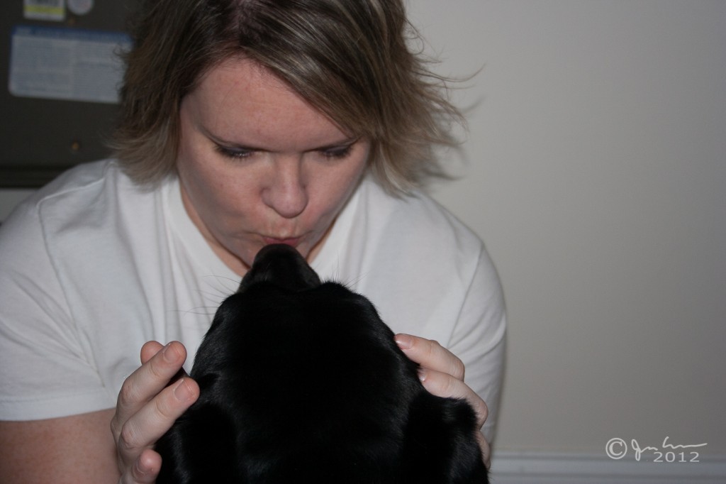
They were all laughing and I said that this wasn’t really all that funny – we all know what that kinda pose means, right?  Is it funny for a 13y.o. to be suggesting she is into…uh…that?  I think it started with Miley Cyrus when she got all slutty, and it went viral from there…and I didn’t want to produce photos of that nature.  The parents looked at me rather shocked for a second, and said they were done and packed up to leave.  I got paid the sitting fee for the session, but suffice to say, no prints were ordered or were any provided.  They’ve also not been very reachable socially since.  I’ve offended them on some level…by not letting their kids pose like this:

Think Negative – not Positive

Sounds odd doesn’t it?  Yet believe it or not, the use of something called negative space can be very powerful in photography.  But what is negative space?  The term is kind of hard to describe in words, but the best way I can think of to describe negative space is the space that has nothing, or the lack of a subject or point of focus.  Things like skies are good examples of negative space.  It can bring a sense of scale in ways that are otherwise very difficult to attain.  I’ve shared a few shots of this here on the blog recently as kind of a “latest and greatest” theme from various trips, but they also serve as good examples of negative space.  Take a look at these shots again and think of them in terms of the negative space, and how it enhances composition:

Negative Space 1
Negative Space 1

Negative Space 2
Negative Space 2

Negative Space 3
Negative Space 3

See how empty or negative space can actually work to your advantage?  Like the examples show, skies work well in this regard, but you could use any negative space to better accent a photo or design.

Anyway, that’s the photo tip and post for today.  Anyone have any thoughts on the use of negative space?  Got examples you can share?  Feel free to sound off with your thoughts, tips, ideas, suggestions in the comments.

Don’t forget, there’s also the monthly giveaway going on over in the Flickr forums – you can win a free copy of PictureCode’s Noise Ninja – just submit up to 3 photos before the deadline!

Happy shooting and we’ll see you back here again tomorrow!

Grab the Feed
Follow Me on Twitter

Eight Ways to Awesome Photos

One of the worst moments in photography is when you get things back on the computer from a shoot to see that dreaded blur!  If only you had been able to stabilize the camera more.  I can’t tell you how many times I’ve been confidant enough in my own abilities to think “I can hand hold that shot”.

Blurry Shot

The truth of the matter is, most of us can’t!  So, avoid the blur whenever possible When trying to capture images where light is low, a sense of movement is desired, or any other scenario where shutter speeds drop perilously low, getting that camera stable is critical!  Here are eight ways to make that happen:

1.  Use a Tripod – Shots taken with tripods are inherently more stable than their handheld counterparts.  Nothing stabilizes things like an inanimate object!

2.  Use a Monopod – With the tripod police out in force more and more, they are being allowed less and less in a number of areas.  If a tripod isn’t permitted, a monopod may be an alternative worth considering.

3.  Use Your Surroundings – Okay, so the tripod wasn’t allowed, the monopod you forgot, but there’s still a chance to catch that shot.  The answer lies in using your surroundings.  Brace the camera against a tree, a fencepost, a car, or whatever is available.  They key is to make your camera stationary.

4.  Bump the ISO – As much as I try to avoid increasing ISO, the newer cameras available do a great job of smoothing, and even then, software post production options are also pretty advanced at cleanup afterward.  So, if you have to, go ahead and bump the ISO settings to shoot fast and still retain exposure accuracy.

Fireworks

5. Hold that Camera – I know some shooters who claim to be able to hand hold as slow as 1/30th of a second, and one of their “secrets” is a secure grip on the camera.  Make sure you’re holding your camera right and not flapping your arms out beside you, all fingers around the edges (like a camera phone), and you can get better shots.

6.  Shoot between Breaths – Yup, you can shoot between breaths.  It’s key to remember not to hold your breath, but rather inhale slowly, exhale slowly, and that momentary gap between breaths is a moment when your body rhythms are not moving at all, heartbeat included!

7.  Slide that Finger – No, not that one!  Your shutter finger is what I am talking about.  So many people tend to jab the shutter, but that pushes the camera and can introduce movement.  Make it a slow slide with increasing pressure, almost as if the shutter release is an afterthought.

8.  Watch Your Feet – Standing with your feet together like a ballerina is never a good idea when shooting.  Your center of gravity rises, and you are unstable.  When you are unstable, so is your camera.  The same holds in the opposite extreme, so keep your feet about shoulder width apart when shooting.

Pacific Sunset

If you like these tips, keep in mind, there’s 90 more tips just like these in my eBook Combo Kit where you get both 49 Photo Tips, Volumes I and II, as shown at the top of the homepage.  On sale for a limited time, this combo kit is going for $10, so get it now while the savings are available!

There are, of course, other tools and methods to help make your photos better, but these 8 ways to add stability are just a primer to get you on the right track to making the most of your time behind the lens!  Know of any other ways to help stabilize a shot?  Anything I missed or that particularly speaks to you and your own techniques?  Sound off in the comments or via email!

Copyright, Licensing and Model Releases

One of the questions I’ve gotten since releasing the DIY Legal Kit surrounds the sometimes confusing matter of photographer copyright protection versus licensing, and model releases. As the Legal Kit is designed to be the forms needed to cover each of these bases, the delivery was intended for those with a solid understanding of each principle.

However, soon after launch, I realized that the “solid understanding” was not necessarily present, so figured a bit more background would be helpful.  For those of you who already purchased the kit, an upcoming supplemental will be released to you free of charge.  For those of you who would like to get the primer separately though, that will also be made available to give you the primer you need to understand all these nuances.  For now though, I thought it might be helpful to give a bit of an introduction to the concepts here on the blog.  It’s a confusing issue for sure, and one that does warrant a bit of discussion.

Copyright Protection

Copyright protection refers to the rights of an artist to control the distribution of works they create.  Whether you are a painter, a writer, a sculptor, or a photographer, you have the right to control distribution of your own work.  Registering your work with the federal copyright office entitles you not only to the protection of copyright, but also to legal remedies for damages in the event someone tries to use your work without your permission.  The supplemental will cover the process for registering your work with the Federal Copyright Office and answer some of the more common questions there.

Model Release

A model release means a person is signing over the right to produce the image they have been captured in to the photographer.  A photographer may own the copyright to a photograph, but a person also has the right to control their own likeness.  If you do not want a photographer to produce your image in any commercial setting, simply do not sign the model release.  If you are a model, you probably want your image to be used to gain notariety.  So, to do that, you need to release the right to produce images of you to the photographer.

There are always circumstances that can raise questions though.  For instance, does an attendee at a wedding inherently give the photographer the right to use their image?  It was only the bride and groom that hired the photographer, not the attendees!  What about someone who is out on the street taking portraits for $5 a pop?  If you buy the photo, does that grant the photographer the right to use your image?  Not necessarily!  The supplemental answers these types of questions too.

Licensing Your Photos

Probably one of the biggest misconceptions I see around the field of photography, is that clients (and some photographers) see the product as what they are selling, not the service.  The truth of the matter is that as a photographer, it’s more common to get compensation for the service than the photos themselves.  Obtaining a photo, or using a photo afterwards is what’s referred to as licensing.

So, the question naturally comes up from wedding and event photographers – does this mean a couple needs to also pay for the photo album?  The answer is – (as always) “It depends!”  If your pricing structure includes a CD to re-print then no.  If your pricing includes a photo album, then yes!  What about Facebook and Twitter, along with a host of other social media sharing sites?  Are those included?  How does this differ from corporate or studio sessions for head shots or architectural and fine art prints?  These are all great questions and the answers to these and many others will all be included  in the forthcoming supplemental.

Hopefully this has helped answer some of the basic ones that people have had regarding the Legal Kit forms.  The last question you may have at this point is what is included in the DIY Legal Kit itself.  Here’s what you get in the Basic Legal Kit:

  1. Both an adult and minor model release forms (and is accepted at most stock agencies, including iStock, Getty, and Alamy)
  2. A standard event contract
  3. A standard licensing agreement
  4. Schedule A (which itemizes the list of photos included in the agreement)
  5. Schedule B (which covers the terms of usage).

The thing that’s super cool about these forms in the basic kit is that they are designed so you can add your own logo, company graphic and other design styles to the forms to suit your personal preferences.  They are in standard Word format so you can easily modify them as needed for your locality if desired, rather than the more difficult PDF format that is more common with other Legal Kits of forms.

These all were created by a licensed and practicing attorney here in Colorado, with the intent to make them as applicable as possible in most municipalities.  If you do have concerns though, feel free to consult with an attorney in your own area.  As an aside, it’s always cheaper to review existing forms and documents than to have them create ones from scratch for you!

*****

So, if you haven’t gotten the Legal Kit yet, feel free to pick up a copy now: https://canonblogger.com/education/ebooks/

Photo Technique of the Week

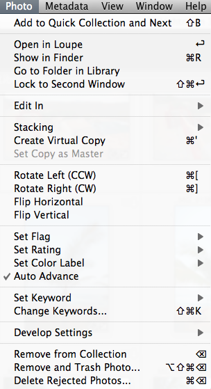
Yeah, okay, I don’t do this a lot, but every once and a while it’s fun to put together a quick technique or tip to share with the reading/listening community, so here’s one that’s very helpful when using Lightroom. More of a tip than a technique, this is simply a suggestion to enable the Auto Advance feature.  When you check this feature, it makes your work flow go a lot quicker when making picks or rejects from catalogs. After I’ve completed an import, I’ll go through and tag the picks and rejects with my keyboard shortcuts (P) and (X) respectively. Because the Auto Advance feature is enabled, simply making a”tag” or flag selection on a picture, advances me to the next one in the current catalog or collection.


After I do this, I simply look up at the top of Lightroom while in Library mode to filter my collection for either picks or rejects. From my approach, I do the rejects first, then CMD/CTRL A to select all and delete! Then from the picks, I’ll go through and make whatever edits I need, even including round trips to Photoshop, Photomatix, or whatever 3rd party software I happen to need or be using at the time.  This is always so much easier with Auto Advance enabled. I can fly through a shoot of 500+ images in about 20 minutes both to clean up the catalog, and make the picks of what will likely be in the final published album. Give it a whirl and see if it improves your work flow!

Got your own tips or tricks for Lightroom, Photoshop, or simple camera techniques? Share the love and sound off in the comments! Either that or share your own thoughts on what you think of the techniques I share here. Regardless, tips tricks and techniques like these are always designed to help you get through post production and do what we all love to do – get out and shoot some more! Happy shooting and we’ll see you back here next time!

In Loving Memory

It’s been five years since this originally posted, but shall live on forever. Republished annually:

5/4/2013 was a sad day…after 12 years together, our family dog Maggie had reached a point where her body is just not able to sustain her anymore. Over the last 9 months we have seen her deteriorate slowly. Her Lab face always seems to defy the pain she is in as she perks up whenever we come in the room, take her on a walk, or give her some “floor time” to play. Play times have gotten shorter, walks are probably more appropriately referred to as stumbles and flat out face plants, and her smiles when we enter the room have changed first to tail thumps, and more recently, just an ear perk.

I remember when I first got her – a dozen years ago. I was a single guy in St. Louis, and many family and friends suggested I get a dog for companionship. This bundle of energy snuggled into my arms from the litter almost immediately:

When I met Tracy, the two quickly connected – each becoming almost as attached as I am with our beloved dog now of a dozen years. It was Tracy that started affectionately referring to her as “Maggie-Moo”, or now the more common “Moo” which everyone seems to know her by…

Over the years, she grew, and enjoyed many many happy days. Some of my favorite moments include particular events. Here she is expressing her curiosity the year I got a 10-22mm lens, checking out the new gear in my bag:

Us humans can take a page from our dogs, because they always seem to be smiling, happy to just be there, and both giving and receiving companionship, even just enjoying something as simple as a warm sunny day:

Being the Lab that she is, Maggie also enjoyed every moment she could in water, swimming, chasing sticks, and of course, giving me a dousing whenever I needed one…

Maggie is such a good dog – and acutely aware of people and their emotions This dog never left my side when I was bedridden with pneumonia. When something is missing or unfamiliar, she is always on the alert, checking things out to make sure all is in order…

Not to say that she was always good – as sometimes Maggie would get into something either with our consent, or just from her own search and explore sessions…

Her signature mark is a “happy wiggle” where she would literally throw herself down on the floor, and wiggle around on her back. This was always a sign that we knew she was in a happy place…

One of our favorite shots of her is one where she is obliging us with a pose over Halloween, so I feel compelled to share it here as well – so prim and proper…

So, we made the painful decision to let her go with some dignity. It was SO HARD to make this decision. We cried and reconsidered countless times whether we were doing the right thing or not. With no human children, Maggie really is our only child, and letting her go even today is something we feel physically ill about. She just can’t handle another move though – there are literally weeks, possibly only days left, so we opted to let her go gracefully…

It’s an inevitable part of the circle of life, and while the logical part of me knows and understands this, the emotional side of me will never be the same person again. It hurts so bad to let her go, even though I know she is going to a better place. Thanks for the lifetime of memories “Moo”…we love you! You were larger than life itself!

Wordless Wednesday #27: Boulder Tulips


Wordless Wednesday #27: Boulder Tulips

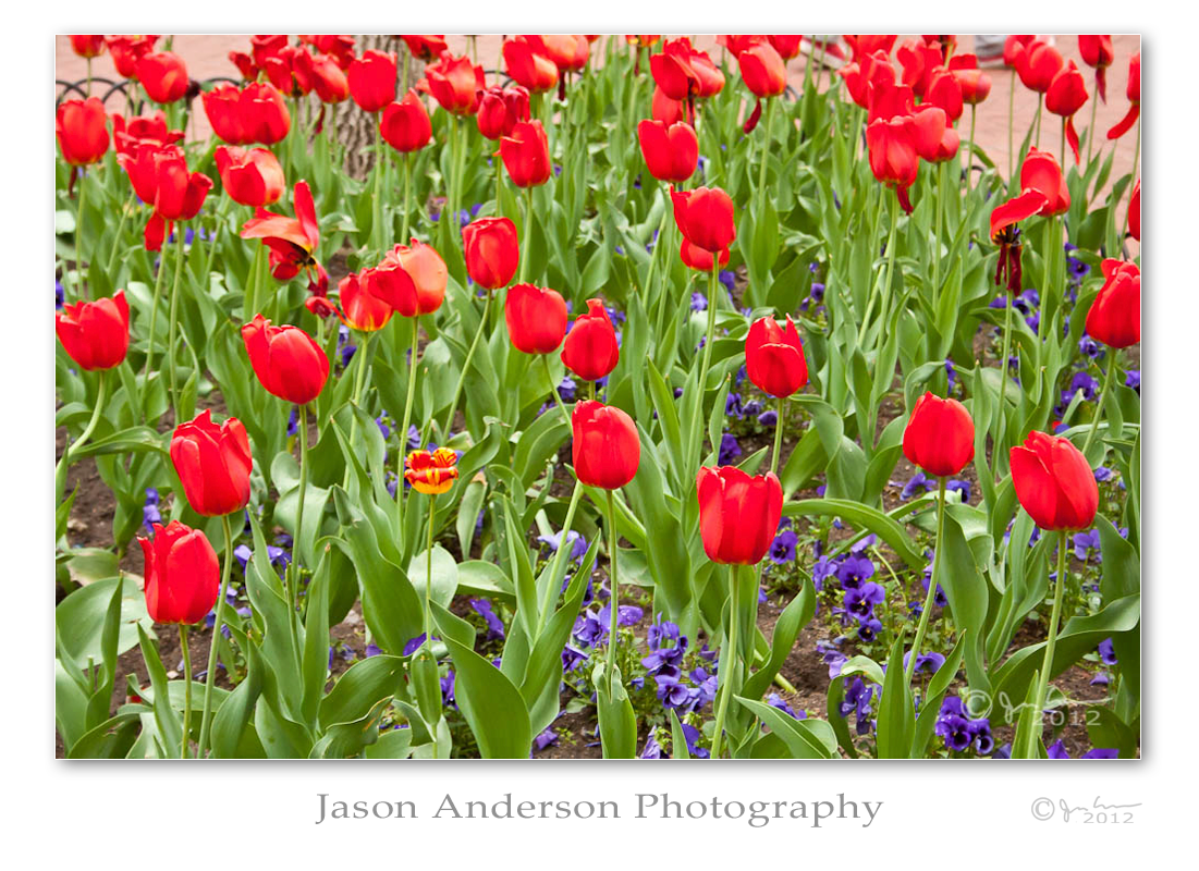
I’m coming out of silence for Wordless Wednesday…primarily because so many people are asking me questions via email, Twitter, and FB to share details about the composition, post production, and other details.  Instead of just spitting out metadata and other information, I’ve got questions and answers from now on:

#1 – What rule of composition did I use and why?

I chose the Rule of Thirds for this shot, and specifically chose the lower left third to be the grabber.  I didn’t want this to be an overpowering shot, for the eye to just enjoy the plethora of tulips…but the little tiny yellow and red amongst the larger red ones struck me for some reason, so I framed it to the lower left – thus giving more space for the eye to expand out from there to the rest of the scene.

#2 – Are any rules of composition broken?

Here, I don’t think so – in general, the Rule of Thirds applies, and the Golden K also applies if you look at it for more than a second or two…see the K lines appear in the red tulips?  Kinda neat, eh?

#3 – What camera/lens combo did I use?

For this shot, I was on my trusty Canon 40D, and the lens mount was none other than the Canon kit 18-55mm (nonIS)!  I went with the 18-55 mm lens because this is a very good lens for approximating the equivalent of what the human eye sees, and for this photo shoot, I wanted that effect.

#4 – What lighting did I use?

Here, there were no lights…it was au naturale:  S=1/60th, f7.1, focal length = 50mm, and an ISO of 1250!  (Yep, ISO 1250 – I was hand holding and wanted to keep it bright!  The scene was actually much darker, because the sun was going down, and I really wanted the colors to pop!  Depth of field was also important to me, because all the flowers needed to stay relatively sharp. Since I was shooting light and on the fly (no tripod or monopod), my only option for getting the brightness in the scene that I wanted was to push the ISO settings up to maintain correct exposure.  

#5 – How did I process it?

I processed this in Lightroom, using just a few tweaks on the right panel:  I had under-exposed a little (especially given the fading lighting conditions), so upped that by .76.  I also set Clarity, Vibrance and Saturation to 50, +10, and +10 accordingly.  These settings helped bring out more of the color and vibrance that I was seeing but was not in the default raw file.  My sharpening and noise levels were also set to  +73 and +50…the sharpening was up that high because,w ell, we always have to sharpen at least a little, and a went a little higher to help define that depth of field.  Lastly, the noise levels were pushed up to help counter the impact of the ISO when I was shooting.

Hopefully this will help those of you who are interested in learning what I see with my eye and why I capture certain images.  If you have more questions, or thoughts on improvement, feel free to share those in the comments!

Aspect Ratio adjustments explained

I can’t tell you the number of times I’ve gone to print pictures I’ve taken only to find that I had composed it in a way that a portion of the image was lost when printed because it had to be cropped out to fit on the paper.  Today I am going to share a technique in Photoshop that will help you get around that pesky limitation.

First a little background – the reason why we are losing part of the picture is because we are changing the aspect ratio.  What is aspect ratio?  Simply enough, it’s the relative size of the long side of the picture to the short side.  Aspect ratios are often referred to by their lowest common factor.  So, a 4×6 print uses a 3:2 aspect ratio.  (Aspect ratios usually are stated with the larger of the numbers coming first…)  An 8×10 has an aspect ratio of 5:4.  Want to print a 16×20?  Guess what – it’s got an aspect ratio of 5:4 too!  Here are some of the most common aspect ratios that you see in photography:

4:3 – Point and Shoot Cameras
3:2 – 35mm Film cameras and most APS-C sensor cameras (SLR’s)
1.81:1 – APS-H Mode (High Def)
3:1 – APS-P (Panoramic)

So, with an SLR camera, since your sensor approximates an aspect ratio of 3:2, getting an 8×10 print means you need to keep your subject matter in from the edges because when you crop to the new ratio, at least one of those edges (and a little of the other) will be lost from the crop.  So, having now explained  “why”, let’s now look at the “how” (as in how to fix it!) in the delayed tutorial for the week:

The Rule of Thirds in History

We’ve been looking at the Rule of Thirds in photography for compositional approaches, and I commented on what seems to be a trend toward the former being more popular in portrait work and the latter being more popular in landscape type work.  The idea makes sense as portraits have subjects within the picture, while with landscapes the subject IS the picture (the entire scene).  Click here for the full blog post with examples.

Well, today, I am taking advantage of the open sourced nature of Wikipedia (all images link back to the Wikipedia pages they came from) for some well-known works of art that have survived the test of time to see how they measure up under the Rule of Thirds.  The results are kind of interesting:

The first is from Picasso, from his Cubism work, titled Three Musicians…

Van Gogh

A super-imposed Rule of Thirds grid is rather telling.  While this construct is somewhat different, because of the style of Cubism, I found it interesting to see the lines that he painted also fell into roughly the same places as those of the Rule of Thirds.  And the hot point in the upper left is kind of close to the “face” of one of the musicians.  Does the rule of Thirds apply here?  Given the linear composition, my vote is Yes – what’s yours?

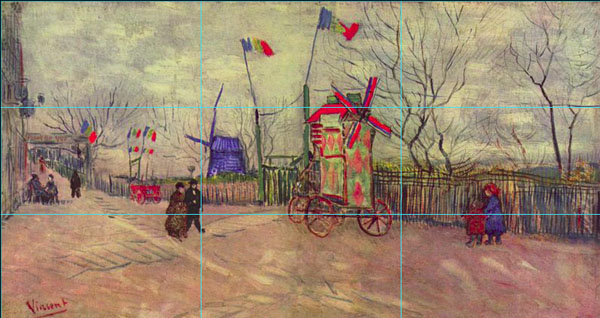
Next up, is Van Gogh, with a painting titled “Street Scene in the Montmartre”:

Vaon Gogh

Here, hot points are very much at play, with the people walking down the street, coming in at the lower left hot point, and the red splash of color on the windmill is very close to the upper right point.  The fence line also roughly follows the lower third so elements of both compositional styles are present here.  Does the Rule of Thirds apply here?  I’d say yes!  Do you agree?

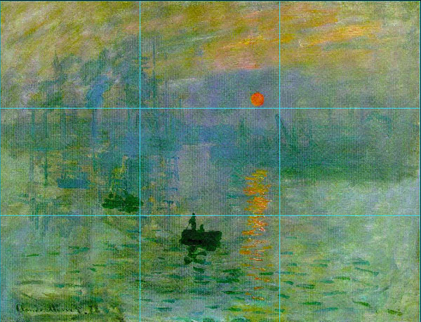
Lastly, let’s take a look at one of the more abstract artists in history:  Monet, and one of my favorite works of his, “Impression, Sunrise”…

Picture 2

The sun – pretty close to the upper right hot spot, and teh reflection in the impressionist waters, almost as in line with the right third line.  The boater shadow, being an opposing color, stands out anyway, but it also helps the composition that the lower third intersects it to a degree.  Remember, art is not an exact science, and creativity wouldn’t have variation if subjects were always right on the hotspot.  Equally, it wouldn’t spark or inspire us to always place things on the thirds lines. These are guides, meant to help you compose in aesthetically pleasing and appealing ways.  Does the Rule of Thirds apply here?  Without a doubt, is my answer!  Am I wrong?  What’s your take?

These are but three single instances of works of art that have survived the test of time.  There is so much history to art and its creative appeal, but I would venture to guess that much of it has some elemetns of composition in common throughout the ages.  Yet, there will always be exceptions.  That is the challenge for today – do you know any famous works of art historically that break the rules?   What makes them work and why?  Share your comments here in the blog.

A few other tidbits to share today outside of the main focal point (get it? 🙂 ):

  • Three more days to the Worldwide Photowalk, hosted by Scott Kelby and with tons of sponsors and prizes.  Have you registered?  Some cities still have openings so check cities near you – there’s still time to register!  (It’s free!)
  • A fellow NAPP member had started a community forum thread asking about the graphics tablet pen as a useful tool, and Dave Cross stopped in to share that he made a blog post scheduled for yesterday.  I made a mental note to stop over and read it – great thoughts, and definitely worth the 30 seconds (I read his blog daily anyway)!
  • Last, but not least, I got an email recently about this new site where photographers of any background can upload images of their lighting setups or other creative perspectives and setups with light to share with the community at large.  It’s a great outlet and you can get some pretty incredible inspiration from it…the name is Light Test and coincidentally, so is the web address.  Check them out here.

As a final note today, as I always like to share sources of creativity, I’d like to give some special thanks to Elizabeth Gast (a.k.a. Firgs), of  Design by Firgs.   She has been instrumental in helping me think outside my own box of creative limits, and in working hard to improve both the quality of work and how I present that work.  Today, she featured me on her site as a “Hot Site!”.  While I am always going to take the self-deprecating approach, here I must simply and humbly say thanks to her.  Not only for the mention on her site today, but also for her instrumental help in helping me improve my own web presence with regard to branding and design styles (see my Twitter background for an example).

That’s enough for one day, doncha think?  Happy shooting and we’ll see you back here again tomorrow.

Grab the Feed