Wordy Wednesday #028: Dewy Details

Wordy Wednesday #028: Dewy Details

#1 – What rule of composition did I use and why?

For this particular photo, I’m not sure there is a Rule of Composition that applies.  The Rule of Thirds, Golden K, Circle, etc. and the rest are clearly not present.  It’s just a random pattern of dewdrops, and in remembering when I took this, the random nature is what I wanted to capture, so the rules went out the window

#2 – Are any rules of composition broken?

Yes – all over the place!  As mentioned in point #1, there is no rule to this, it’s all random, and that randomness was the goal, so I had to throw all the rules out the window in order to accomplish the objective.  Does it work for you?

#3 – What camera/lens combo did I use?

For this shot, I was on my trusty Canon 40D, and the lens mount was the Sigma 70mm Macro.  This particular lens is very sharp, and ideally suited to macro photography, which was my objective when I first went out.  The dewdrops of the flora and fauna in the area were on my mind, but as I returned home, this particular scene drew me, both because of the randomness, and as a “teachable moment” that your own vision can change or the theme of a shoot can change if you keep your mind open.

#4 – What lighting did I use?

Here, there were no lights…it was au naturale:  S=1/125th, f11, focal length = 70mm, and an ISO of 400

#5 – How did I process it?

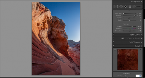
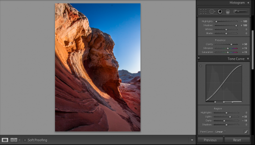
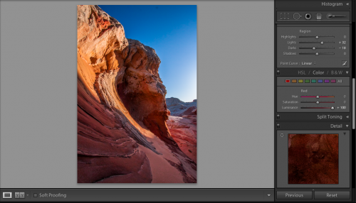
Minimal processing on this one.  The neutral tones, and just the idea of how raindrops can be amazing no matter where they exist (this was on the hood of a highly polished car) as the goal, and I liked it.  All I did was sharpen and remove a little noise (+60, +50).

Hopefully this will help those of you who are interested in learning what I see with my eye and why I capture certain images.  If you have more questions, or thoughts on improvement, feel free to share those in the comments!

From Bad to Beautiful

Making better pictures comes in three forms – better setup, better composition, and better post production.  You will make your best shots if you improve in each of these areas.  So, today, I’m going to share a technique I’ve used to take boring and bad photos to make them beautiful in post production.  Here’s where we’re going to go:

So, the final product looks pretty good here, right?  It means we must have had a keeper to begin with, right?  Well, not necessarily – the first shot looked like it was under-exposed, and could easily have been thrown out.  Take a look:

Yeah, it looks pretty bland – there’s no pop, the shadows are too dark, the blues in the sky are bland, and it’s something that we might just blow past as an under-exposed shot.  The truth is though – we’ve gotta trust the histogram.  Take a look

What we have to remember is that there are no blown highlight details or shadow details lost according to our histogram.  We’ve got detail on both ends.  What the histogram is telling us though, is that more of our photo is in shadow than in highlights.  We do have some of both, but we need to bring some balance to it.  So, let’s get started

In getting started, we need to bring out the shadow detail more, but I also want to bring some of those highlights down a little too, because it just looks a little too harsh.  Here’s the default scene inside of Lightroom.  Let’s see what happens when we bring the highlights down – and when I say “down”, I mean way down!

See how the harshness of the sky on the right has been pulled back?  Much better, but we still need to bring out some of that shadow detail on the next step, so, let’s take a look:

Remember, it’s just my personal tastes, but I like the settings of 50-15-15 through to really get some eye-dropping pop in my photos.  It’s pretty nice, but if I push these sliders much further, it will start to look garish.  This means I need to dabble a little with the tone curve to get the pop that I am looking for.  So, in remembering the histogram, I am wanting a bit more detail from the dark and the bright areas need to pop a little more too without getting lighter.  Here’s where I made some tone curve adjustments:

The pop is really starting to take shape here…but the red still need a little more brightness to them to really keep the look and feel consistent wit what I want the image to look like once all is said and done.  To do that, I dive into the color palette, grab the red luminosity slider and crank it up all the way.  The results are pretty nice!

It’s at this point when I noticed a dust bunny from my lens (see near the top of the sky).  So, I headed back up to the top of the Develop Module to take care of business:

Now that I’ve fixed the dust bunny, it’s time to move onto my final step..my lens correction!  No matter how good your lens is, there are imperfections, from chromatic abberations to edge distortions.  The general rule of thumb is that the wider the lens, the more edge distortion there is.  Since I shot this with my 10-22 which is an ultrawide, there’s some substantial distortion to fix.  So, let’s take a look:

For those of you that prefer audio/video tutorials, I’ve done a short YouTube video.  It’s a lot faster than the read, but some details are lost if you tend to go after minutia:

Enjoy, and we’ll see you here next time! 🙂